Header image by Richard Strozynski
During my after-thesis-vacation, I managed to tick off two long-term todo’s on my list - set up a homepage and to participate in the #TidyTuesday challenge to strengthen my data science and visualization skills and share my work and code tricks with the amazing Rstats community on Twitter. The #TidyTuesday challenge is a excellent opportunity to do so!
What is it about?
The R4DS (“R for Data Science”) online learning community founded by Jesse Maegan is a great opportunity to train skills related to data wrangling and visualization and forms a network of mentors and learners. One of the first projects born out of this collaboration is #TidyTuesday - a weekly social data project that focusses on understanding how to summarize and arrange data to make meaningful charts with {ggplot2}, {tidyr}, {dplyr} and other tools in the {tidyverse} ecosystem founded by Thomas Mock. The intent is to provide a safe and supportive forum to practice their wrangling and data visualization skills.
Every Tuesday, R enthusiasts from all over the world clean, wrangle, tidy and visualize a new data set and share it on Twitter using the hashtag #TidyTuesday. I follow the challenges quite some time and I am amazed by the high-quality visualizations some contributors share on their Twitter (check for example the work of David Smale, Harro Cyranka and Jake Kaupp to name a few) but I during the PhD Thesis I always felt bad starting such a fun project. Since I submitted my thesis a few weeks ago and since I was anyway running deeper and deeper down the {tidyverse} hole during the PhD project, using their packages for all nearly all steps from data processing to statistical modelling and plotting, I finally gave it a try!
First Contribution: Week 17
Highly motivated I opened the challenge of the current week (Week 17) - and what a bummer, my first contribution had to focus on anime data, one of the least favorite genres in my life. So I decided to subset the data to the only anime I know by heart: the lovely crafted Studio Ghibli movies which my partner is a big fan of (I mean, we even have a Totoro drawing hanging in our flat…)!
Finally time for #TidyTuesday after submitting the thesis 😎 I am not really following the #anime genre so I picked the only anime I know by heart - @StudioGhibli🐉
— Cédric Scherer (@CedScherer) April 23, 2019
Code: https://t.co/laRPpWPPE7
#rstats #r4ds #dataviz #ggplot2 #tidyverse

Catching Up: Week 14 and 16
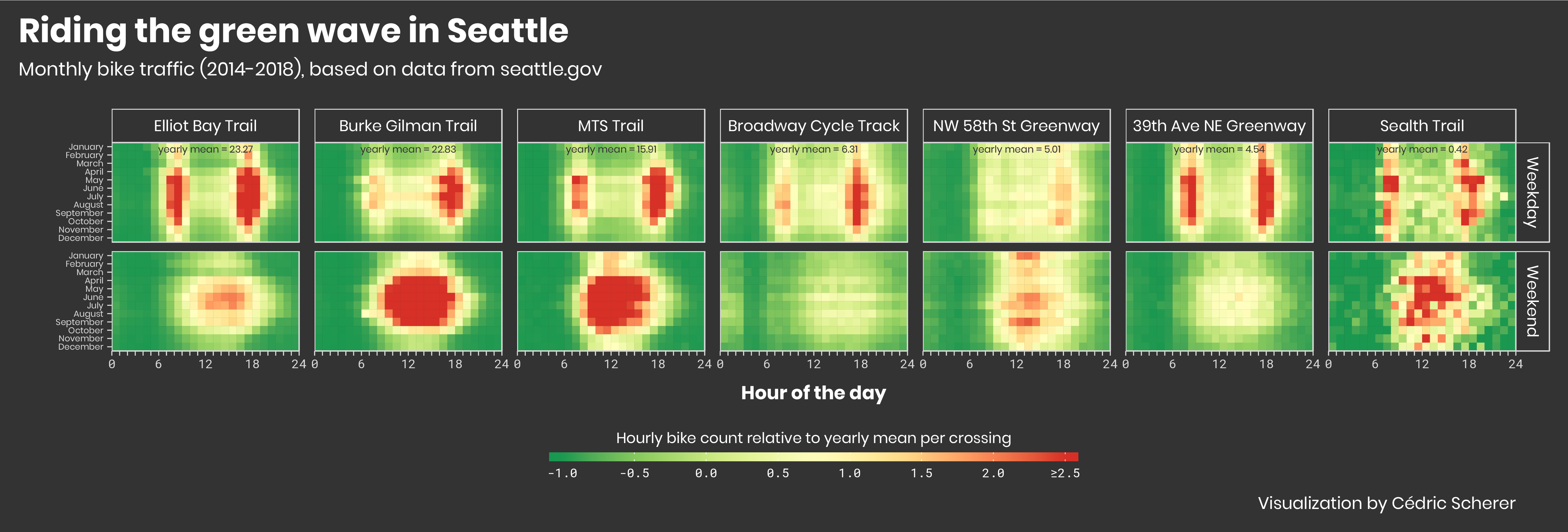
From this moment on, I was addicted and picked two other datasets, one on bike traffic in Seattle (Week 14):
Catching up with the folks of @R4DScommunity and the #TidyTuesday 📊 and picking the 🍒of the previous challenges! Visualization of seasonal trends in 🚴♀️ traffic in Seattle based on time of the day, month, and weekday/weekend.
— Cédric Scherer (@CedScherer) April 24, 2019
#dataviz #rstats #r4ds #tidyverse #ggplot2
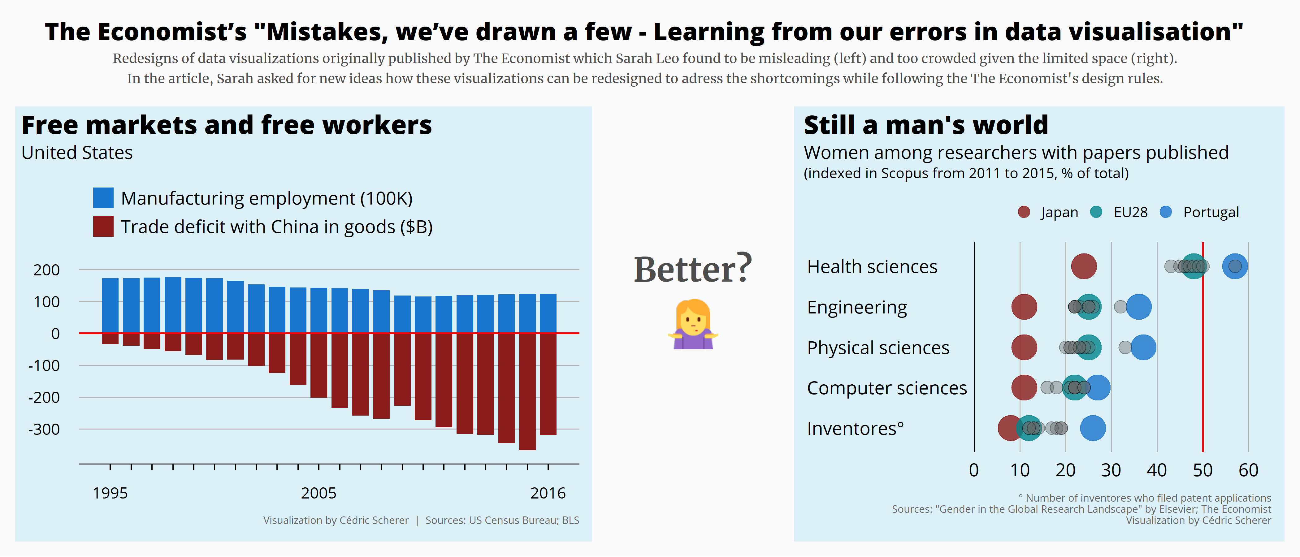
… and several data sets in that were part of the inspiring article “Mistakes, we’ve drawn a few - Learning from our errors in data visualisation” by The Economist (Week 16):
I can't stop! 🤓 Another #TidyTuesday contribution to catch up - week 2019-16. I tried to improve a few of the "mistakes that @TheEconomist has drawn" 📊📈 Article by @MissSarahLeo: https://t.co/ufVhnMU94Z
— Cédric Scherer (@CedScherer) April 26, 2019
#dataviz #rstats #r4ds #tidyverse #ggplot2
I decided to stick to the overall theme as a collection of data viz which I may put together as a poster of my highlights - or maybe not. At some point, however, I likely going to use a different theme or a theme which fits the data more each week.
Latest Contribution: Week 18
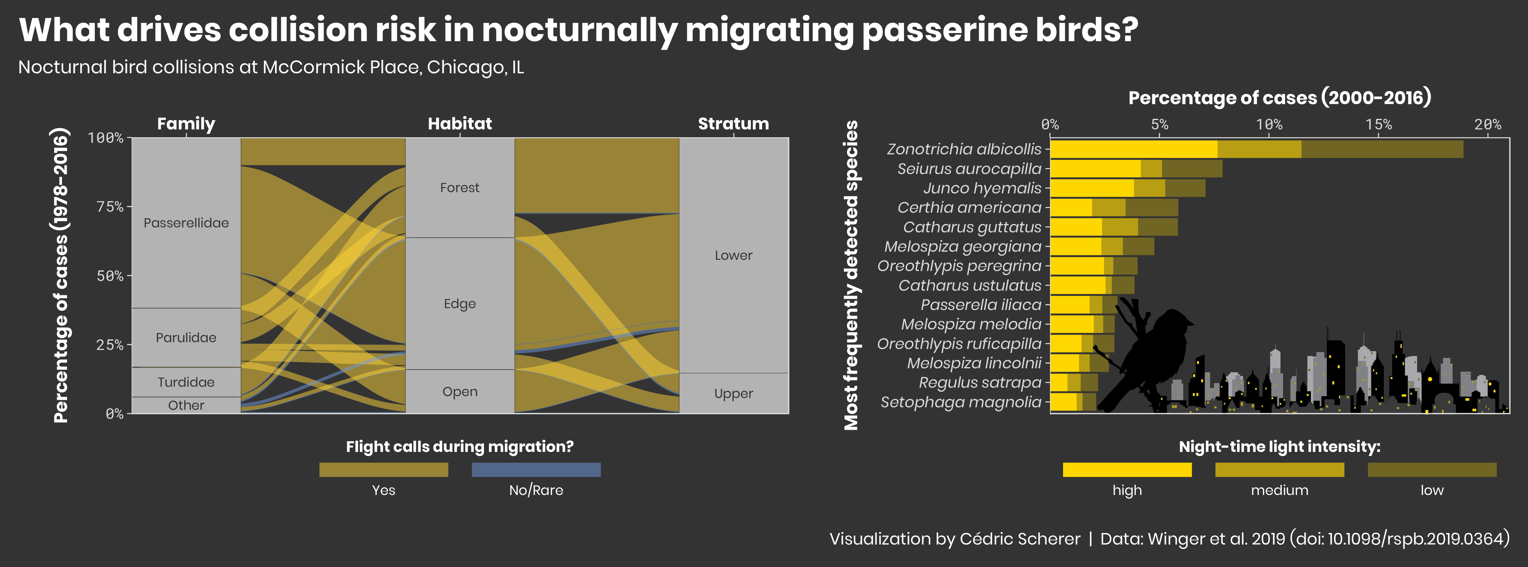
And finally my contribution to the challenge last week with a data set from a study of Winger et al. (2019) on bird collisions in Chicago (Week 18):
#TidyTuesday challenge 2019-18: What drives collision risk in nocturnally migrating #passerine #birds? 🏫🕊️
— Cédric Scherer (@CedScherer) April 30, 2019
#rstats #dataviz #tidyverse #r4ds #ggplot2 #birdmigration #Chicago
Original article: https://t.co/eqSKr4eFZl
You can find all these and upcoming #TidyTuesday contributions in the Visualization section and the corresponding codes on my GitHub page! In future blog posts, I am going to share some thoughts on why I picked a given chart type, which color palettes I use and some tips and tricks of styling your ggplots - stay tuned 🤓