Header image by Richard Strozynski
Last update: 2023-05-05
Introductory Words
I don’t care, just show me the content!
Back in 2016, I had to prepare my PhD introductory talk and I started using {ggplot2} to visualize my data.
I never liked the syntax and style of base plots in R, so I was quickly in love with ggplot.
Especially useful was its faceting utility.
But because I was short on time, I plotted these figures by trial and error and with the help of lots of googling.
The resource I came always back to was a blog entry called Beautiful plotting in R: A ggplot2 cheatsheet by Zev Ross, updated last in January 2016.
After giving the talk which contained some decent plots thanks to the blog post, I decided to go through this tutorial step-by-step.
I learned so much from it and directly started modifying the codes and over the time I added additional code snippets, chart types and resources.
Since the blog entry by Zev Ross was not updated for some years and step by step this became a unique version of a tutorial, I decided to host the updated version on my GitHub.
Now it finds its proper place on this homepage!
(Plus I added a ton of other updates—just to name a few: The fantastic {patchwork}, {ggtext} and {ggforce} packages. How to deal with custom fonts and colors. A collection of R packages tailored to create interactive charts. And several other chart types including pie charts because everyone looooves pie charts!)
Major changes I’ve made:
- to follow the R style guide (e.g. by Hadley Wickham, Google or the Coding Club style guides),
- to change style and aesthetics of plots (e.g. axis titles, legends and nice colors for all plots not only some),
- to have a updated version which keeps track of changes in
{ggplot2}(current version: 3.4.0), - to modify data import (GitHub source),
- to add additional tips on a vast range of topics, including for example chart choice, color palettes, modifying titles, adding lines, modifying legends, annotations with labels, arrows and boxes, multi-panel plots, interactive visualizations, …
Table of Content
- Preparation
- The Dataset
- The {ggplot2} Package
- A Default ggplot
- Working with Axes
- Working with Titles
- Working with Legends
- Working with Backgrounds & Grid Lines
- Working with Margins
- Working with Multi-Panel Plots
- Working with Colors
- Working with Themes
- Working with Lines
- Working with Text
- Working with Coordinates
- Working with Chart Types
- Working with Ribbons (AUC, CI, etc.)
- Working with Smoothings
- Working with Interactive Plots
- Remarks, Tipps & Resources
Preparation
- You can find the Rmarkdown script with the code executed in this blogpost here.
- You can also download the R script containing only the code here.
- You need to install the following packages to execute the full tutorial:
{ggplot2}, part of the{tidyverse}package collection{tidyverse}package collection, namely{dplyr}for data wrangling{tibble}for modern data frames{tidyr}for data cleaning{forcats}for handling factors
{corrr}for calculating correlation matrices{cowplot}for composing ggplots{ggforce}for sina plots and other cool stuff{ggrepel}for nice text labeling{ggridges}for ridge plots{ggsci}for nice color palettes{ggtext}for advanced text rendering{ggthemes}for additional themes{grid}for creating graphical objects{gridExtra}for additional functions for “grid” graphics{patchwork}for multi-panel plots{prismatic}for manipulating colors{rcartocolor}for great color palettes{scico}for perceptional uniform palettes{showtext}for custom fonts{shiny}for interactive apps- a number of packages for interactive visualizations
{charter}{echarts4r}{ggiraph}{highcharter}{plotly}
# install CRAN packages
install.packages(
  c("ggplot2", "tibble", "tidyr", "forcats", "purrr", "prismatic", "corrr",
    "cowplot", "ggforce", "ggrepel", "ggridges", "ggsci", "ggtext", "ggthemes",
    "grid", "gridExtra", "patchwork", "rcartocolor", "scico", "showtext",
    "shiny", "plotly", "highcharter", "echarts4r")
)

# install from GitHub since not on CRAN
install.packages(devtools)
devtools::install_github("JohnCoene/charter")
(For teaching reasons and if people jump to any plot, I load the package needed beside {ggplot2} in the respective section.)
The Dataset
We are using data from the National Morbidity and Mortality Air Pollution Study (NMMAPS). To make the plots manageable we are limiting the data to Chicago and 1997–2000. For more detail on this data set, consult Roger Peng’s book Statistical Methods in Environmental Epidemiology with R. You can download the data we are using during this tutorial here (but you don’t have to).
We can import the data into our R session for example with read_csv() from the {readr} package.
To access the data later, we are storing it in a variable called chic by using the assignment arrow <-.
chic <- readr::read_csv("https://cedricscherer.com/data/chicago-nmmaps-custom.csv")💡 The :: is called namespace and can be used to access a function without loading the package. Here, you could also run library(readr) first and chic <- read_csv(...) afterwards.
tibble::glimpse(chic)## Rows: 1,461
## Columns: 10
## $ city <chr> "chic", "chic", "chic", "chic", "chic", "chic", "chic", "chic", "chic", "chic", "chic", "chic", "chic", "chic", "chic", "chic", "chic", "chic", "chic", "chic", "chic", "chic", "chic", "chic", "chic", "chic", "chic", "chic", "chic", "chic", "chic", "chic", "chic", "chic", "chic", "chic", "chic", "chic", "chic", "chic", "chic", "chic", "chic", "chic", "chic", "chic", "chic", "chic", "chic", "chic", "chic", "chic", "chic", "chic", "chic", "chic", "chic", "chic", "chic", "chic", "chic", "chic", "chic", "chic", "chic", "chic", "chic", "chic", "chic", "chic", "chic", "chic", "chic", "chic", "chic", "chic", "chic", "chic", "chic", "chic", "chic", "chic", "chic", "chic", "chic", "…
## $ date <date> 1997-01-01, 1997-01-02, 1997-01-03, 1997-01-04, 1997-01-05, 1997-01-06, 1997-01-07, 1997-01-08, 1997-01-09, 1997-01-10, 1997-01-11, 1997-01-12, 1997-01-13, 1997-01-14, 1997-01-15, 1997-01-16, 1997-01-17, 1997-01-18, 1997-01-19, 1997-01-20, 1997-01-21, 1997-01-22, 1997-01-23, 1997-01-24, 1997-01-25, 1997-01-26, 1997-01-27, 1997-01-28, 1997-01-29, 1997-01-30, 1997-01-31, 1997-02-01, 1997-02-02, 1997-02-03, 1997-02-04, 1997-02-05, 1997-02-06, 1997-02-07, 1997-02-08, 1997-02-09, 1997-02-10, 1997-02-11, 1997-02-12, 1997-02-13, 1997-02-14, 1997-02-15, 1997-02-16, 1997-02-17, 1997-02-18, 1997-02-19, 1997-02-20, 1997-02-21, 1997-02-22, 1997-02-23, 1997-02-24, 1997-02-25, 1997-02-…
## $ temp <dbl> 36.0, 45.0, 40.0, 51.5, 27.0, 17.0, 16.0, 19.0, 26.0, 16.0, 1.5, 1.0, 3.0, 10.0, 19.0, 9.5, -3.0, 0.0, 14.0, 31.0, 35.0, 36.5, 26.0, 32.0, 14.5, 11.0, 17.0, 2.0, 8.0, 16.5, 31.5, 35.0, 36.5, 30.0, 34.5, 30.0, 26.0, 25.5, 25.5, 26.0, 27.0, 23.5, 21.0, 20.5, 25.5, 20.0, 18.5, 30.0, 48.5, 37.5, 35.5, 36.0, 26.0, 28.0, 21.5, 25.5, 36.5, 34.5, 37.5, 45.5, 35.0, 33.5, 38.0, 33.0, 26.5, 35.5, 39.0, 37.0, 44.0, 37.0, 33.5, 37.5, 26.5, 19.0, 24.5, 45.0, 33.5, 35.5, 46.0, 53.5, 37.5, 32.5, 33.0, 40.5, 44.0, 60.5, 55.5, 43.5, 37.5, 38.5, 44.5, 53.0, 59.5, 62.5, 60.5, 45.0, 34.0, 28.5, 30.0, 30.5, 33.5, 33.5, 38.5, 41.5, 49.0, 43.0, 40.5, 40.0, 45.5, 49.0, 45.0, 43.0, 48.5, 47.5, 48.0…
## $ o3 <dbl> 5.659256, 5.525417, 6.288548, 7.537758, 20.760798, 14.940874, 11.920985, 8.678477, 13.355892, 10.448264, 15.866094, 15.115290, 9.381068, 8.029508, 7.066111, 20.113023, 15.363898, 12.713223, 9.616133, 16.840369, 12.758676, 21.024213, 18.665072, 7.131938, 17.167861, 9.960118, 9.167350, 13.613967, 7.945009, 7.660619, 11.882608, 16.676182, 12.032368, 21.849559, 10.887549, 14.894031, 15.957824, 14.391243, 19.749645, 12.397635, 14.193562, 20.492388, 23.091993, 20.171005, 15.453240, 19.526661, 20.019234, 17.297562, 27.013275, 19.055436, 6.890252, 16.313610, 23.015853, 24.990318, 18.939318, 12.526243, 7.962753, 13.194153, 15.178614, 13.860717, 30.992349, 29.260852, 15.413875, 17.7…
## $ dewpoint <dbl> 37.50000, 47.25000, 38.00000, 45.50000, 11.25000, 5.75000, 7.00000, 17.75000, 24.00000, 5.37500, -6.62500, -8.87500, 1.50000, 11.50000, 23.25000, -9.75000, -10.37500, -4.12500, 22.62500, 27.25000, 41.62500, 20.75000, 18.75000, 29.50000, -1.37500, 17.12500, 8.37500, -6.37500, 11.00000, 16.37500, 33.75000, 29.66667, 29.62500, 28.00000, 32.00000, 24.25000, 21.87500, 23.37500, 22.50000, 21.00000, 21.75000, 19.50000, 11.60000, 16.37500, 23.00000, 15.25000, 8.12500, 32.62500, 41.37500, 27.50000, 44.12500, 29.62500, 24.25000, 14.62500, 10.87500, 27.12500, 35.00000, 30.25000, 36.00000, 44.00000, 27.37500, 29.37500, 28.87500, 28.62500, 13.37500, 35.25000, 28.25000, 32.62500, 33.250…
## $ pm10 <dbl> 13.052268, 41.948600, 27.041751, 25.072573, 15.343121, 9.364655, 20.228428, 33.134819, 12.118381, 24.761534, 18.126151, 16.013770, 34.991079, 64.945403, 26.941955, 27.022906, 18.837025, 31.859740, 30.923168, 19.894566, 27.882017, 18.508762, 11.845698, 26.687346, 16.612825, 21.641455, 22.672498, 28.101180, 51.776607, 48.741462, 24.686329, 23.784943, 27.762150, 21.600928, 17.050900, 10.157749, 15.943086, 33.010704, 14.955909, 30.410449, 23.914813, 22.972347, 12.712336, 22.719836, 35.676001, 28.373076, 15.662430, 38.744847, 27.597166, 17.612211, 29.768805, 7.340321, 7.856717, 7.908915, 17.834350, 41.124012, 34.052583, 19.749350, 26.126759, 28.129506, 9.940940, 15.980970, 26.0…
## $ season <chr> "Winter", "Winter", "Winter", "Winter", "Winter", "Winter", "Winter", "Winter", "Winter", "Winter", "Winter", "Winter", "Winter", "Winter", "Winter", "Winter", "Winter", "Winter", "Winter", "Winter", "Winter", "Winter", "Winter", "Winter", "Winter", "Winter", "Winter", "Winter", "Winter", "Winter", "Winter", "Winter", "Winter", "Winter", "Winter", "Winter", "Winter", "Winter", "Winter", "Winter", "Winter", "Winter", "Winter", "Winter", "Winter", "Winter", "Winter", "Winter", "Winter", "Winter", "Winter", "Winter", "Winter", "Winter", "Winter", "Winter", "Winter", "Winter", "Winter", "Winter", "Winter", "Winter", "Winter", "Winter", "Winter", "Winter", "Winter", "Winter", "…
## $ yday <dbl> 1, 2, 3, 4, 5, 6, 7, 8, 9, 10, 11, 12, 13, 14, 15, 16, 17, 18, 19, 20, 21, 22, 23, 24, 25, 26, 27, 28, 29, 30, 31, 32, 33, 34, 35, 36, 37, 38, 39, 40, 41, 42, 43, 44, 45, 46, 47, 48, 49, 50, 51, 52, 53, 54, 55, 56, 57, 58, 59, 60, 61, 62, 63, 64, 65, 66, 67, 68, 69, 70, 71, 72, 73, 74, 75, 76, 77, 78, 79, 80, 81, 82, 83, 84, 85, 86, 87, 88, 89, 90, 91, 92, 93, 94, 95, 96, 97, 98, 99, 100, 101, 102, 103, 104, 105, 106, 107, 108, 109, 110, 111, 112, 113, 114, 115, 116, 117, 118, 119, 120, 121, 122, 123, 124, 125, 126, 127, 128, 129, 130, 131, 132, 133, 134, 135, 136, 137, 138, 139, 140, 141, 142, 143, 144, 145, 146, 147, 148, 149, 150, 151, 152, 153, 154, 155, 156, 157, 158,…
## $ month <chr> "Jan", "Jan", "Jan", "Jan", "Jan", "Jan", "Jan", "Jan", "Jan", "Jan", "Jan", "Jan", "Jan", "Jan", "Jan", "Jan", "Jan", "Jan", "Jan", "Jan", "Jan", "Jan", "Jan", "Jan", "Jan", "Jan", "Jan", "Jan", "Jan", "Jan", "Jan", "Feb", "Feb", "Feb", "Feb", "Feb", "Feb", "Feb", "Feb", "Feb", "Feb", "Feb", "Feb", "Feb", "Feb", "Feb", "Feb", "Feb", "Feb", "Feb", "Feb", "Feb", "Feb", "Feb", "Feb", "Feb", "Feb", "Feb", "Feb", "Mar", "Mar", "Mar", "Mar", "Mar", "Mar", "Mar", "Mar", "Mar", "Mar", "Mar", "Mar", "Mar", "Mar", "Mar", "Mar", "Mar", "Mar", "Mar", "Mar", "Mar", "Mar", "Mar", "Mar", "Mar", "Mar", "Mar", "Mar", "Mar", "Mar", "Mar", "Apr", "Apr", "Apr", "Apr", "Apr", "Apr", "Apr", "A…
## $ year <dbl> 1997, 1997, 1997, 1997, 1997, 1997, 1997, 1997, 1997, 1997, 1997, 1997, 1997, 1997, 1997, 1997, 1997, 1997, 1997, 1997, 1997, 1997, 1997, 1997, 1997, 1997, 1997, 1997, 1997, 1997, 1997, 1997, 1997, 1997, 1997, 1997, 1997, 1997, 1997, 1997, 1997, 1997, 1997, 1997, 1997, 1997, 1997, 1997, 1997, 1997, 1997, 1997, 1997, 1997, 1997, 1997, 1997, 1997, 1997, 1997, 1997, 1997, 1997, 1997, 1997, 1997, 1997, 1997, 1997, 1997, 1997, 1997, 1997, 1997, 1997, 1997, 1997, 1997, 1997, 1997, 1997, 1997, 1997, 1997, 1997, 1997, 1997, 1997, 1997, 1997, 1997, 1997, 1997, 1997, 1997, 1997, 1997, 1997, 1997, 1997, 1997, 1997, 1997, 1997, 1997, 1997, 1997, 1997, 1997, 1997, 1997, 1997, 1997, 199…head(chic, 10)## # A tibble: 10 × 10
## city date temp o3 dewpoint pm10 season yday month year
## <chr> <date> <dbl> <dbl> <dbl> <dbl> <chr> <dbl> <chr> <dbl>
## 1 chic 1997-01-01 36 5.66 37.5 13.1 Winter 1 Jan 1997
## 2 chic 1997-01-02 45 5.53 47.2 41.9 Winter 2 Jan 1997
## 3 chic 1997-01-03 40 6.29 38 27.0 Winter 3 Jan 1997
## 4 chic 1997-01-04 51.5 7.54 45.5 25.1 Winter 4 Jan 1997
## 5 chic 1997-01-05 27 20.8 11.2 15.3 Winter 5 Jan 1997
## 6 chic 1997-01-06 17 14.9 5.75 9.36 Winter 6 Jan 1997
## 7 chic 1997-01-07 16 11.9 7 20.2 Winter 7 Jan 1997
## 8 chic 1997-01-08 19 8.68 17.8 33.1 Winter 8 Jan 1997
## 9 chic 1997-01-09 26 13.4 24 12.1 Winter 9 Jan 1997
## 10 chic 1997-01-10 16 10.4 5.38 24.8 Winter 10 Jan 1997The {ggplot2} Package
ggplot2is a system for declaratively creating graphics, based on The Grammar of Graphics. You provide the data, tellggplot2how to map variables to aesthetics, what graphical primitives to use, and it takes care of the details.
A ggplot is built up from a few basic elements:
- Data: The raw data that you want to plot.
- Geometries
geom_: The geometric shapes that will represent the data. - Aesthetics
aes(): Aesthetics of the geometric and statistical objects, such as position, color, size, shape, and transparency - Scales
scale_: Maps between the data and the aesthetic dimensions, such as data range to plot width or factor values to colors. - Statistical transformations
stat_: Statistical summaries of the data, such as quantiles, fitted curves, and sums. - Coordinate system
coord_: The transformation used for mapping data coordinates into the plane of the data rectangle. - Facets
facet_: The arrangement of the data into a grid of plots. - Visual themes
theme(): The overall visual defaults of a plot, such as background, grids, axes, default typeface, sizes and colors.
💡 The number of elements may vary depending on how you group them and whom you ask.
A Default ggplot
First, to be able to use the functionality of {ggplot2} we have to load the package (which we can also load via the tidyverse package collection):
library(ggplot2)
# library(tidyverse)
The syntax of {ggplot2} is different from base R.
In accordance with the basic elements, a default ggplot needs three things that you have to specify: the data, aesthetics, and a geometry.
We always start to define a plotting object by calling ggplot(data = df) which just tells {ggplot2} that we are going to work with that data.
In most cases, you might want to plot two variables—one on the x and one on the y axis.
These are positional aesthetics and thus we add aes(x = var1, y = var2) to the ggplot() call (yes, the aes() stands for aesthetics).
However, there are also cases where one has to specify one or even three or more variables.
💡 We specify the data outsideaes() and add the variables that ggplot maps the aesthetics to insideaes().
Here, we map the variable date to the x position and the variable temp to the y position.
Later, we will also map variables to all kind of other aesthetics such as color, size, and shape.
(g <- ggplot(chic, aes(x = date, y = temp)))
Hm, only a panel is created when running this.
Why?
This is because {ggplot2} does not know how we want to plot that data—we still need to provide a geometry!
ggplot2 allows you to store the current ggobject in a variable of your choice by assigning it to a variable, in our case called g.
You can extend this ggobject later by adding other layers, either all at once or by assigning it to the same or another variable.
💡 By using parentheses while assigning an object, the object will be printed immediately. Instead of writing g <- ggplot(...) and then g we simply write (g <- ggplot(...)).
There are many, many different geometries (called geoms because each function usually starts with geom_) one can add to a ggplot by default (see here for a full list) and even more provided by extension packages (see here for a collection of extension packages).
Let’s tell {ggplot2} which style we want to use, for example by adding geom_point() to create a scatter plot:
g + geom_point()
Nice!
But this data could be also visualized as a line plot (not optimal, but people do things like this all the time).
So we simply add geom_line() instead and voilá:
g + geom_line()
One can also combine several geometric layers—and this is where the magic and fun starts!
g + geom_line() + geom_point()
That’s it for now about geometries. No worries, we are going to learn several plot types at a later point.
Change Properties of Geometries
Within the geom_* command, you already can manipulate visual aesthetics such as the color, shape, and size of your points.
Let’s turn all points to large fire-red diamonds!
g + geom_point(color = "firebrick", shape = "diamond", size = 2)
💡 {ggplot2} understands both color and colour as well as the short version col.
💁 You can use preset colors (here is a full list) or hex color codes, both in quotes, and even RGB/RGBA colors by using the rgb() function.
Expand to see example.
g + geom_point(color = "#b22222", shape = "diamond", size = 2)
g + geom_point(color = rgb(178, 34, 34, maxColorValue = 255), shape = "diamond", size = 2)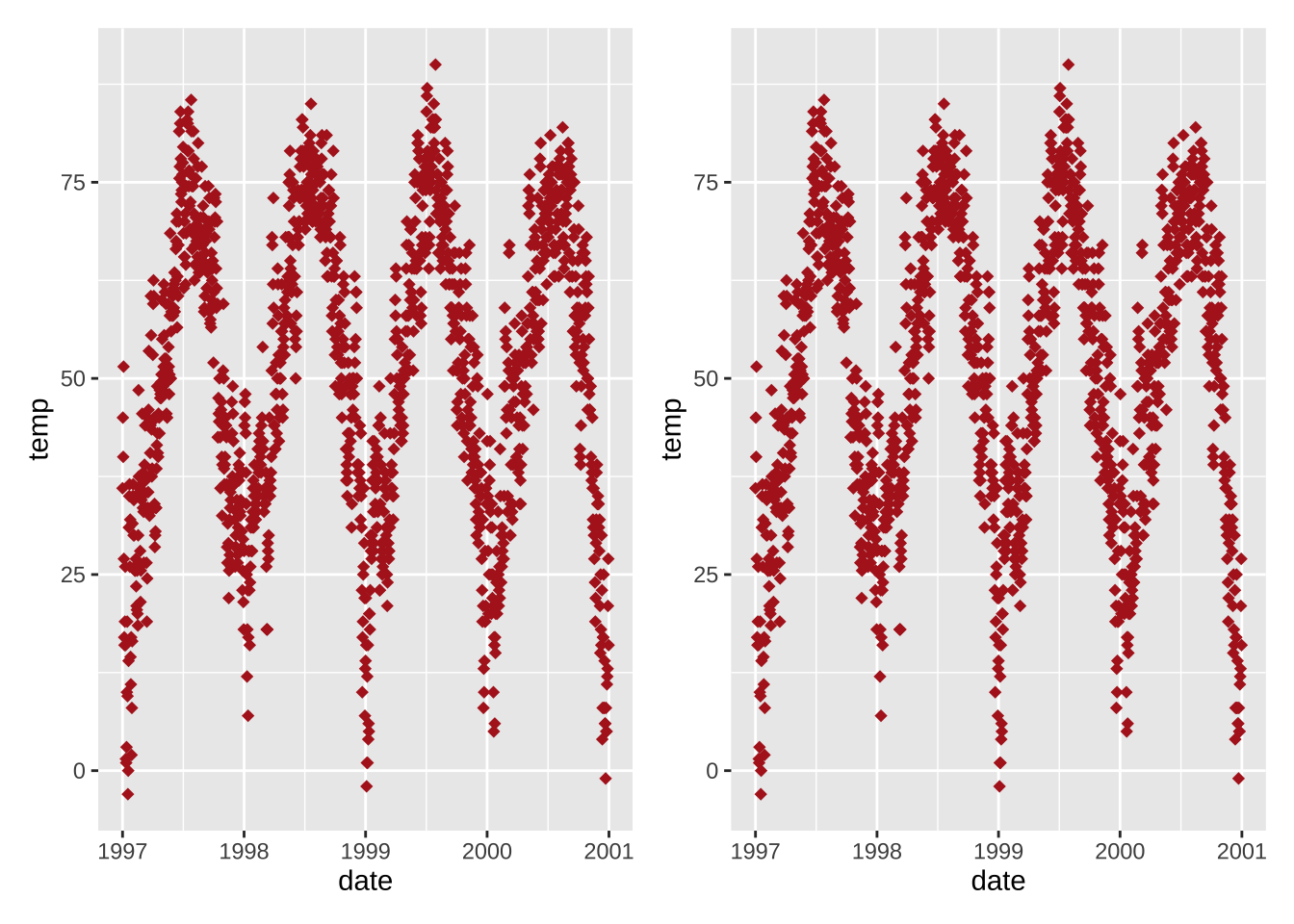
Each geom comes with its own properties (called arguments) and the same argument may result in a different change depending on the geom you are using.
g + geom_point(color = "firebrick", shape = "diamond", size = 2) +
    geom_line(color = "firebrick", linetype = "dotted", lwd = .3)
Replace the default ggplot2 theme
And to illustrate some more of ggplot’s versatility, let’s get rid of the grayish default {ggplot2} look by setting a different built-in theme, e.g. theme_bw()—by calling theme_set() all following plots will have the same black’n’white theme.
The red points look way better now!
theme_set(theme_bw())

g + geom_point(color = "firebrick")
You can find more on how to use built-in themes and how to customize themes in the section “Working with Themes”.
From the next chapter on, we will also use the theme() function to customize particular elements of the theme.
💡 theme() is an essential command to manually modify all kinds of theme elements (texts, rectangles, and lines).
To see which details of a ggplot theme can be modified have a look here—and take some time, this is a looong list.
Working with Axes
Change Axis Titles
Let’s add some well-written labels to the axes.
For this, we add labs() providing a character string for each label we want to change (here x and y):
ggplot(chic, aes(x = date, y = temp)) +
  geom_point(color = "firebrick") +
  labs(x = "Year", y = "Temperature (°F)")
💁 You can also add each axis title via xlab() and ylab().
Expand to see example.
ggplot(chic, aes(x = date, y = temp)) +
  geom_point(color = "firebrick") +
  xlab("Year") +
  ylab("Temperature (°F)")
Usually you can also specify symbols by simply adding the symbol itself (here “°”) but the code below also allows to add not only symbols but e.g. superscripts:
ggplot(chic, aes(x = date, y = temp)) +
  geom_point(color = "firebrick") +
  labs(x = "Year", y = expression(paste("Temperature (", degree ~ F, ")"^"(Hey, why should we use metric units?!)")))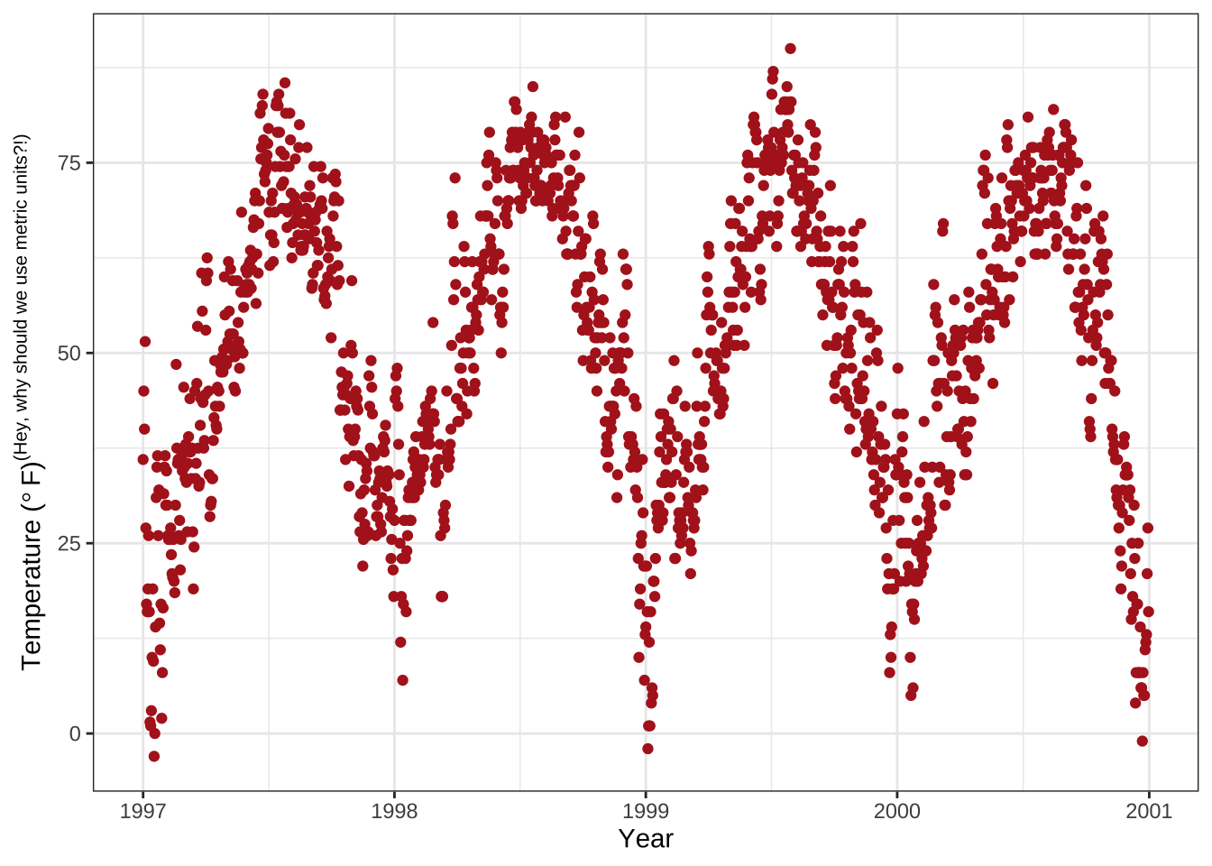
Increase Space between Axis and Axis Titles
theme() is an essential command to modify particular theme elements (texts and titles, boxes, symbols, backgrounds, …).
We are going to use them a lot!
For now, we are going to modify text elements.
We can change the properties of all or particular text elements (here axis titles) by overwriting the default element_text() within the theme() call:
ggplot(chic, aes(x = date, y = temp)) +
  geom_point(color = "firebrick") +
  labs(x = "Year", y = "Temperature (°F)") +
  theme(axis.title.x = element_text(vjust = 0, size = 15),
        axis.title.y = element_text(vjust = 2, size = 15))
vjust refers to the vertical alignment, which usually ranges between 0 and 1 but you can also specify values outside that range.
Note that even though we move the axis title on the y axis horizontally, we need to specify vjust (which is correct from theperspective of the label).
You can also change the distance by specifying the margin of both text elements:
ggplot(chic, aes(x = date, y = temp)) +
  geom_point(color = "firebrick") +
  labs(x = "Year", y = "Temperature (°F)") +
  theme(axis.title.x = element_text(margin = margin(t = 10), size = 15),
        axis.title.y = element_text(margin = margin(r = 10), size = 15))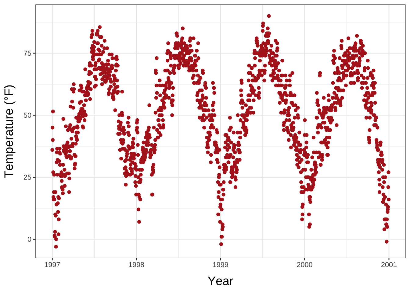
The labels t and r within the margin() object refer to top and right, respectively.
You can also specify the four margins as margin(t, r, b, l).
Note that we now have to change the right margin to modify the space on the y axis, not the bottom margin.
💡 A good way to remember the order of the margin sides is “t-r-ou-b-l-e”.
Change Aesthetics of Axis Titles
Again, we use the theme() function and modify the element axis.title and/or the subordinated elements axis.title.x and axis.title.y.
Within the element_text() we can for example overwrite the defaults for size, color, and face:
ggplot(chic, aes(x = date, y = temp)) +
  geom_point(color = "firebrick") +
  labs(x = "Year", y = "Temperature (°F)") +
  theme(axis.title = element_text(size = 15, color = "firebrick",
                                  face = "italic"))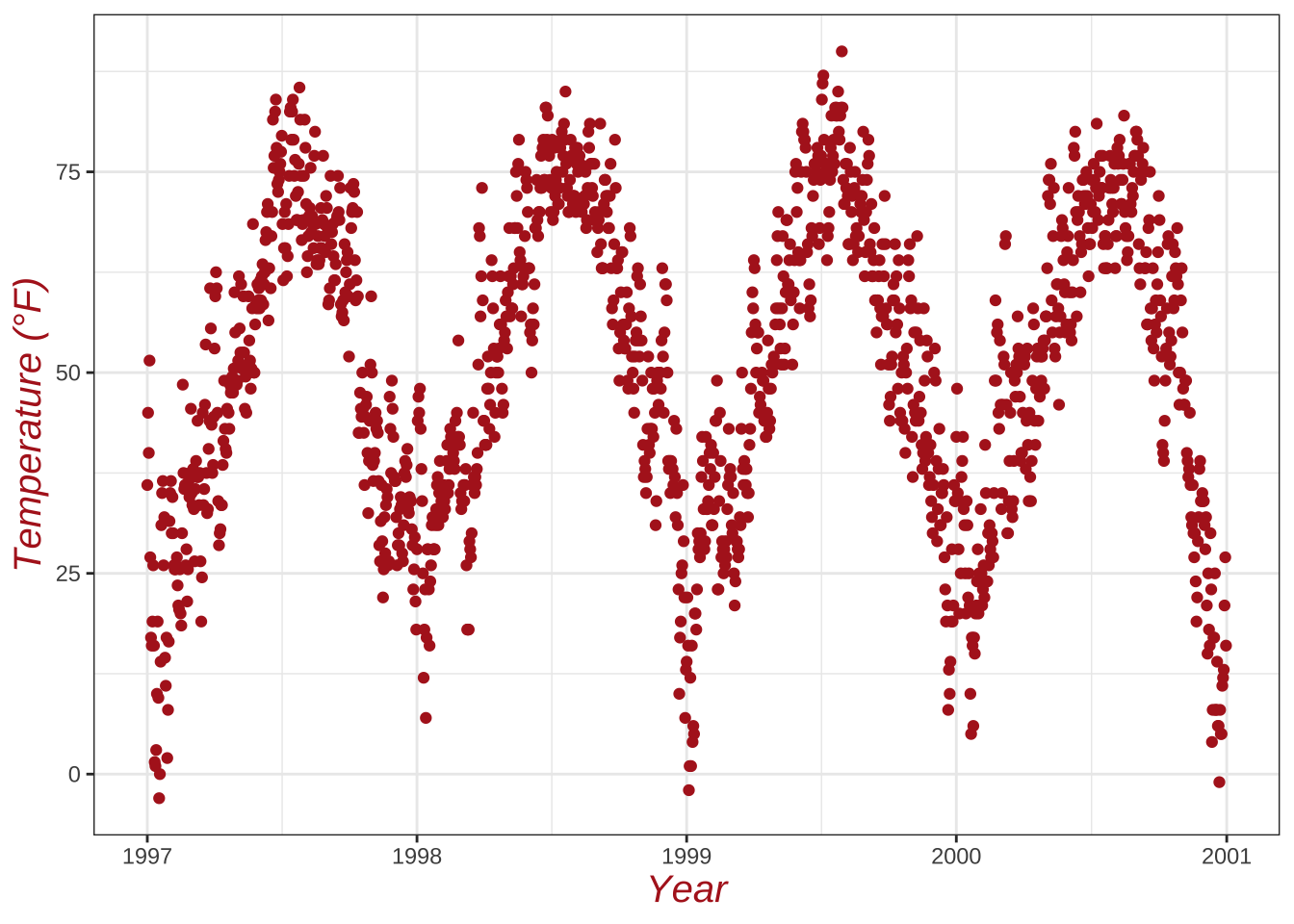
The face argument can be used to make the font bold or italic or even bold.italic.
ggplot(chic, aes(x = date, y = temp)) +
  geom_point(color = "firebrick") +
  labs(x = "Year", y = "Temperature (°F)") +
  theme(axis.title.x = element_text(color = "sienna", size = 15),
        axis.title.y = element_text(color = "orangered", size = 15))
💁 You could also use a combination of axis.title and axis.title.y, since axis.title.x inherits the values from axis.title.
Expand to see example.
ggplot(chic, aes(x = date, y = temp)) +
  geom_point(color = "firebrick") +
  labs(x = "Year", y = "Temperature (°F)") +
  theme(axis.title = element_text(color = "sienna", size = 15),
        axis.title.y = element_text(color = "orangered", size = 15))
One can modify some properties for both axis titles and other only for one or properties for each on its own:
ggplot(chic, aes(x = date, y = temp)) +
  geom_point(color = "firebrick") +
  labs(x = "Year", y = "Temperature (°F)") +
  theme(axis.title = element_text(color = "sienna", size = 15, face = "bold"),
        axis.title.y = element_text(face = "bold.italic"))
Change Aesthetics of Axis Text
Similarly, you can also change the appearance of the axis text (here the numbers) by using axis.text and/or the subordinated elements axis.text.x and axis.text.y:
ggplot(chic, aes(x = date, y = temp)) +
  geom_point(color = "firebrick") +
  labs(x = "Year", y = "Temperature (°F)") +
  theme(axis.text = element_text(color = "dodgerblue", size = 12),
        axis.text.x = element_text(face = "italic"))
Rotate Axis Text
Specifying an angle allows you to rotate any text elements.
With hjust and vjust you can adjust the position of the text afterwards horizontally (0 = left, 1 = right) and vertically (0 = top, 1 = bottom):
ggplot(chic, aes(x = date, y = temp)) +
  geom_point(color = "firebrick") +
  labs(x = "Year", y = "Temperature (°F)") +
  theme(axis.text.x = element_text(angle = 50, vjust = 1, hjust = 1, size = 12))
Remove Axis Text & Ticks
There may be rarely a reason to do so—but this is how it works:
ggplot(chic, aes(x = date, y = temp)) +
  geom_point(color = "firebrick") +
  labs(x = "Year", y = "Temperature (°F)") +
  theme(axis.ticks.y = element_blank(),
        axis.text.y = element_blank())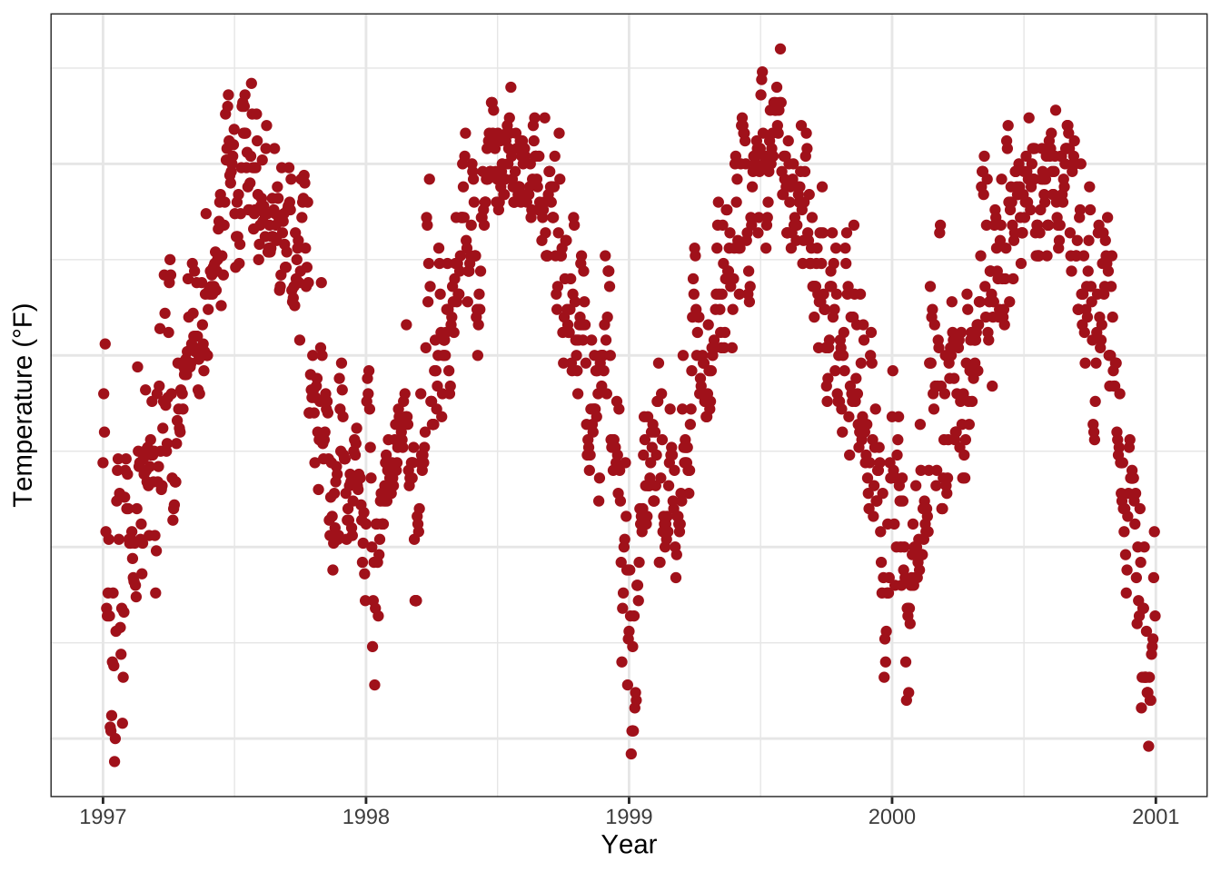
I introduced three theme elements—text, lines, and rectangles—but actually there is one more: element_blank() which removes the element (and thus is not considered an official element).
💡 If you want to get rid of a theme element, the element is always element_blank().
Remove Axis Titles
We could again use theme_blank() but it is way simpler to just remove the label in the labs() (or xlab()) call:
ggplot(chic, aes(x = date, y = temp)) +
  geom_point(color = "firebrick") +
  labs(x = NULL, y = "")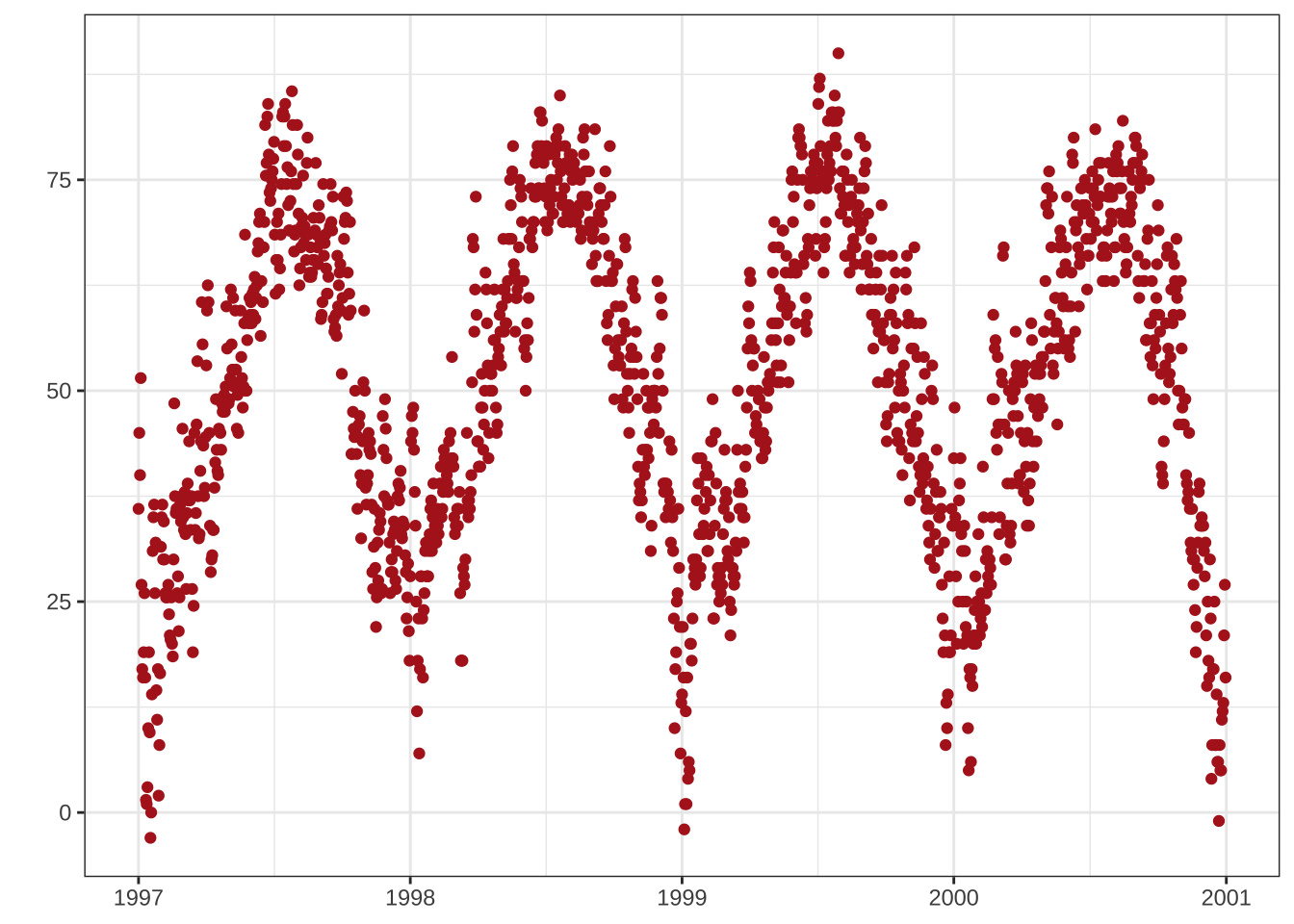
💡 Note that NULL removes the element (similarly to element_blank()) while empty quotes "" will keep the spacing for the axis title and simply print nothing.
Limit Axis Range
Sometimes you want to zoom into take a closer look at some range of your data.
You can do this without subsetting your data:
ggplot(chic, aes(x = date, y = temp)) +
  geom_point(color = "firebrick") +
  labs(x = "Year", y = "Temperature (°F)") +
  ylim(c(0, 50))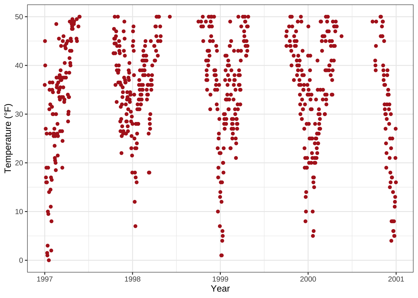
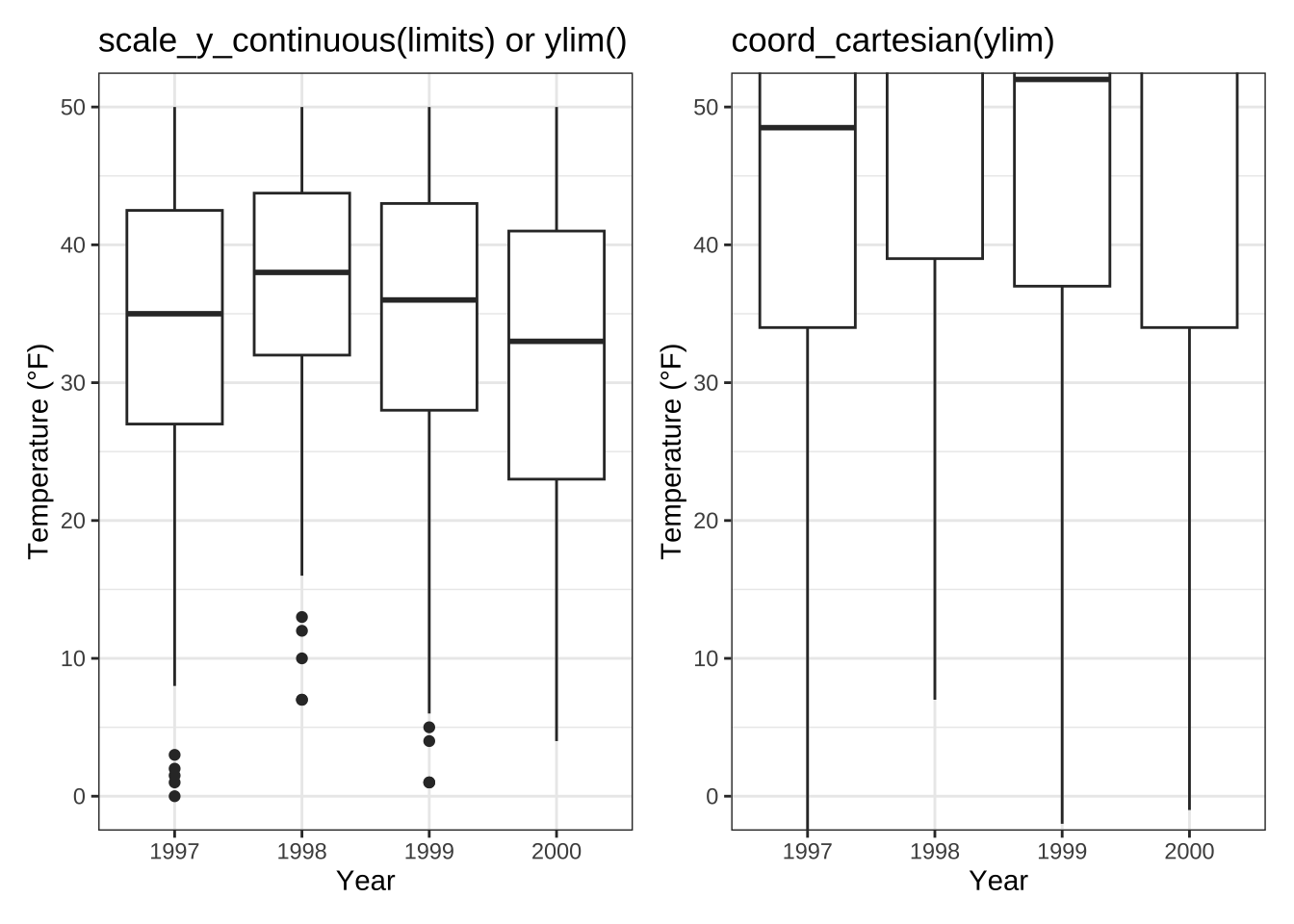
Alternatively you can use scale_y_continuous(limits = c(0, 50)) or coord_cartesian(ylim = c(0, 50)).
The former removes all data points outside the range while the second adjusts the visible area and is similar to ylim(c(0, 50)).
You may wonder: So in the end both result in the same. But not really, there is an important difference—compare the two following plots:
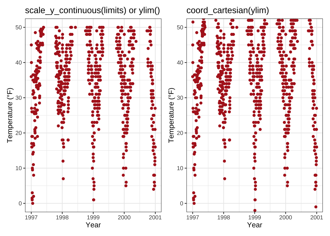
You might have spotted that on the left there is some empty buffer around your y limits while on the right points are plotted right up to the border and even beyond. This perfectly illustrates the subsetting (left) versus the zooming (right). To show why this is important let’s have a look at a different chart type, a box plot:
Um.
Because scale_x|y_continuous() subsets the data first, we get completely different (and wrong, at least if in the case this was not your aim) estimates for the box plots!
I hope you don’t have to go back to your old scripts now and check if you maybe have manipulated your data while plotting and did report wrong summary stats in your report, paper or thesis…
Force Plot to Start at Origin
Related to that, you can force R to plot the graph starting at the origin:
chic_high <- dplyr::filter(chic, temp > 25, o3 > 20)

ggplot(chic_high, aes(x = temp, y = o3)) +
  geom_point(color = "darkcyan") +
  labs(x = "Temperature higher than 25°F",
       y = "Ozone higher than 20 ppb") +
  expand_limits(x = 0, y = 0)
💁 Using coord_cartesian(xlim = c(0, NA), ylim = c(0, NA)) will lead to the same result.
Expand to see example.
chic_high <- dplyr::filter(chic, temp > 25, o3 > 20)

ggplot(chic_high, aes(x = temp, y = o3)) +
  geom_point(color = "darkcyan") +
  labs(x = "Temperature higher than 25°F",
       y = "Ozone higher than 20 ppb") +
  coord_cartesian(xlim = c(0, NA), ylim = c(0, NA))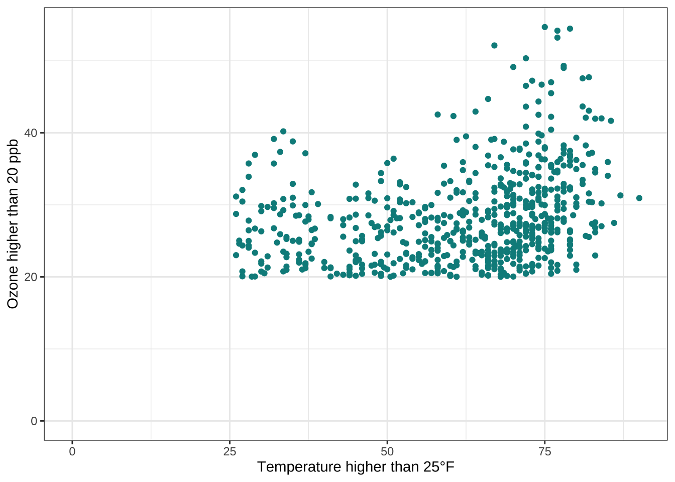
But we can also force it to literally start at the origin!
ggplot(chic_high, aes(x = temp, y = o3)) +
  geom_point(color = "darkcyan") +
  labs(x = "Temperature higher than 25°F",
       y = "Ozone higher than 20 ppb") +
  expand_limits(x = 0, y = 0) +
  coord_cartesian(expand = FALSE, clip = "off")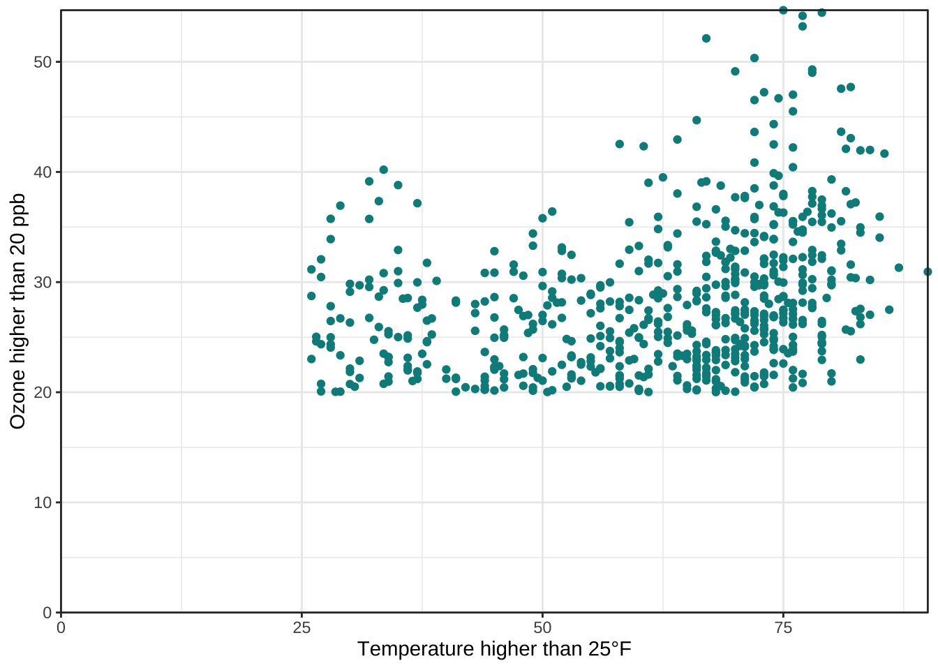
💡 The argument clip = "off" in any coordinate system, always starting with coord_*, allows to draw outside of the panel area.
Here, I call it to make sure that the tick marks at c(0, 0) are not cut.
See the Twitter thread by Claus Wilke for more details.
Axes with Same Scaling
For demonstrating purposes, let’s plot temperature against temperature with some random noise.
The coord_equal() is a coordinate system with a specified ratio representing the number of units on the y-axis equivalent to one unit on the x-axis.
The default, ratio = 1, ensures that one unit on the x-axis is the same length as one unit on the y-axis:
ggplot(chic, aes(x = temp, y = temp + rnorm(nrow(chic), sd = 20))) +
  geom_point(color = "sienna") +
  labs(x = "Temperature (°F)", y = "Temperature (°F) + random noise") +
  xlim(c(0, 100)) + ylim(c(0, 150)) +
  coord_fixed()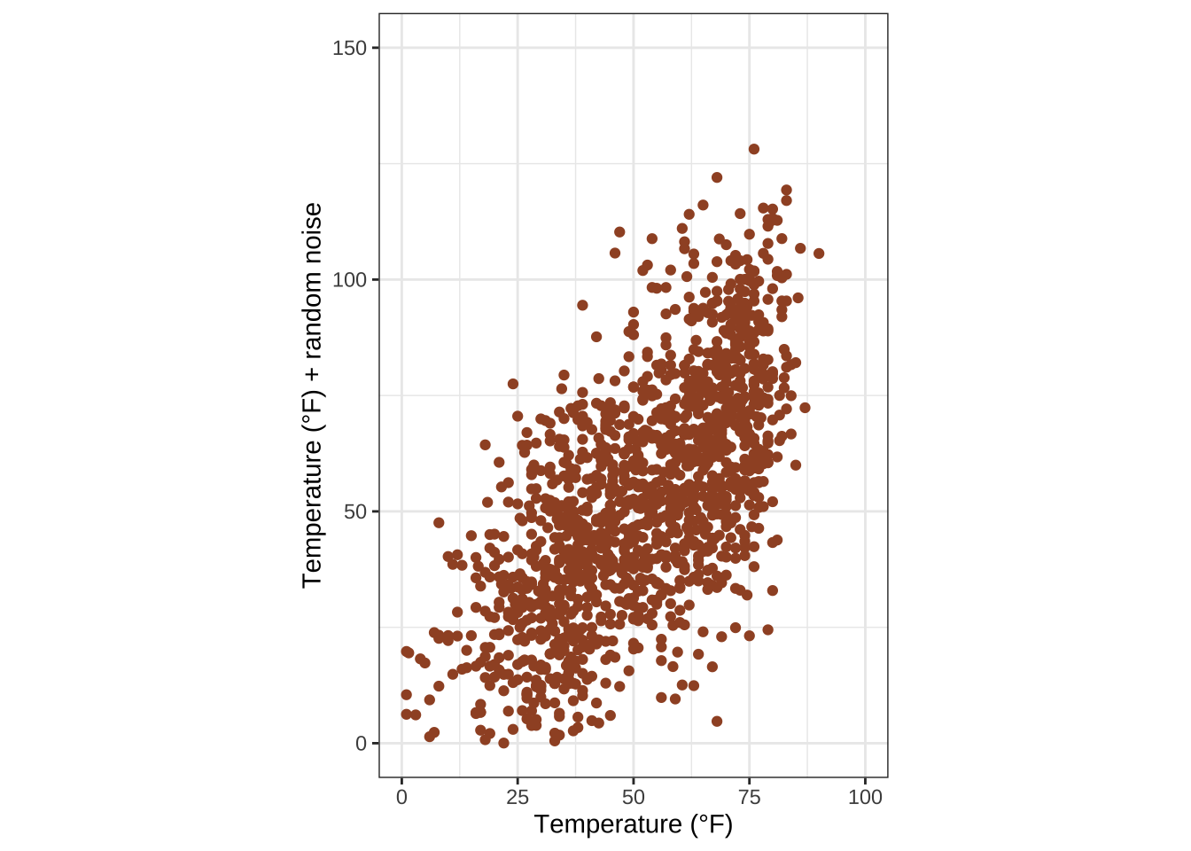
Ratios higher than one make units on the y axis longer than units on the x-axis, and vice versa:
ggplot(chic, aes(x = temp, y = temp + rnorm(nrow(chic), sd = 20))) +
  geom_point(color = "sienna") +
  labs(x = "Temperature (°F)", y = "Temperature (°F) + random noise") +
  xlim(c(0, 100)) + ylim(c(0, 150)) +
  coord_fixed(ratio = 1/5)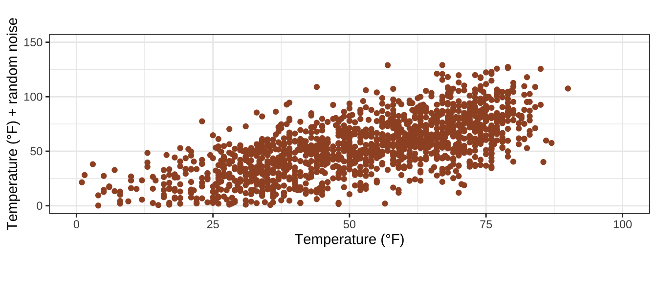
Use a Function to Alter Labels
Sometimes it is handy to alter your labels a little, perhaps adding units or percent signs without adding them to your data. You can use a function in this case:
ggplot(chic, aes(x = date, y = temp)) +
  geom_point(color = "firebrick") +
  labs(x = "Year", y = NULL) +
  scale_y_continuous(label = function(x) {return(paste(x, "Degrees Fahrenheit"))})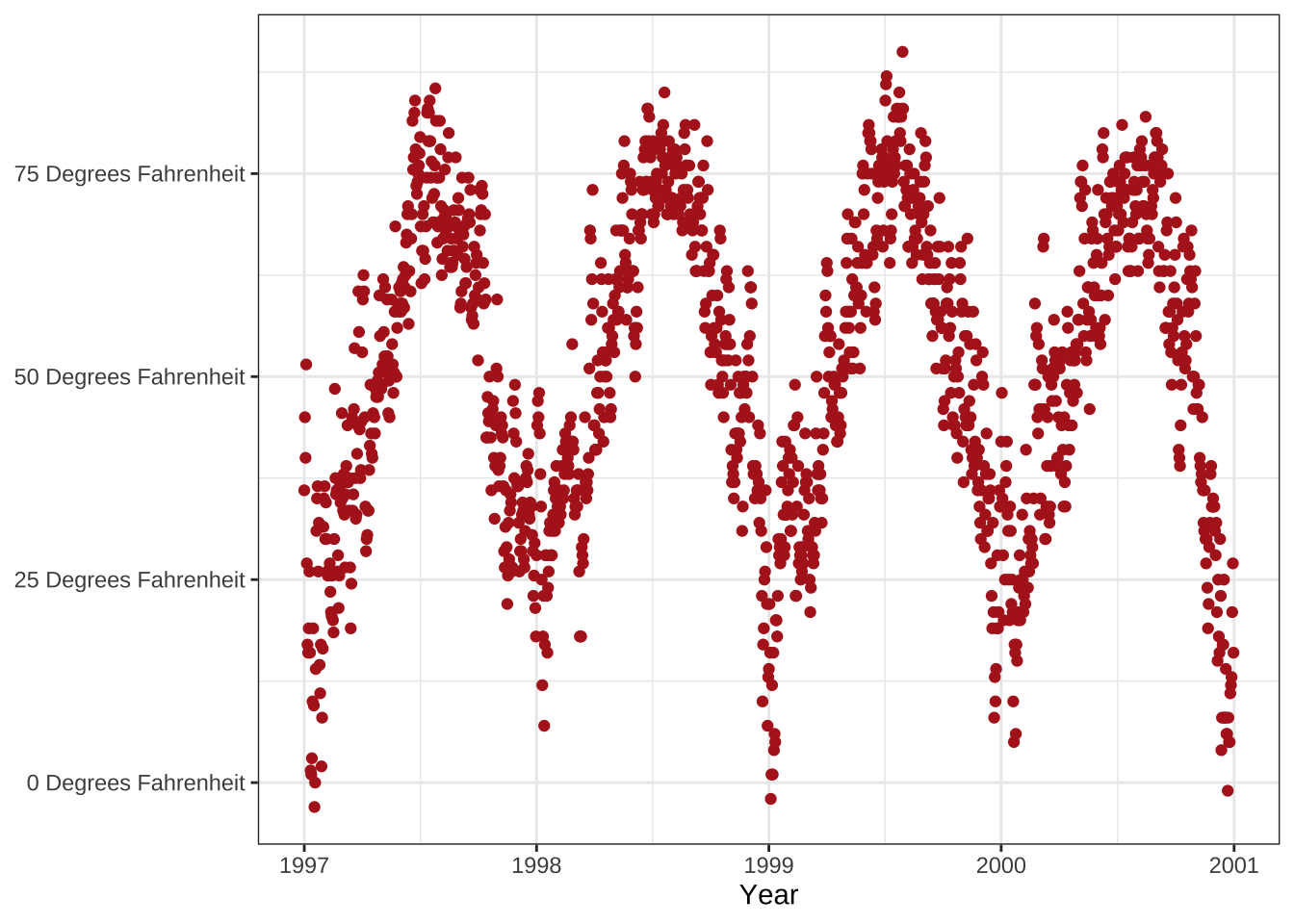
Working with Titles
Add a Title
We can add a title via the ggtitle() function:
ggplot(chic, aes(x = date, y = temp)) +
  geom_point(color = "firebrick") +
  labs(x = "Year", y = "Temperature (°F)") +
  ggtitle("Temperatures in Chicago")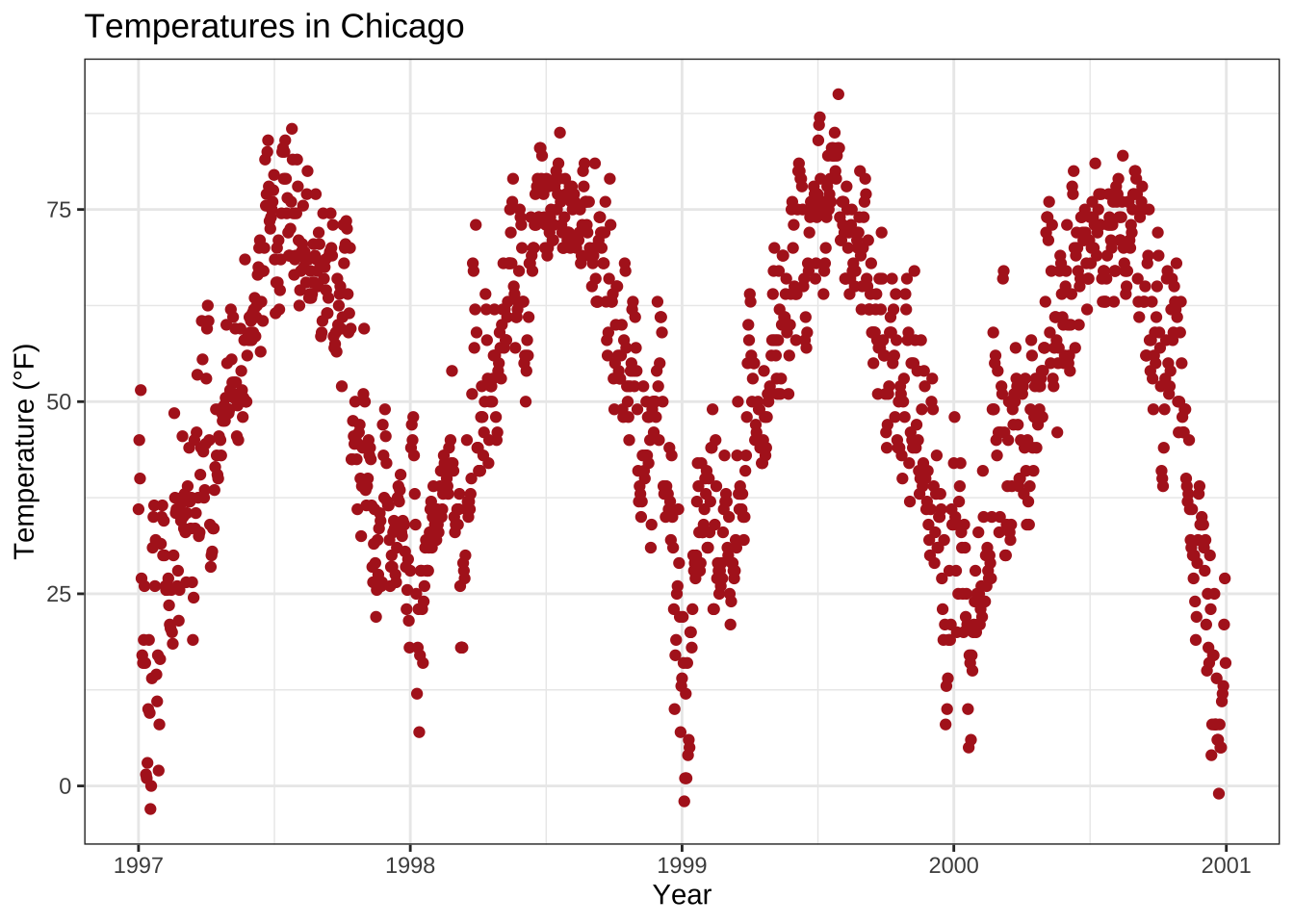
Alternatively, you can use labs().
Here you can add several arguments, e.g. additionally a subtitle, a caption and a tag (as well as axis titles as shown before):
ggplot(chic, aes(x = date, y = temp)) +
  geom_point(color = "firebrick") +
  labs(x = "Year", y = "Temperature (°F)",
       title = "Temperatures in Chicago",
       subtitle = "Seasonal pattern of daily temperatures from 1997 to 2001",
       caption = "Data: NMMAPS",
       tag = "Fig. 1")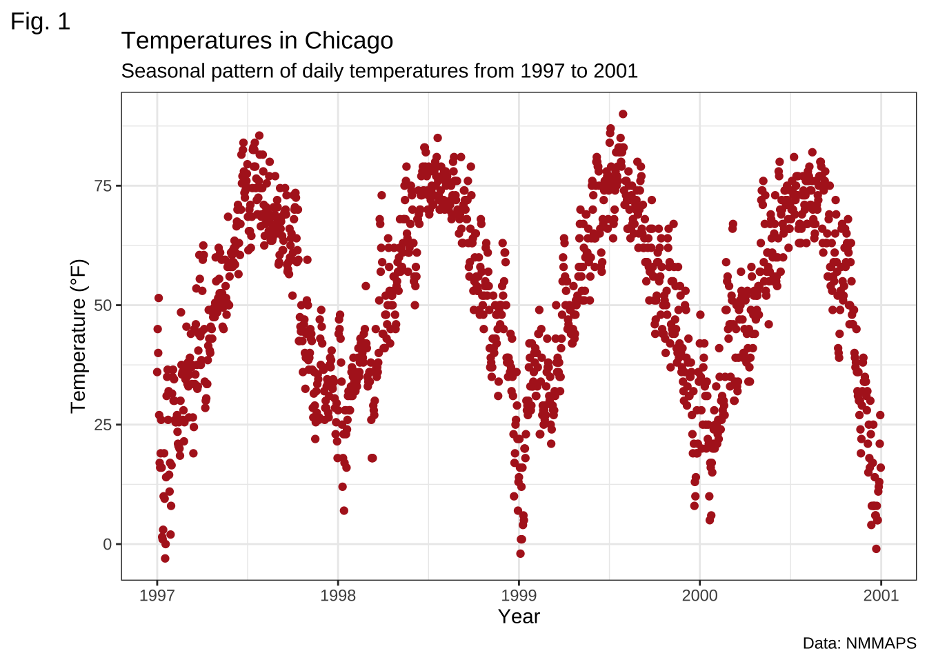
Make Title Bold & Add a Space at the Baseline
Again, since we want to modify the properties of a theme element, we use the theme() function and as for the text elements axis.title and axis.text modify the font face and the margin.
All the following modifications of theme elements work not only for the title but for all other labels such as plot.subtitle, plot.caption, plot.tag, legend.title, legend.text, and axis.title and axis.text.
ggplot(chic, aes(x = date, y = temp)) +
  geom_point(color = "firebrick") +
  labs(x = "Year", y = "Temperature (°F)",
       title = "Temperatures in Chicago") +
  theme(plot.title = element_text(face = "bold",
                                  margin = margin(10, 0, 10, 0),
                                  size = 14))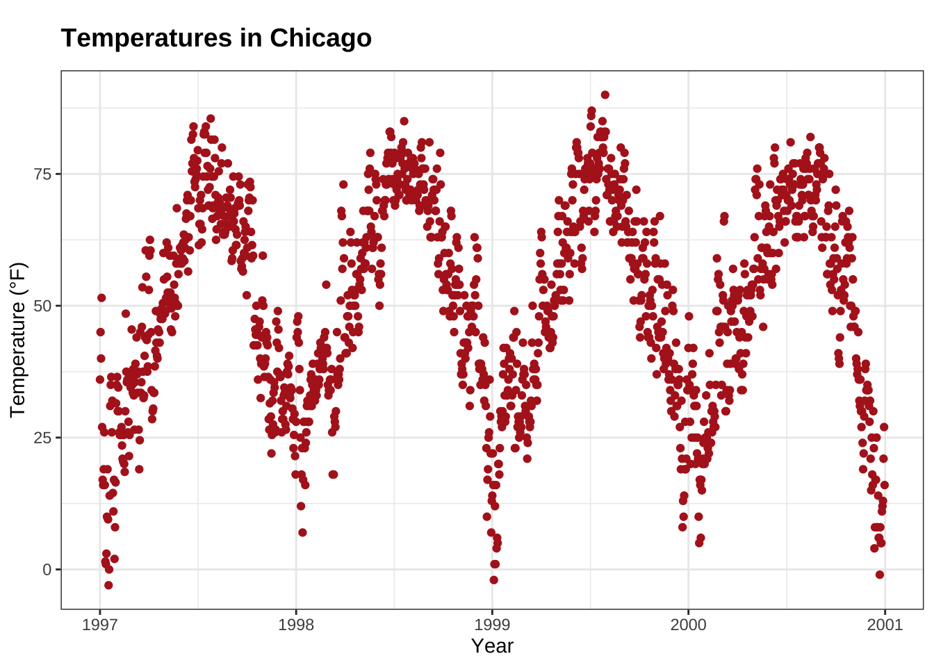
💡 A nice way to remember the order of the margin arguments is “t-r-oub-l-e” that resembles the first letter of the four sides.
Adjust Position of Titles
The general alignment (left, center, right) is controlled by hjust (which stands for horizontal adjustment):
ggplot(chic, aes(x = date, y = temp)) +
  geom_point(color = "firebrick") +
  labs(x = "Year", y = NULL,
       title = "Temperatures in Chicago",
       caption = "Data: NMMAPS") +
  theme(plot.title = element_text(hjust = 1, size = 16, face = "bold.italic"))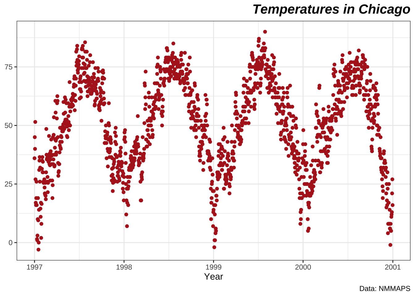
Of course, there it is also possible to adjust the vertical alignment, controlled by vjust.
Since 2019, the user is able to specify the alignment of the title, subtitle, and caption either based on the panel area (the default) or the plot margin via plot.title.position and plot.caption.position.
The later is actually the better choice designwise in most cases and many people were very happy about that new feature since especially with very long y axis labels the alignment looks awful:
(g <- ggplot(chic, aes(x = date, y = temp)) +
  geom_point(color = "firebrick") +
  scale_y_continuous(label = function(x) {return(paste(x, "Degrees Fahrenheit"))}) +
  labs(x = "Year", y = NULL,
       title = "Temperatures in Chicago between 1997 and 2001 in Degrees Fahrenheit",
       caption = "Data: NMMAPS") +
  theme(plot.title = element_text(size = 14, face = "bold.italic"),
        plot.caption = element_text(hjust = 0)))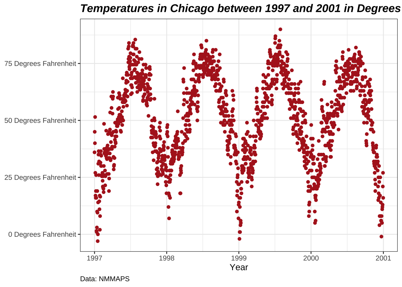
g + theme(plot.title.position = "plot",
          plot.caption.position = "plot")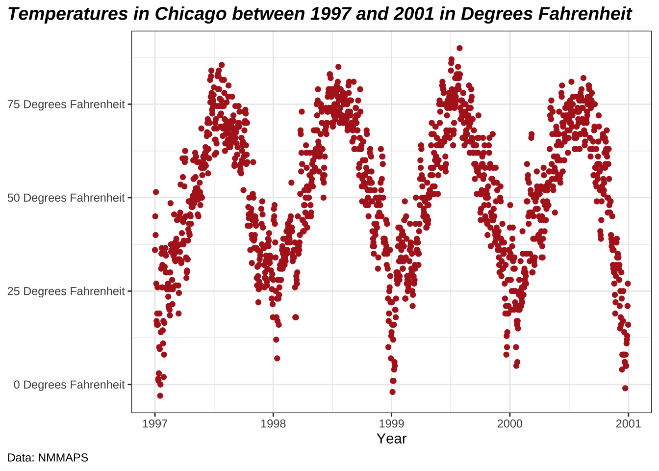
Use a Non-Traditional Font in Your Title
You can also use different fonts not only the default one provided by ggplot (and which differs between operating systems).
There are several packages that help you to use fonts which are installed on your machine (and you may be using in your office program).
Here, I use the showtext package that makes it easy to use various types of fonts (TrueType, OpenType, Type 1, web fonts, etc.) in R plots.
After we have loaded the package, you need to import the font that has to be installed on your device as well.
I regularly use Google fonts that can be imported with the function font_add_google() but you can also add other fonts with font_add().
(Note that even in case of using Google fonts you must install the font—and restart Rstudio—to use the font.)
library(showtext)
font_add_google("Playfair Display", ## name of Google font
                "Playfair")  ## name that will be used in R
font_add_google("Bangers", "Bangers")
Now, we can use those font families using—yeah, you guessed right—theme():
ggplot(chic, aes(x = date, y = temp)) +
  geom_point(color = "firebrick") +
  labs(x = "Year", y = "Temperature (°F)",
       title = "Temperatures in Chicago",
       subtitle = "Daily temperatures in °F from 1997 to 2001") +
  theme(plot.title = element_text(family = "Bangers", hjust = .5, size = 25),
        plot.subtitle = element_text(family = "Playfair", hjust = .5, size = 15))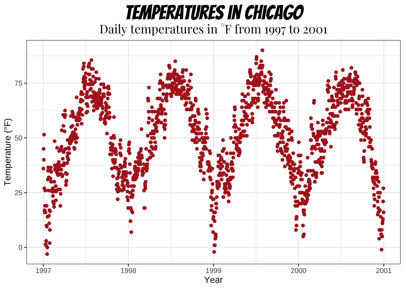
You can also set a non-default font for all text elements of your plots, for more details see section “Working with Themes”. I am going to use Roboto Condensed as the new font for all following plots.
font_add_google("Roboto Condensed", "Roboto Condensed")
theme_set(theme_bw(base_size = 12, base_family = "Roboto Condensed"))
(Previously, this tutorial used the {extrafont} package, which did a great job until last year. All of the sudden I couldn’t add any new fonts anymore and after getting a new laptop, the package did not find any fonts at all… I usually suggest the {ragg} package now. However, I did not succeed to make it work for my homepage so I use the {showtext} package which is great as well with the only main difference that you need to import the font you want to use explicitly with {showtext}. However, it seems there are some technical details that are not solved optimally by {showtext} so you may want to use the package as a very last resort.)
Change Spacing in Multi-Line Text
You can use the lineheight argument to change the spacing between lines.
In this example, I have squished the lines together (lineheight < 1).
ggplot(chic, aes(x = date, y = temp)) +
  geom_point(color = "firebrick") +
  labs(x = "Year", y = "Temperature (°F)") +
  ggtitle("Temperatures in Chicago\nfrom 1997 to 2001") +
  theme(plot.title = element_text(lineheight = .8, size = 16))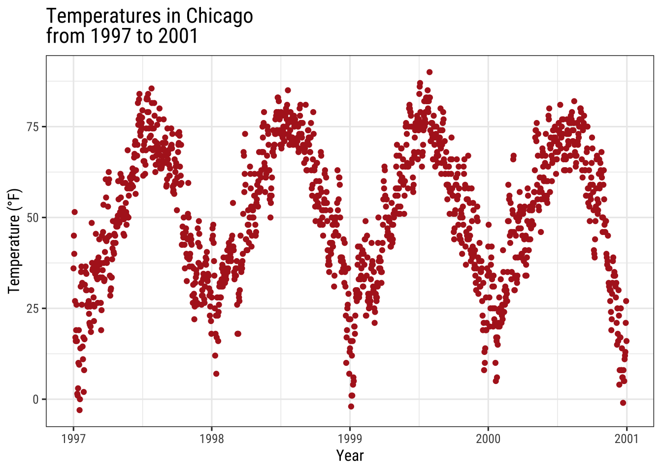
Working with Legends
We will color code the plot based on season.
Or to phrase it in a more ggplot’ish way: we map the variable season to the aesthetic color.
One nice thing about {ggplot2} is that it adds a legend by default when mapping a variable to an aesthetic.
You can see that by default the legend title is what we specified in the color argument:
ggplot(chic,
       aes(x = date, y = temp, color = season)) +
  geom_point() +
  labs(x = "Year", y = "Temperature (°F)")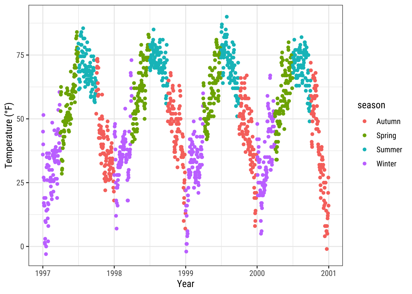
Turn Off the Legend
Always one of the first question is: “How can I get rid of the legend?”.
It is quite easy and always works with theme(legend.position = "none"):
ggplot(chic,
       aes(x = date, y = temp, color = season)) +
  geom_point() +
  labs(x = "Year", y = "Temperature (°F)") +
  theme(legend.position = "none")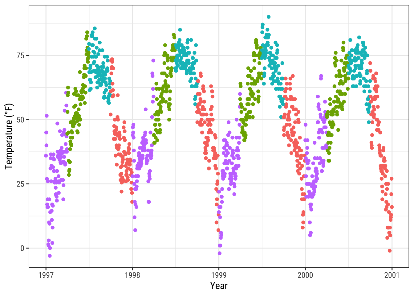
You can also use guides(color = "none") or scale_color_discrete(guide = "none") depending on the specific case.
While the change of the theme element removes all legends at once, you can remove particular legends with the latter options while keeping some others:
ggplot(chic,
       aes(x = date, y = temp,
           color = season, shape = season)) +
  geom_point() +
  labs(x = "Year", y = "Temperature (°F)") +
  guides(color = "none")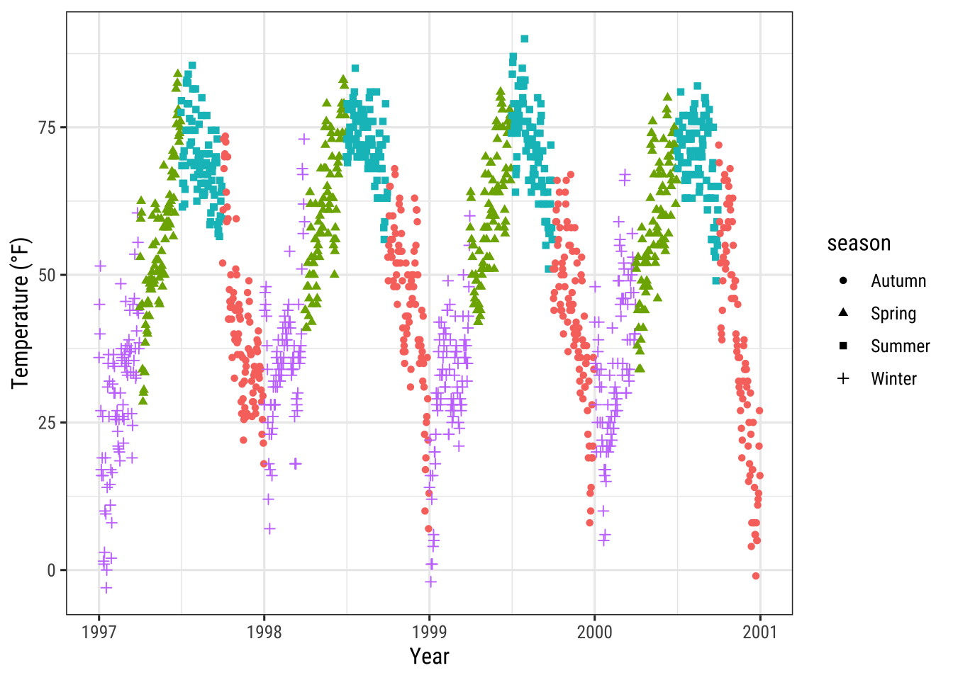
Here, for example, we keep the legend for the shapes while discarding the one for the colors.
Remove Legend Titles
As we already learned, use element_blank() to draw nothing:
ggplot(chic, aes(x = date, y = temp, color = season)) +
  geom_point() +
  labs(x = "Year", y = "Temperature (°F)") +
  theme(legend.title = element_blank())
💁 You can achieve the same by setting the legend name to NULL, either via scale_color_discrete(name = NULL) or labs(color = NULL).
Expand to see examples.
ggplot(chic, aes(x = date, y = temp, color = season)) +
  geom_point() +
  labs(x = "Year", y = "Temperature (°F)") +
  scale_color_discrete(name = NULL)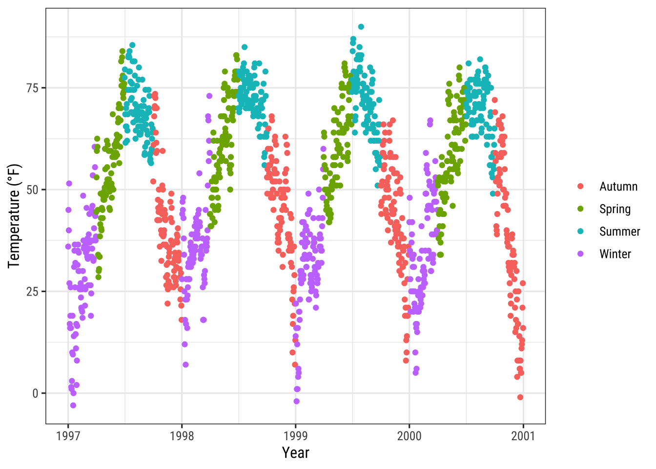
ggplot(chic, aes(x = date, y = temp, color = season)) +
  geom_point() +
  labs(x = "Year", y = "Temperature (°F)") +
  labs(color = NULL)
Change Legend Position
If you want to place the legend not on the right, one uses legend.position as argument in theme.
Possible positions are “top”, “right” (which is the default), “bottom”, and “left”.
ggplot(chic, aes(x = date, y = temp, color = season)) +
  geom_point() +
  labs(x = "Year", y = "Temperature (°F)") +
  theme(legend.position = "top")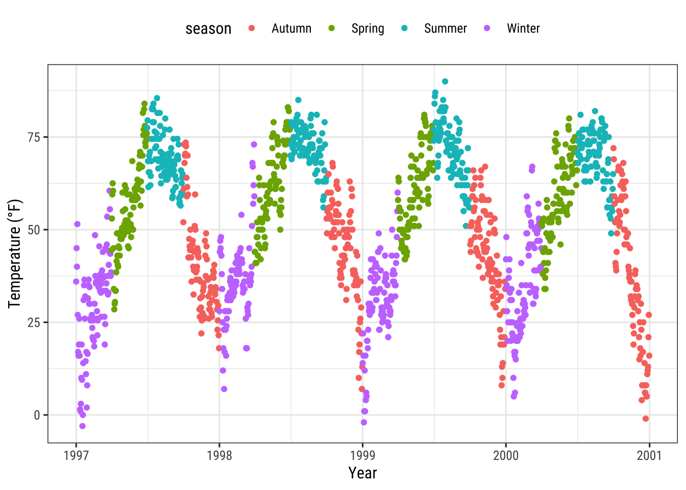
You can also place the legend inside the panel by specifying a vector with relative x and y coordinates ranging from 0 (left or bottom) to 1 (right or top):
ggplot(chic, aes(x = date, y = temp, color = season)) +
  geom_point() +
  labs(x = "Year", y = "Temperature (°F)",
       color = NULL) +
  theme(legend.position = c(.15, .15),
        legend.background = element_rect(fill = "transparent"))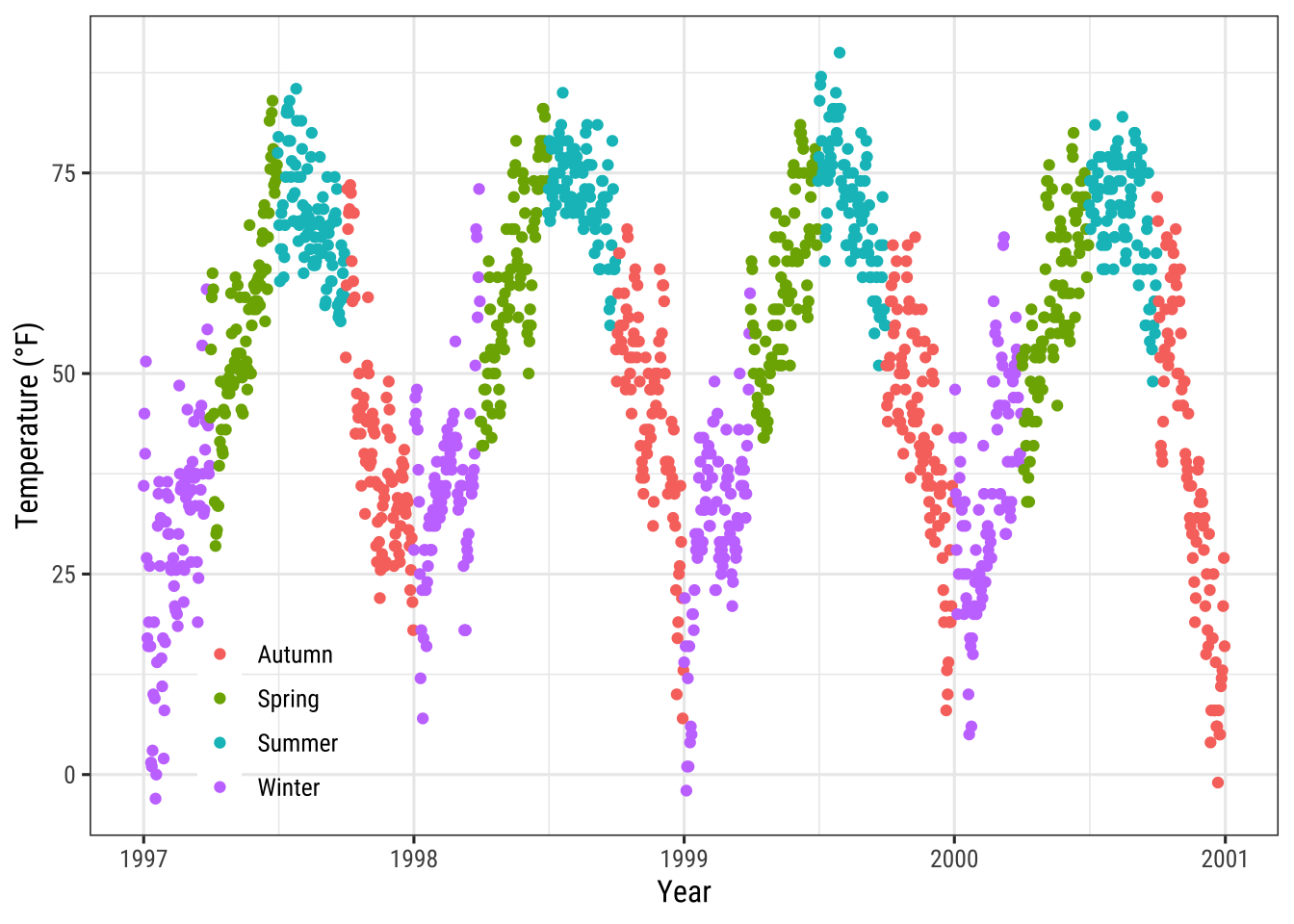
Here, I also overwrite the default white legend background with a transparent fill to make sure the legend does not hide any data points.
Change Legend Direction
As you have seen, the legend direction is by default vertical but horizontal when you choose either the “top” or “bottom” position. But you can also switch the direction as you like:
ggplot(chic, aes(x = date, y = temp, color = season)) +
  geom_point() +
  labs(x = "Year", y = "Temperature (°F)") +
  theme(legend.position = c(.5, .97),
        legend.background = element_rect(fill = "transparent")) +
  guides(color = guide_legend(direction = "horizontal"))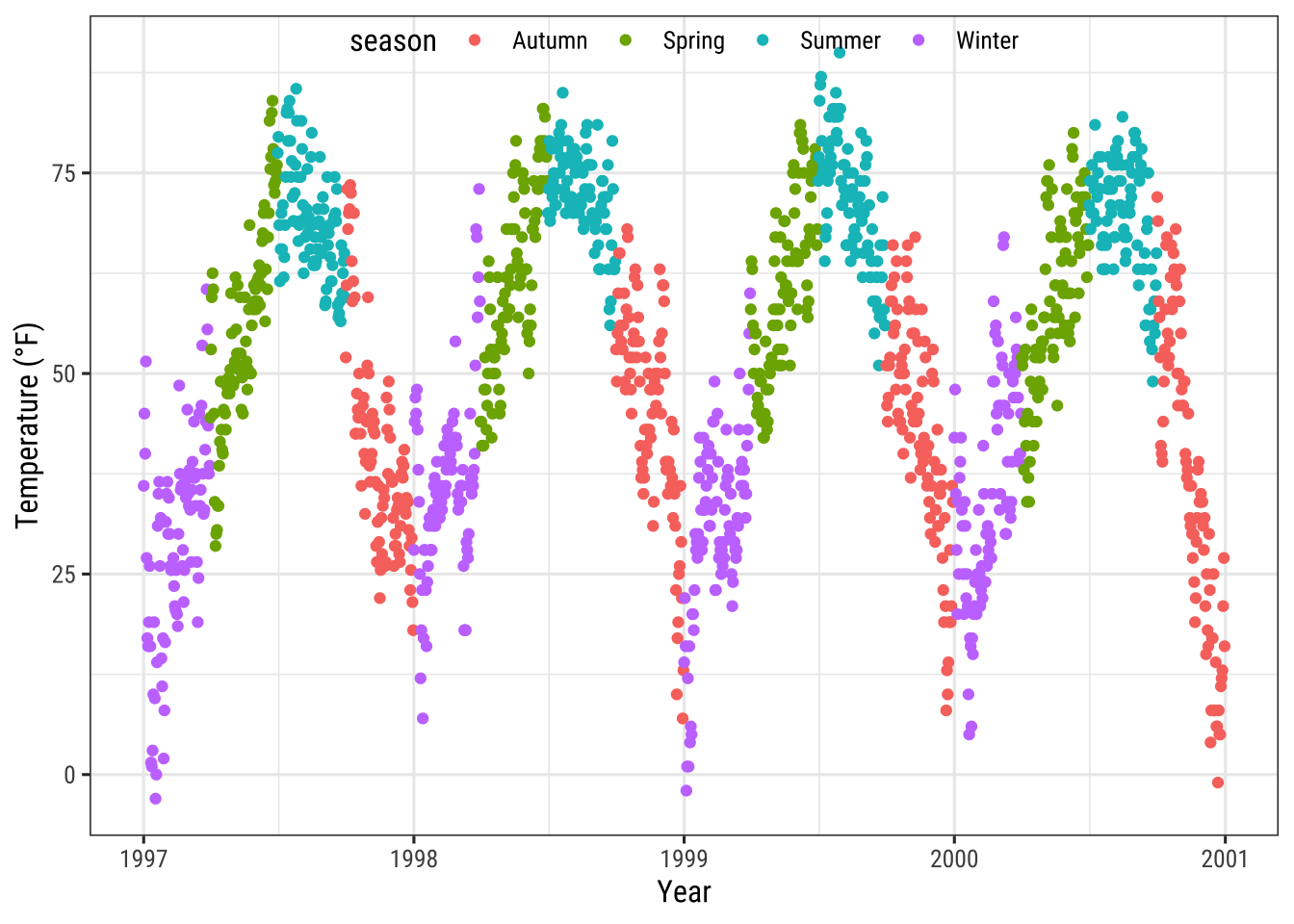
Change Style of the Legend Title
You can change the appearance of the legend title by adjusting the theme element legend.title:
ggplot(chic, aes(x = date, y = temp, color = season)) +
  geom_point() +
  labs(x = "Year", y = "Temperature (°F)") +
  theme(legend.title = element_text(family = "Playfair",
                                    color = "chocolate",
                                    size = 14, face = "bold"))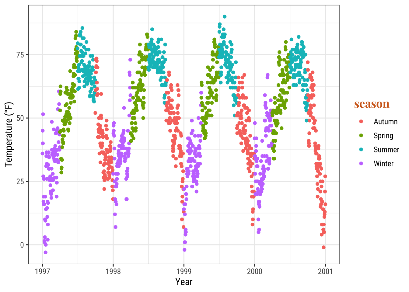
Change Legend Title
The easiest way to change the title of the legend is the labs() layer:
ggplot(chic, aes(x = date, y = temp, color = season)) +
  geom_point() +
  labs(x = "Year", y = "Temperature (°F)",
       color = "Seasons\nindicated\nby colors:") +
  theme(legend.title = element_text(family = "Playfair",
                                    color = "chocolate",
                                    size = 14, face = "bold"))
The legend details can be changed via scale_color_discrete(name = "title") or guides(color = guide_legend("title")):
ggplot(chic, aes(x = date, y = temp, color = season))) +
  geom_point() +
  labs(x = "Year", y = "Temperature (°F)") +
  theme(legend.title = element_text(family = "Playfair",
                                    color = "chocolate",
                                    size = 14, face = "bold")) +
  scale_color_discrete(name = "Seasons\nindicated\nby colors:")
Change Order of Legend Keys
We can achieve this by changing the levels of season:
chic$season <-
  factor(chic$season,
         levels = c("Winter", "Spring", "Summer", "Autumn"))

ggplot(chic, aes(x = date, y = temp, color = season)) +
  geom_point() +
  labs(x = "Year", y = "Temperature (°F)")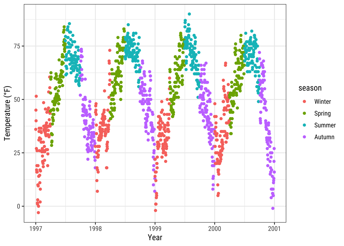
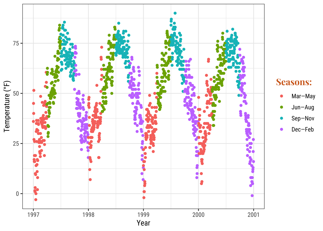
Change Legend Labels
We are going to replace the seasons by the months which they are covering by providing a vector of names in the scale_color_discrete() call:
ggplot(chic, aes(x = date, y = temp, color = season)) +
  geom_point() +
  labs(x = "Year", y = "Temperature (°F)") +
  scale_color_discrete(
    name = "Seasons:",
    labels = c("Mar—May", "Jun—Aug", "Sep—Nov", "Dec—Feb")
  ) +
  theme(legend.title = element_text(
    family = "Playfair", color = "chocolate", size = 14, face = 2
  ))
Change Background Boxes in the Legend
To change the background color (fill) of the legend keys, we adjust the setting for the theme element legend.key:
ggplot(chic, aes(x = date, y = temp, color = season)) +
  geom_point() +
  labs(x = "Year", y = "Temperature (°F)") +
  theme(legend.key = element_rect(fill = "darkgoldenrod1"),
        legend.title = element_text(family = "Playfair",
                                    color = "chocolate",
                                    size = 14, face = 2)) +
  scale_color_discrete("Seasons:")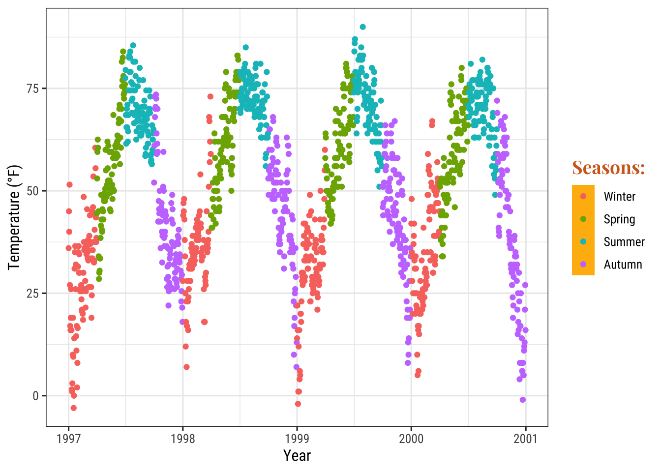
If you want to get rid of them entirely use fill = NA or fill = "transparent".
Change Size of Legend Symbols
Points in the legend can get a little lost with the default size, especially without the boxes.
To override the default one uses again the guides layer like this:
ggplot(chic, aes(x = date, y = temp, color = season)) +
  geom_point() +
  labs(x = "Year", y = "Temperature (°F)") +
  theme(legend.key = element_rect(fill = NA),
        legend.title = element_text(color = "chocolate",
                                    size = 14, face = 2)) +
  scale_color_discrete("Seasons:") +
  guides(color = guide_legend(override.aes = list(size = 6)))
Leave a Layer Off the Legend
Let’s say you have two different geoms mapped to the same variable. For example, color as an aesthetic for both a point layer and a rug layer of the same data. By default, both the points and the “line” end up in the legend like this:
ggplot(chic, aes(x = date, y = temp, color = season)) +
  geom_point() +
  labs(x = "Year", y = "Temperature (°F)") +
  geom_rug()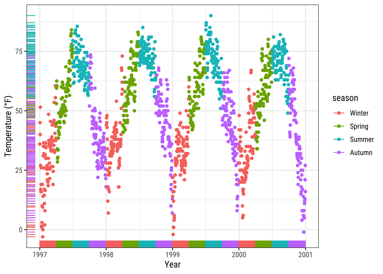
You can use show.legend = FALSE to turn off a layer in the legend:
ggplot(chic, aes(x = date, y = temp, color = season)) +
  geom_point() +
  labs(x = "Year", y = "Temperature (°F)") +
  geom_rug(show.legend = FALSE)
Manually Adding Legend Items
{ggplot2} will not add a legend automatically unless you map aesthetics (color, size etc.) to a variable.
There are times, though, that I want to have a legend so that it is clear what you are plotting.
Here is the default:
ggplot(chic, aes(x = date, y = o3)) +
  geom_line(color = "gray") +
  geom_point(color = "darkorange2") +
  labs(x = "Year", y = "Ozone")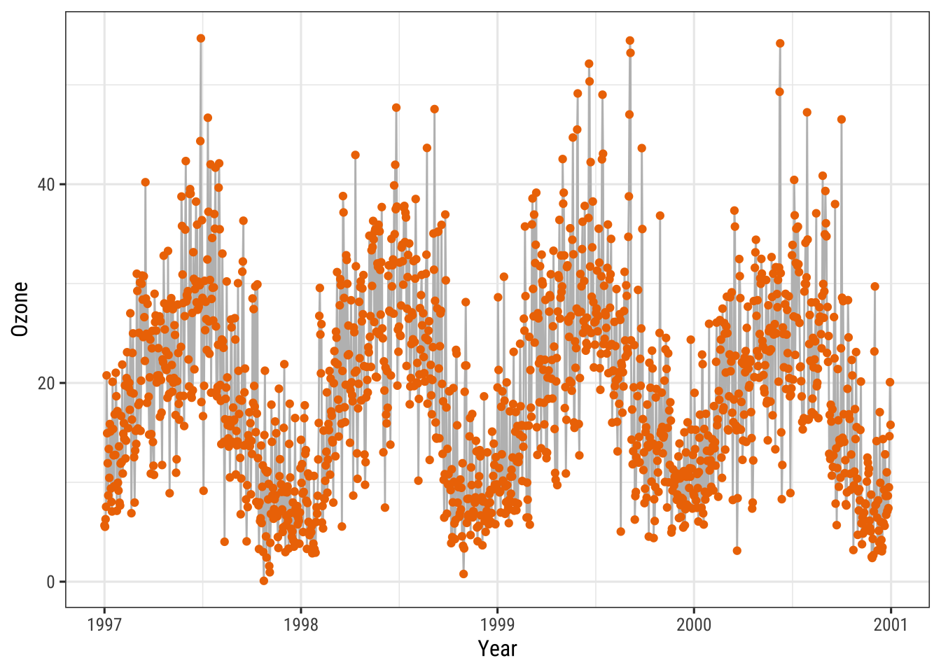
We can force a legend by mapping a guide to a variable.
We are mapping the lines and the points using aes() and we are mapping not to a variable in our dataset but to a single string (so that we get just one color for each).
ggplot(chic, aes(x = date, y = o3)) +
  geom_line(aes(color = "line")) +
  geom_point(aes(color = "points")) +
  labs(x = "Year", y = "Ozone") +
  scale_color_discrete("Type:")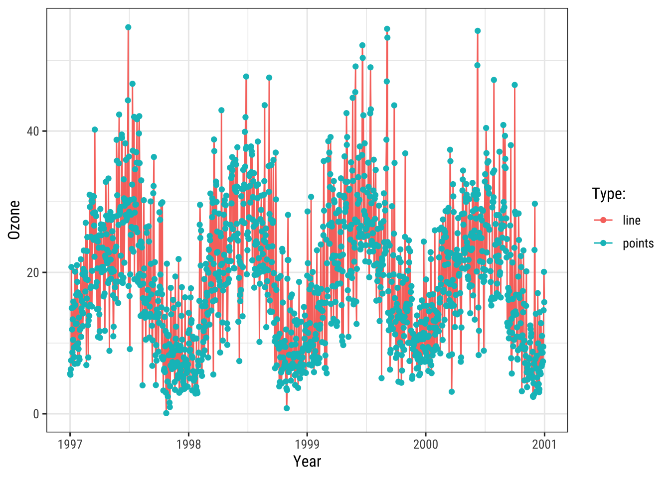
We are getting close but this is not what we want.
We want gray and red!
To change the color, we use scale_color_manual().
Additionally, we override the legend aesthetics using the guide() function.
Voila! Now, we have a plot with gray lines and red pints as well as a single gray line and a single red point as legend symbols:
ggplot(chic, aes(x = date, y = o3)) +
  geom_line(aes(color = "line")) +
  geom_point(aes(color = "points")) +
  labs(x = "Year", y = "Ozone") +
  scale_color_manual(name = NULL,
                     guide = "legend",
                     values = c("points" = "darkorange2",
                                "line" = "gray")) +
  guides(color = guide_legend(override.aes = list(linetype = c(1, 0),
                                                  shape = c(NA, 16))))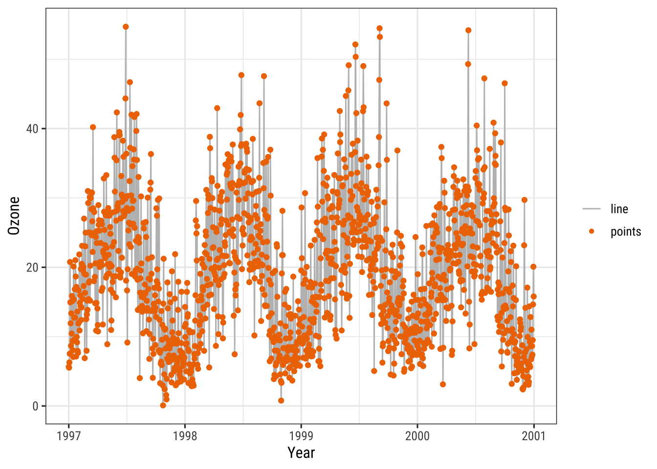
Use Other Legend Styles
The default legend for categorical variables such as season is a guide_legend() as you have seen in several previous examples.
If you map a continuous variable to an aesthetic, {ggplot2} will by default not use guide_legend() but guide_colorbar() (or guide_colourbar()):
ggplot(chic,
       aes(x = date, y = temp, color = temp)) +
  geom_point() +
  labs(x = "Year", y = "Temperature (°F)", color = "Temperature (°F)")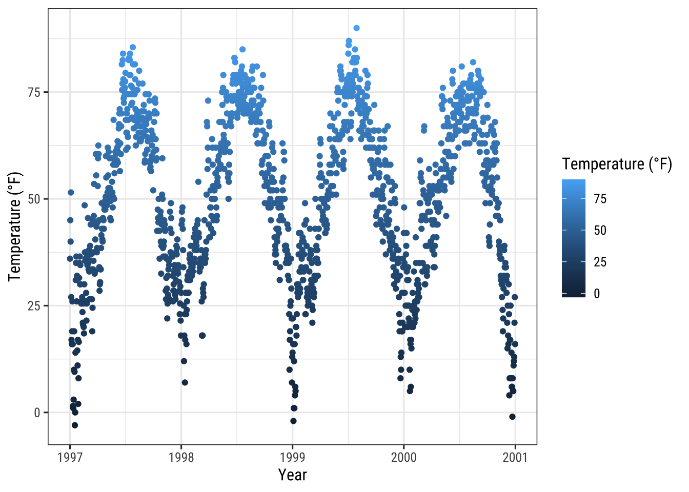
However, by using guide_legend() you can force the legend to show discrete colors for a given number of breaks as in case of a categorical variable:
ggplot(chic,
       aes(x = date, y = temp, color = temp)) +
  geom_point() +
  labs(x = "Year", y = "Temperature (°F)", color = "Temperature (°F)") +
  guides(color = guide_legend())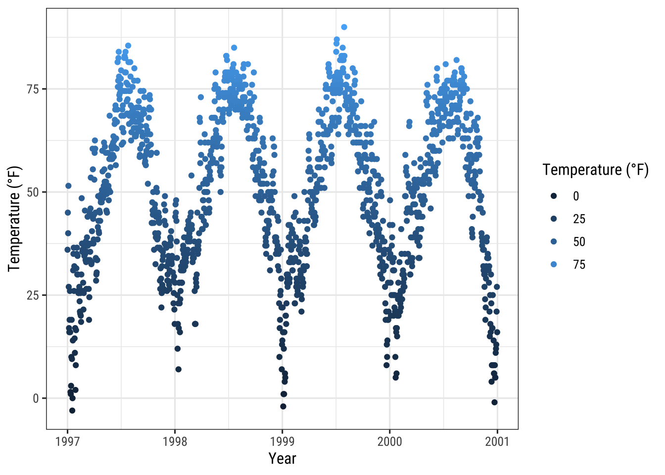
You can also use binned scales:
ggplot(chic,
       aes(x = date, y = temp, color = temp)) +
  geom_point() +
  labs(x = "Year", y = "Temperature (°F)", color = "Temperature (°F)") +
  guides(color = guide_bins())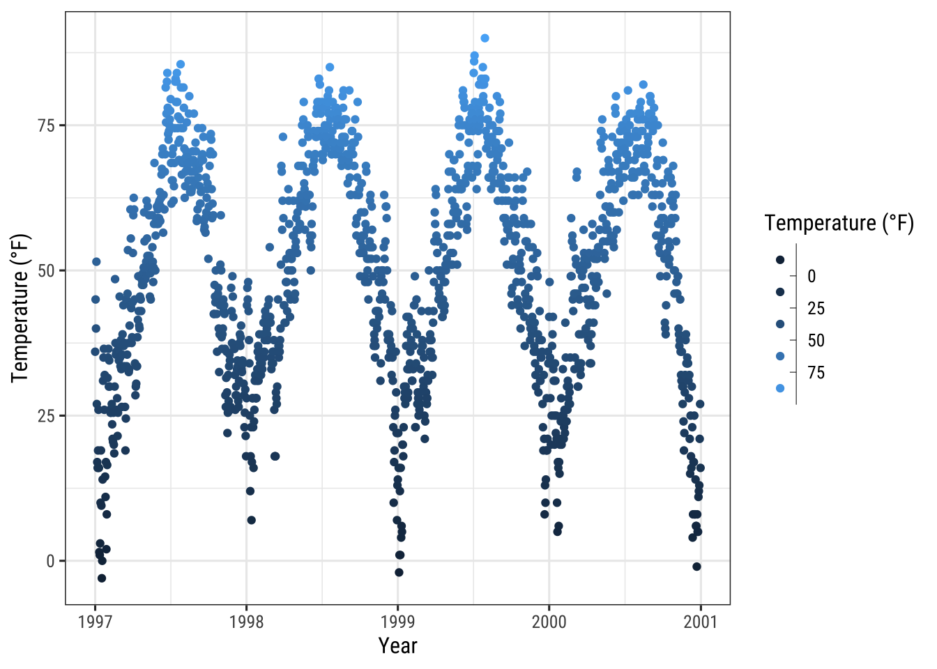
… or binned scales as discrete colorbars:
ggplot(chic,
       aes(x = date, y = temp, color = temp)) +
  geom_point() +
  labs(x = "Year", y = "Temperature (°F)", color = "Temperature (°F)") +
  guides(color = guide_colorsteps())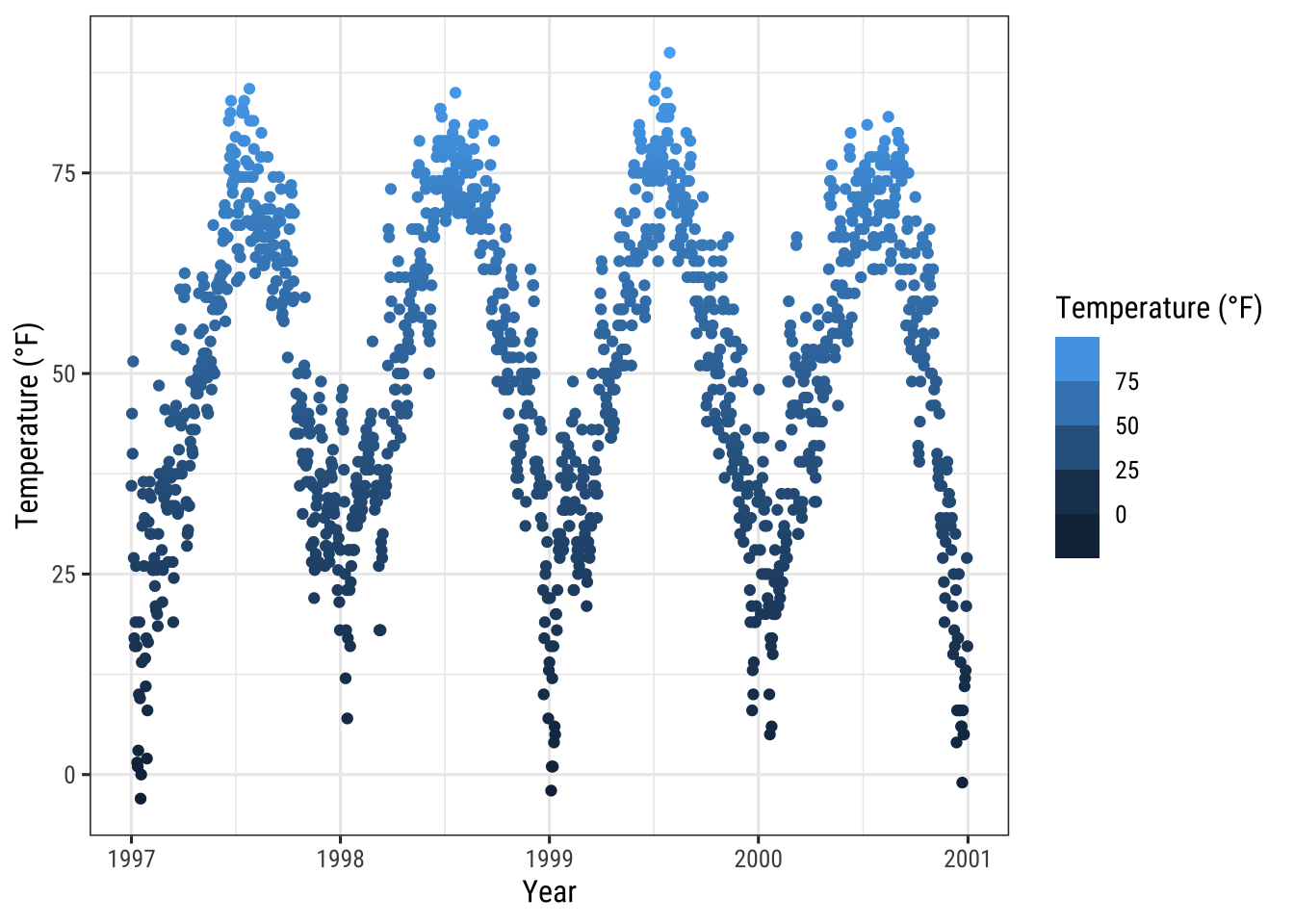
Working with Backgrounds & Grid Lines
There are ways to change the entire look of your plot with one function (see “Working with Themes” section below) but if you want to simply change the colors of some elements, you can also do that.
Change the Panel Background Color
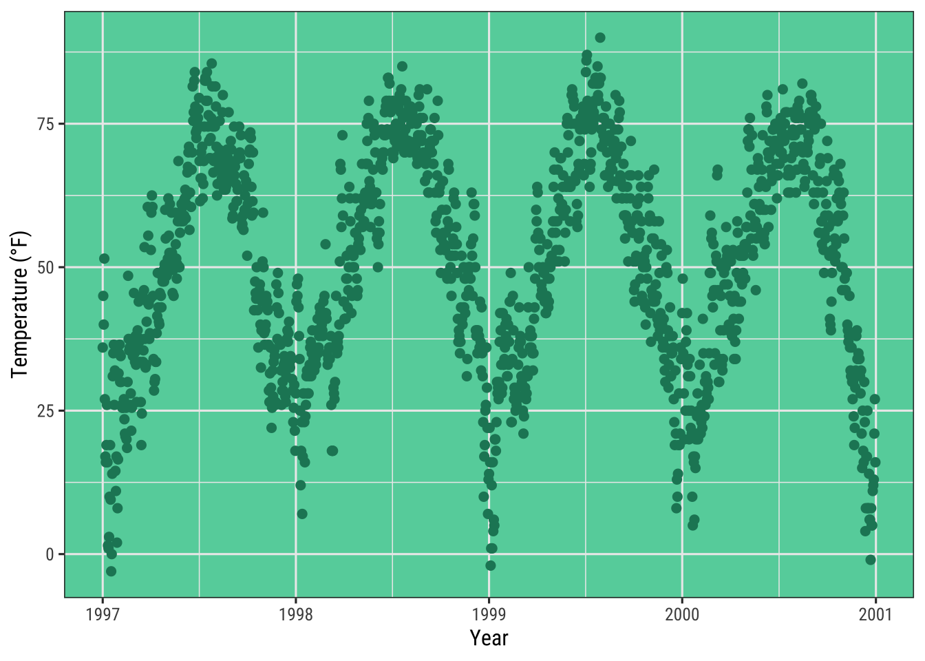
To change the background color (fill) of the panel area (i.e. the area where the data is plotted), one needs to adjust the theme element panel.background:
ggplot(chic, aes(x = date, y = temp)) +
  geom_point(color = "#1D8565", size = 2) +
  labs(x = "Year", y = "Temperature (°F)") +
  theme(panel.background = element_rect(
    fill = "#64D2AA", color = "#64D2AA", linewidth = 2)
  )
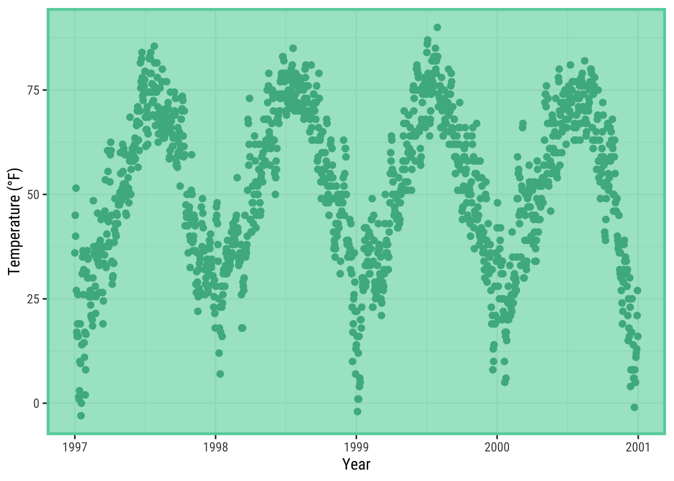
Note that the true color—the outline of the panel background—did not change even though we specified it.
This is because there is a layer on top of the panel.background, namely panel.border.
However, make sure to use a transparent fill here, otherwise your data is hidden behind this layer.
In the following example, I illustrate that by using a semitransparent hex color for the fill argument in element_rect:
ggplot(chic, aes(x = date, y = temp)) +
  geom_point(color = "#1D8565", size = 2) +
  labs(x = "Year", y = "Temperature (°F)") +
  theme(panel.border = element_rect(
    fill = "#64D2AA99", color = "#64D2AA", linewidth = 2)
  )
Change Grid Lines
There are two types of grid lines: major grid lines indicating the ticks and minor grid lines between the major ones.
You can change all of these by overwriting the defaults for panel.grid or for each set of gridlines separately, panel.grid.major and panel.grid.minor.
ggplot(chic, aes(x = date, y = temp)) +
  geom_point(color = "firebrick") +
  labs(x = "Year", y = "Temperature (°F)") +
  theme(panel.grid.major = element_line(color = "gray10", linewidth = .5),
        panel.grid.minor = element_line(color = "gray70", linewidth = .25))
You can even specify settings for all four different levels:
ggplot(chic, aes(x = date, y = temp)) +
  geom_point(color = "firebrick") +
  labs(x = "Year", y = "Temperature (°F)") +
  theme(panel.grid.major = element_line(linewidth = .5, linetype = "dashed"),
        panel.grid.minor = element_line(linewidth = .25, linetype = "dotted"),
        panel.grid.major.x = element_line(color = "red1"),
        panel.grid.major.y = element_line(color = "blue1"),
        panel.grid.minor.x = element_line(color = "red4"),
        panel.grid.minor.y = element_line(color = "blue4"))
And, of course, you can remove some or all grid lines if you like:
ggplot(chic, aes(x = date, y = temp)) +
  geom_point(color = "firebrick") +
  labs(x = "Year", y = "Temperature (°F)") +
  theme(panel.grid.minor = element_blank())
ggplot(chic, aes(x = date, y = temp)) +
  geom_point(color = "firebrick") +
  labs(x = "Year", y = "Temperature (°F)") +
theme(panel.grid = element_blank())![]()
Change Spacing of Gridlines
Furthermore, you can also define the breaks between both, major and minor grid lines:
ggplot(chic, aes(x = date, y = temp)) +
  geom_point(color = "firebrick") +
  labs(x = "Year", y = "Temperature (°F)") +
  scale_y_continuous(breaks = seq(0, 100, 10),
                     minor_breaks = seq(0, 100, 2.5))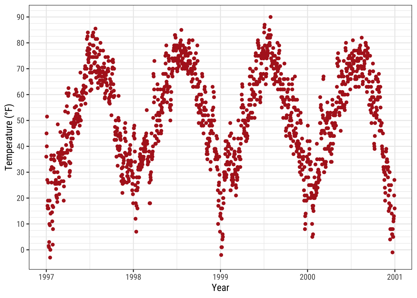
Change the Plot Background Color
Similarly, to change the background color (fill) of the plot area, one needs to modify the theme element plot.background:
ggplot(chic, aes(x = date, y = temp)) +
  geom_point(color = "firebrick") +
  labs(x = "Year", y = "Temperature (°F)") +
  theme(plot.background = element_rect(fill = "gray60",
                                       color = "gray30", linewidth = 2))
You can achieve a unique background color by either setting the same colors in both panel.background and plot.background or by setting the background filling of the panel to "transparent" or NA:
ggplot(chic, aes(x = date, y = temp)) +
  geom_point(color = "firebrick") +
  labs(x = "Year", y = "Temperature (°F)") +
  theme(panel.background = element_rect(fill = NA),
        plot.background = element_rect(fill = "gray60",
                                       color = "gray30", linewidth = 2))
Working with Margins
Sometimes it is useful to add a little space to the plot margin.
Similar to the previous examples we can use an argument to the theme() function.
In this case the argument is plot.margin.
As In the previous example we already illustrated the default margin by changing the background color using plot.background.
Now let us add extra space to both the left and right.
The argument, plot.margin, can handle a variety of different units (cm, inches, etc.) but it requires the use of the function unit from the package grid to specify the units.
You can either provide the same value for all sides (easiest via rep(x, 4)) or particular distances for each.
Here I am using a 1cm margin on the top and bottom, 3 cm margin on the right, and a 8 cm margin on the left.
ggplot(chic, aes(x = date, y = temp)) +
  geom_point(color = "firebrick") +
  labs(x = "Year", y = "Temperature (°F)") +
  theme(plot.background = element_rect(fill = "gray60"),
        plot.margin = margin(t = 1, r = 3, b = 1, l = 8, unit = "cm"))
The order of the margin sides is top, right, bottom, left—a nice way to remember this order is “trouble that sorts the first letter of the four sides.
💁 You can also use unit() instead of margin().
Expand to see example.
ggplot(chic, aes(x = date, y = temp)) +
  geom_point(color = "firebrick") +
  labs(x = "Year", y = "Temperature (°F)") +
  theme(plot.background = element_rect(fill = "gray60"),
        plot.margin = unit(c(1, 3, 1, 8), "cm"))
Working with Multi-Panel Plots
The {ggplot2} package has two nice functions for creating multi-panel plots, called facets.
They are related but a little different: facet_wrap creates essentially a ribbon of plots based on a single variable while facet_grid spans a grid of two variables.
Create a Grid of Small Multiples Based on Two Variables
In case of two variables, facet_grid does the job.
Here, the order of the variables determines the number of rows and columns:
ggplot(chic, aes(x = date, y = temp)) +
geom_point(color = "orangered", alpha = .3) +
theme(axis.text.x = element_text(angle = 45, vjust = 1, hjust = 1)) +
labs(x = "Year", y = "Temperature (°F)") +
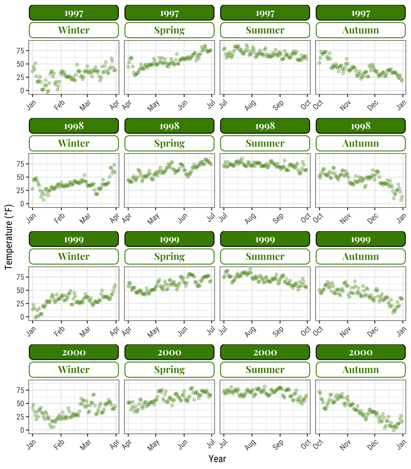
facet_grid(year ~ season)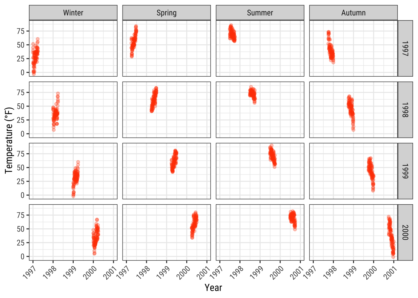
To change from row to column arrangement you can change facet_grid(year ~ season) to facet_grid(season ~ year).
Create Small Multiples Based on One Variable
facet_wrap creates a facet of a single variable, written with a tilde in front: facet_wrap(~ variable).
The appearance of these subplots is controlled by the arguments ncol and nrow:
g <-
  ggplot(chic, aes(x = date, y = temp)) +
    geom_point(color = "chartreuse4", alpha = .3) +
    labs(x = "Year", y = "Temperature (°F)") +
    theme(axis.text.x = element_text(angle = 45, vjust = 1, hjust = 1))

g + facet_wrap(~ year)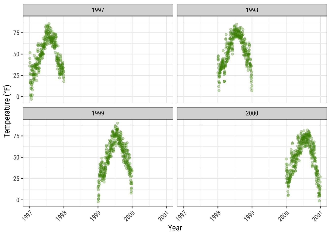
Accordingly, you can arrange the plots as you like, instead as a matrix in one row…
g + facet_wrap(~ year, nrow = 1)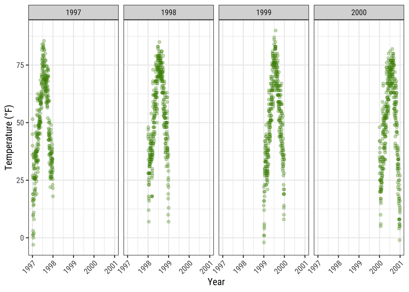
… or even as a asymmetric grid of plots:
g + facet_wrap(~ year, ncol = 3) + theme(axis.title.x = element_text(hjust = .15))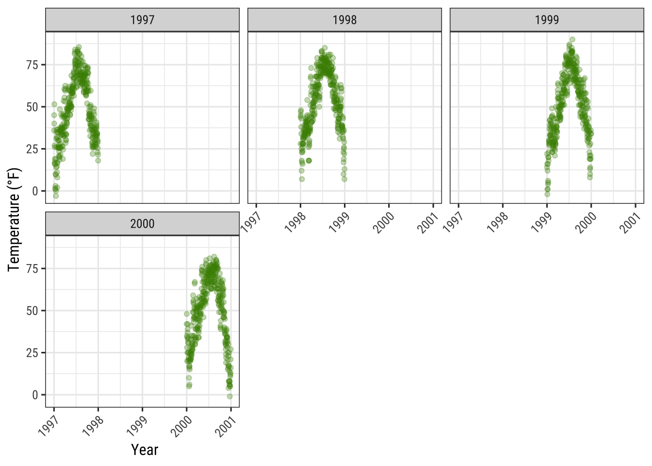
Allow Axes to Roam Free
The default for multi-panel plots in {ggplot2} is to use equivalent scales in each panel.
But sometimes you want to allow a panels own data to determine the scale.
This is often not a good idea since it may give your user the wrong impression about the data.
But sometimes it is indeed useful and to do this you can set scales = "free":
g + facet_wrap(~ year, nrow = 2, scales = "free")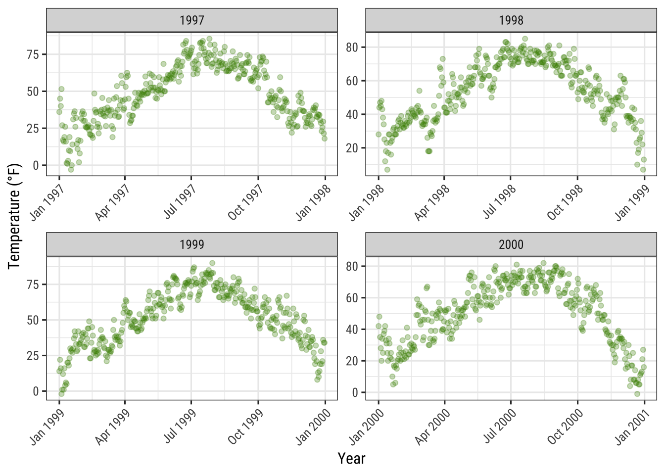
Note that both, x and y axes differ in their range!
Use facet_wrap with Two Variables
The function facet_wrap can also take two variables:
g + facet_wrap(year ~ season, nrow = 4, scales = "free_x")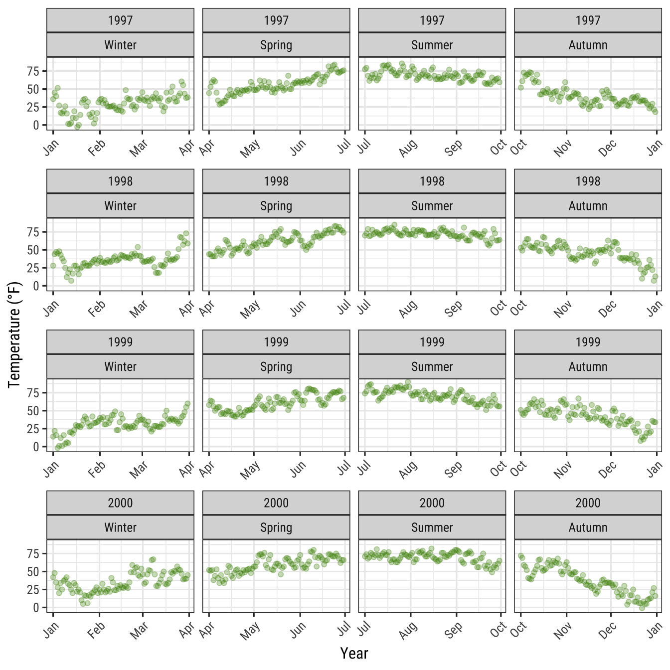
When using facet_wrap you are still able to control the grid design: you can rearrange the number of plots per row and column and you can also let all axes roam free.
In contrast, facet_grid will also take a free argument but will only let it roam free per column or row:
g + facet_grid(year ~ season, scales = "free_x")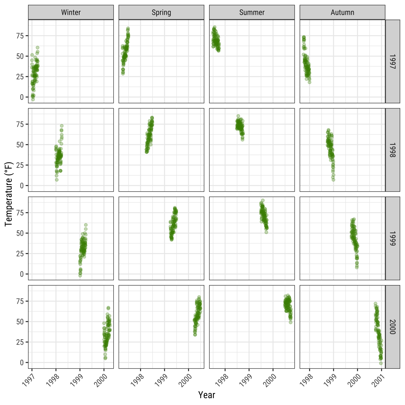
Modify Style of Strip Texts
By using theme, you can modify the appearance of the strip text (i.e. the title for each facet) and the strip text boxes:
g + facet_wrap(~ year, nrow = 1, scales = "free_x") +
  theme(strip.text = element_text(face = "bold", color = "chartreuse4",
                                  hjust = 0, size = 20),
        strip.background = element_rect(fill = "chartreuse3", linetype = "dotted"))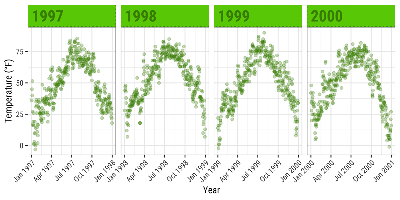
The following two functions adapted from this answer by Claus Wilke, the author of the {ggtext} package, allow to highlight specific labels in combination with element_textbox() that is provided by {ggtext}.
library(ggtext)
library(purrr) ## for %||%

element_textbox_highlight <- function(..., hi.labels = NULL, hi.fill = NULL,
                                      hi.col = NULL, hi.box.col = NULL, hi.family = NULL) {
  structure(
    c(element_textbox(...),
      list(hi.labels = hi.labels, hi.fill = hi.fill, hi.col = hi.col, hi.box.col = hi.box.col, hi.family = hi.family)
    ),
    class = c("element_textbox_highlight", "element_textbox", "element_text", "element")
  )
}

element_grob.element_textbox_highlight <- function(element, label = "", ...) {
  if (label %in% element$hi.labels) {
    element$fill <- element$hi.fill %||% element$fill
    element$colour <- element$hi.col %||% element$colour
    element$box.colour <- element$hi.box.col %||% element$box.colour
    element$family <- element$hi.family %||% element$family
  }
  NextMethod()
}
Now you can use it and specify for example all striptexts:
g + facet_wrap(year ~ season, nrow = 4, scales = "free_x") +
  theme(
    strip.background = element_blank(),
    strip.text = element_textbox_highlight(
      family = "Playfair", size = 12, face = "bold",
      fill = "white", box.color = "chartreuse4", color = "chartreuse4",
      halign = .5, linetype = 1, r = unit(5, "pt"), width = unit(1, "npc"),
      padding = margin(5, 0, 3, 0), margin = margin(0, 1, 3, 1),
      hi.labels = c("1997", "1998", "1999", "2000"),
      hi.fill = "chartreuse4", hi.box.col = "black", hi.col = "white"
    )
  )
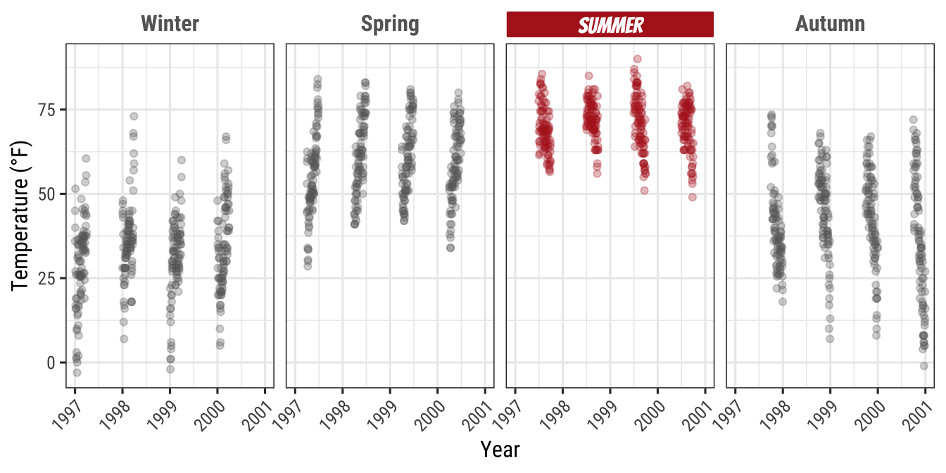
ggplot(chic, aes(x = date, y = temp)) +
  geom_point(aes(color = season == "Summer"), alpha = .3) +
  labs(x = "Year", y = "Temperature (°F)") +
  facet_wrap(~ season, nrow = 1) +
  scale_color_manual(values = c("gray40", "firebrick"), guide = "none") +
  theme(
    axis.text.x = element_text(angle = 45, vjust = 1, hjust = 1),
    strip.background = element_blank(),
    strip.text = element_textbox_highlight(
      size = 12, face = "bold",
      fill = "white", box.color = "white", color = "gray40",
      halign = .5, linetype = 1, r = unit(0, "pt"), width = unit(1, "npc"),
      padding = margin(2, 0, 1, 0), margin = margin(0, 1, 3, 1),
      hi.labels = "Summer", hi.family = "Bangers",
      hi.fill = "firebrick", hi.box.col = "firebrick", hi.col = "white"
    )
  )
Create a Panel of Different Plots
There are several ways how plots can be combined.
The easiest approach in my opinion is the {patchwork} package by Thomas Lin Pedersen:
p1 <- ggplot(chic, aes(x = date, y = temp,
                       color = season)) +
        geom_point() +
        geom_rug() +
        labs(x = "Year", y = "Temperature (°F)")

p2 <- ggplot(chic, aes(x = date, y = o3)) +
        geom_line(color = "gray") +
        geom_point(color = "darkorange2") +
        labs(x = "Year", y = "Ozone")

library(patchwork)
p1 + p2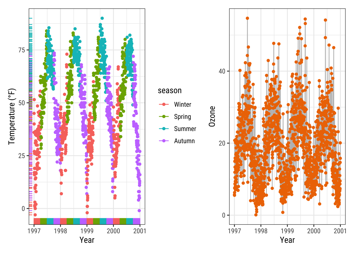
We can change the order by “dividing” both plots (and note the alignment even though one has a legend and one doesn’t!):
p1 / p2
And also nested plots are possible!
(g + p2) / p1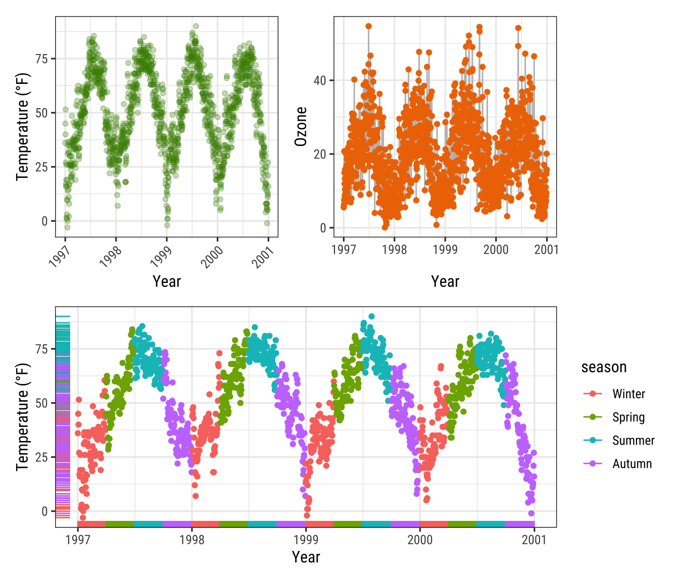
(Note the alignment of the plots even though only one plot includes a legend.)
Alternatively, the {cowplot} package by Claus Wilke provides the functionality to combine multiple plots (and lots of other good utilities):
library(cowplot)
plot_grid(plot_grid(g, p1), p2, ncol = 1)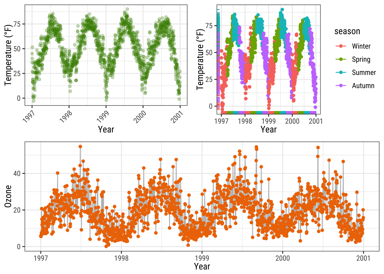
… and so does the {gridExtra} package as well:
library(gridExtra)
grid.arrange(g, p1, p2,
             layout_matrix = rbind(c(1, 2), c(3, 3)))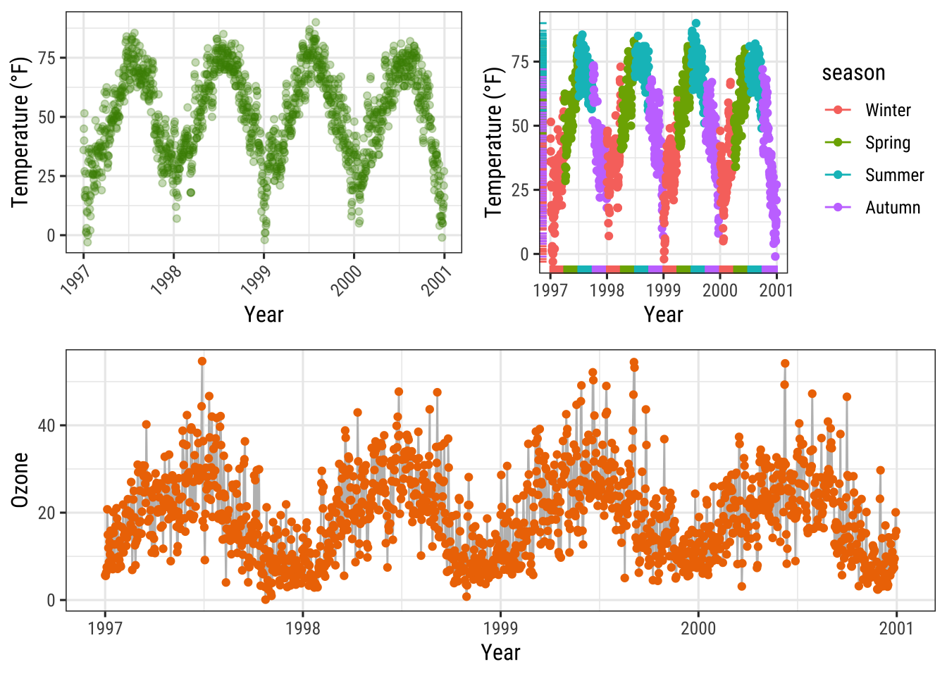
The same idea of defining a layout can be used with {patchwork} which allows creating complex compositions:
layout <- "
AABBBB#
AACCDDE
##CCDD#
##CC###
"

p2 + p1 + p1 + g + p2 +
  plot_layout(design = layout)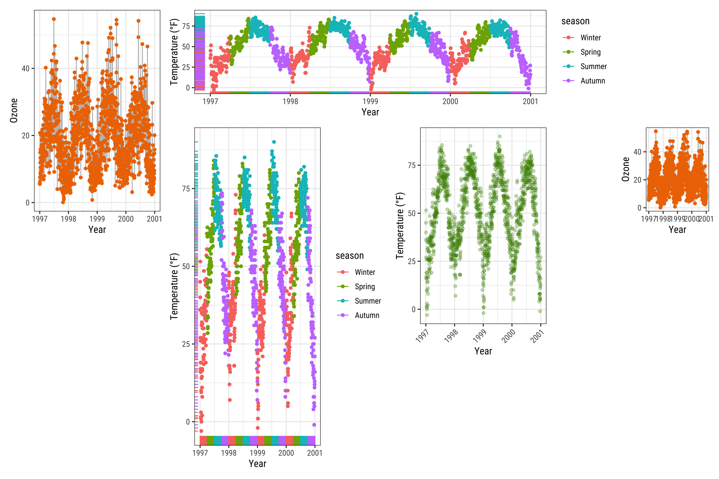
Working with Colors
For simple applications working with colors is straightforward in {ggplot2}.
For a more advanced treatment of the topic you should probably get your hands on Hadley’s book which has nice coverage.
Other good sources are the R Cookbook and the `color section in the R Graph Gallery by Yan Holtz.
There are two main differences when it comes to colors in {ggplot2}.
Both arguments, color and fill, can be
- specified as single color or
- assigned to variables.
As you have already seen in the beginning of this tutorial, variables that are inside the aesthetics are encoded by variables and those that are outside are properties that are unrelated to the variables.
This complete nonsense plot showing the number of records per year and season illustrates that fact:
ggplot(chic, aes(year)) +
  geom_bar(aes(fill = season), color = "grey", linewidth = 2) +
  labs(x = "Year", y = "Observations", fill = "Season:")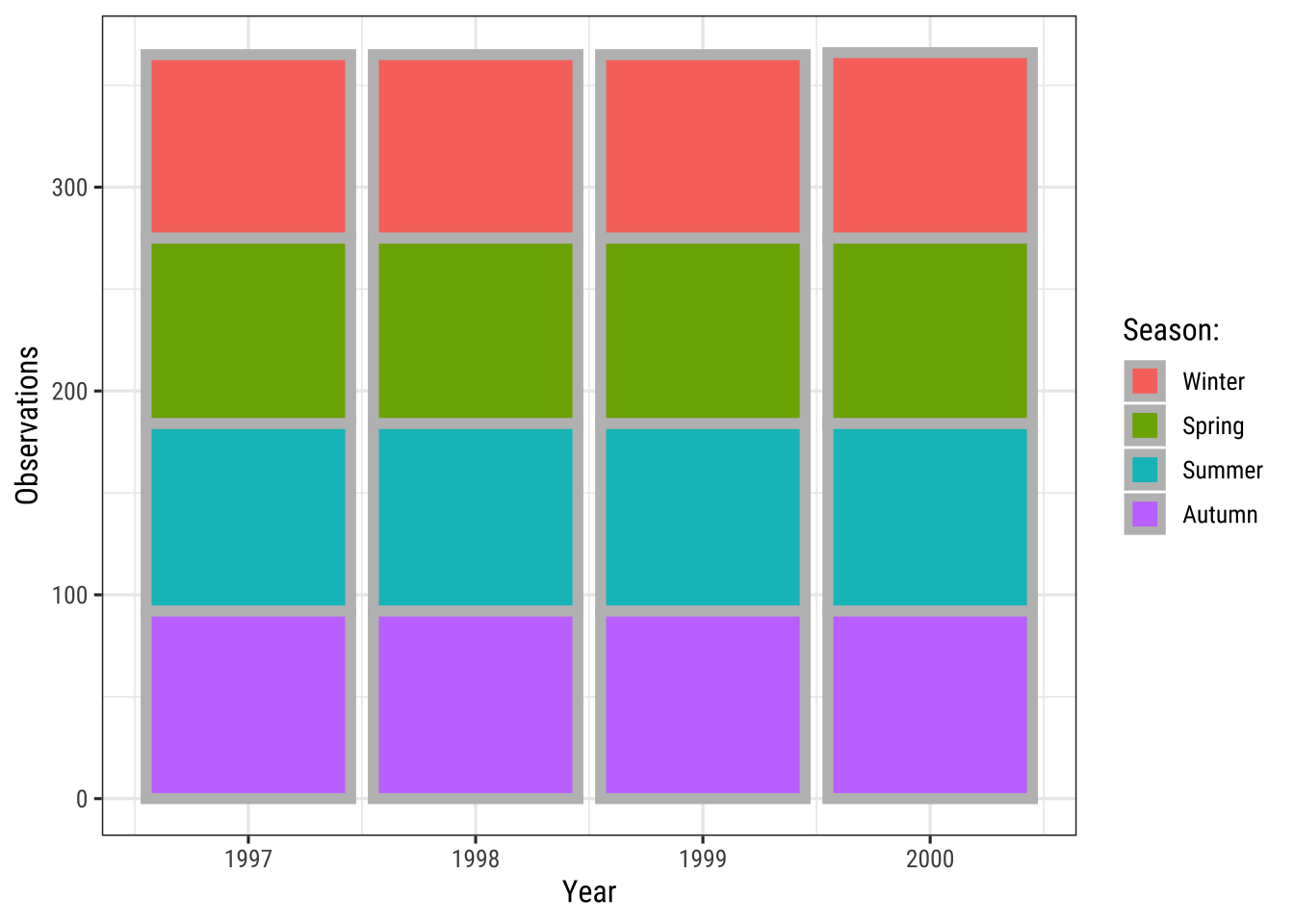
Specify Single Colors
Static, single colors are simple to use. We can specify a single color for a geom:
ggplot(chic, aes(x = date, y = temp)) +
  geom_point(color = "steelblue", size = 2) +
  labs(x = "Year", y = "Temperature (°F)")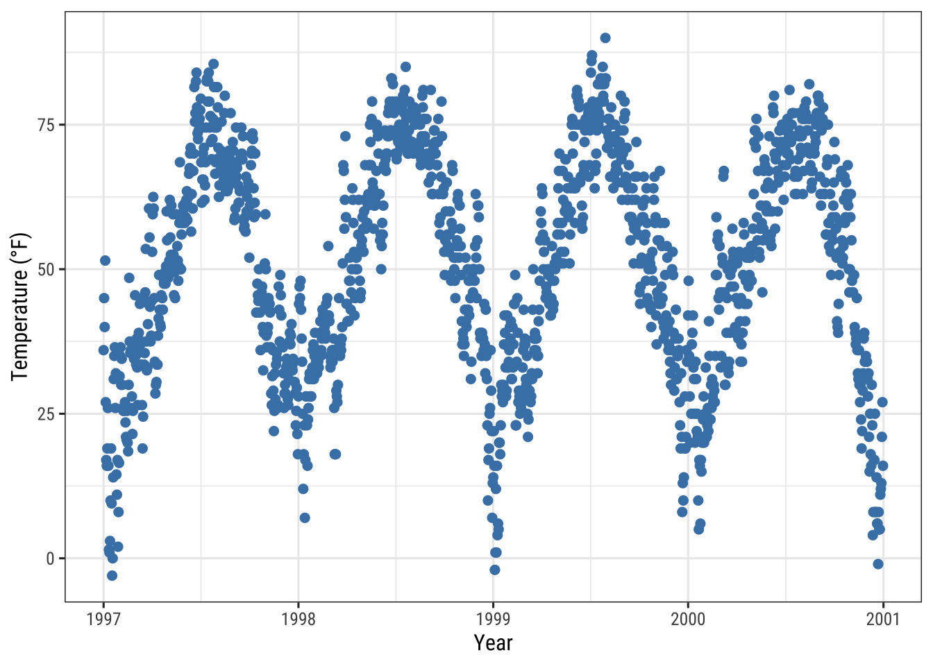
… and in case it provides both, a color (outline color) and a fill (filling color):
ggplot(chic, aes(x = date, y = temp)) +
  geom_point(shape = 21, size = 2, stroke = 1,
             color = "#3cc08f", fill = "#c08f3c") +
  labs(x = "Year", y = "Temperature (°F)")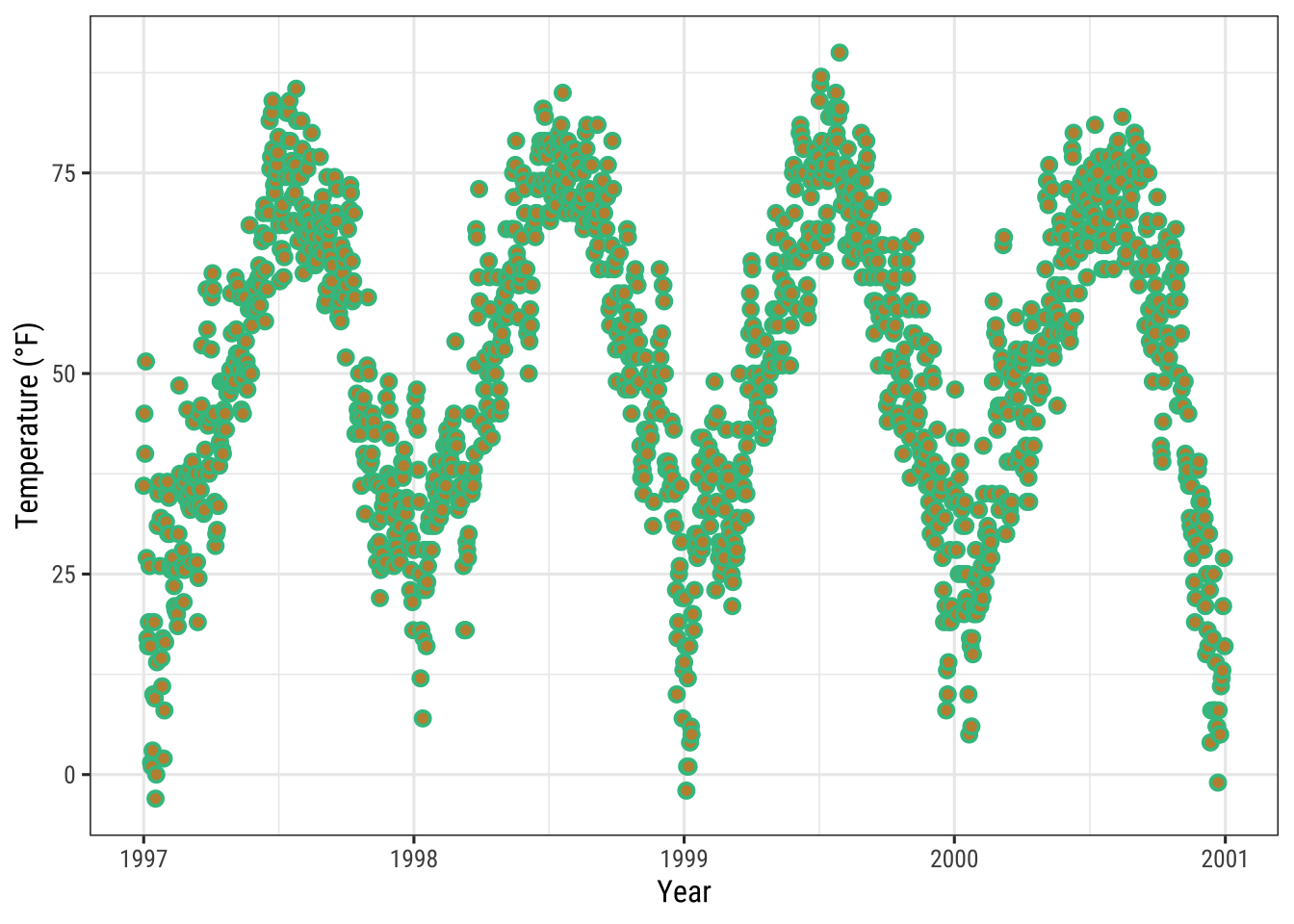
Tian Zheng at Columbia has created a useful PDF of R colors.
Of course, you can also specify hex color codes (simply as strings as in the example above) as well as RGB or RGBA values (via the rgb() function: rgb(red, green, blue, alpha)).
Assign Colors to Variables
In {ggplot2}, colors that are assigned to variables are modified via the scale_color_* and the scale_fill_* functions.
In order to use color with your data, most importantly you need to know if you are dealing with a categorical or continuous variable.
The color palette should be chosen depending on type of the variable, with sequential or diverging color palettes being used for continuous variables and qualitative color palettes for categorical variables:
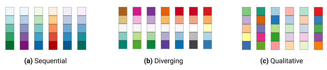
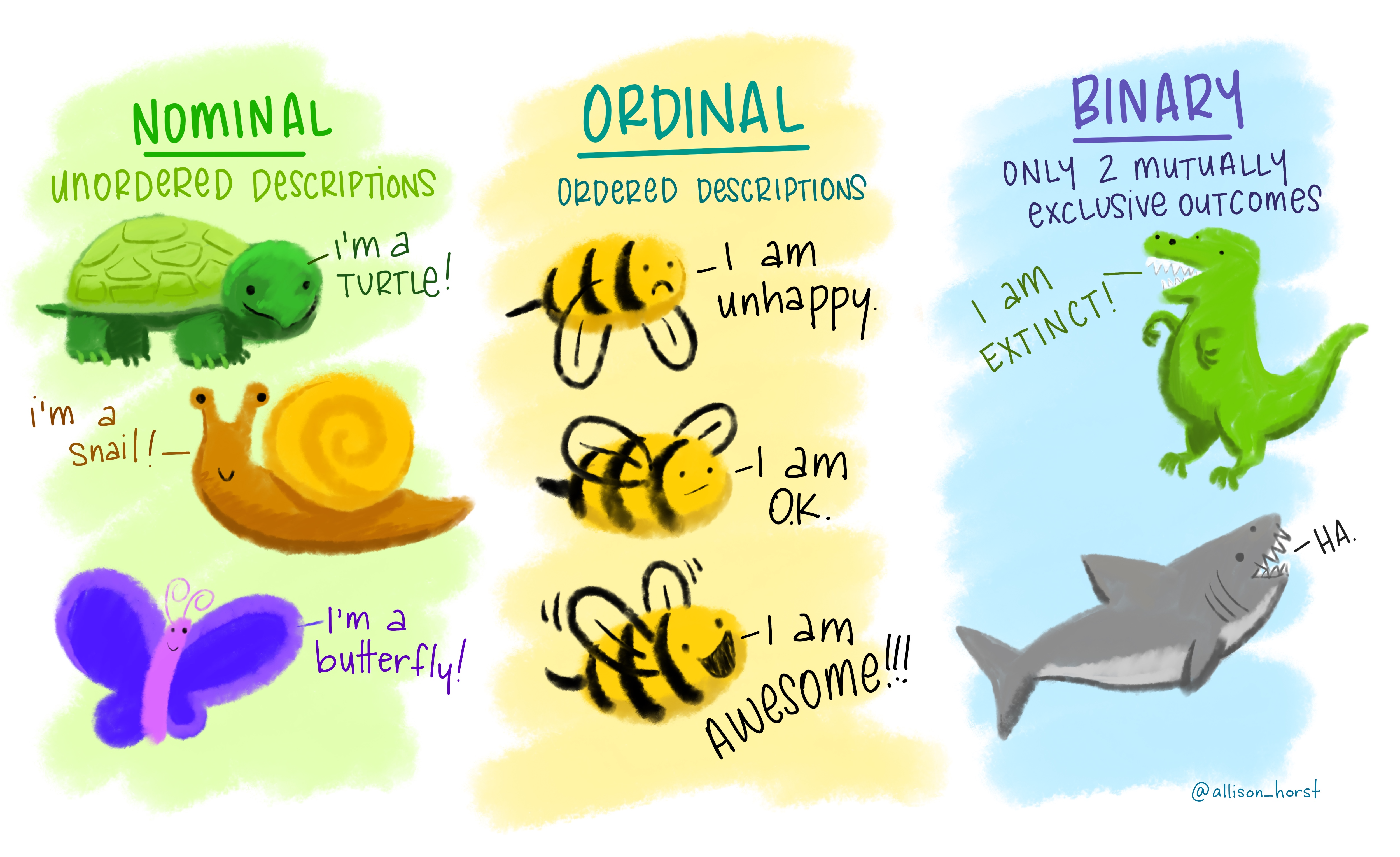
Qualitative Variables
Qualitative or categorical variables represent types of data which can be divided into groups (categories). The variable can be further specified as nominal, ordinal, and binary (dichotomous). Examples of qualitative/categorical variables are:
The default categorical color palette looks like this:
(ga <- ggplot(chic, aes(x = date, y = temp, color = season)) +
  geom_point() +
  labs(x = "Year", y = "Temperature (°F)", color = NULL))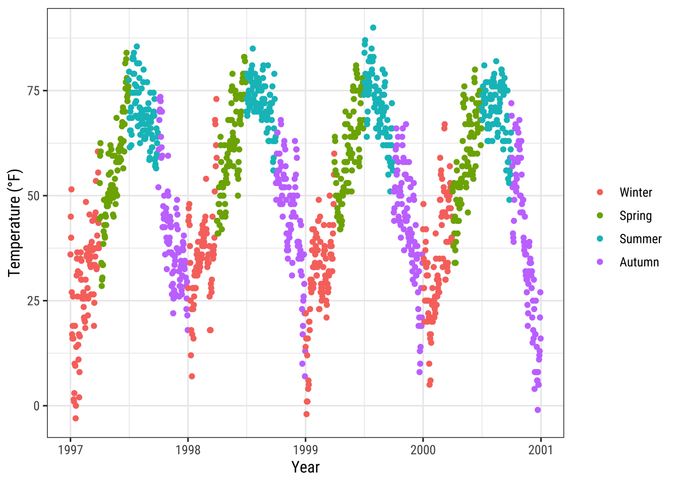
Manually Select Qualitative Colors
You can pick your own set of colors and assign them to a categorical variables via the function scale_*_manual() (the * can be either color, colour, or fill).
The number of specified colors has to match the number of categories:
ga + scale_color_manual(values = c("dodgerblue4",
                                   "darkolivegreen4",
                                   "darkorchid3",
                                   "goldenrod1"))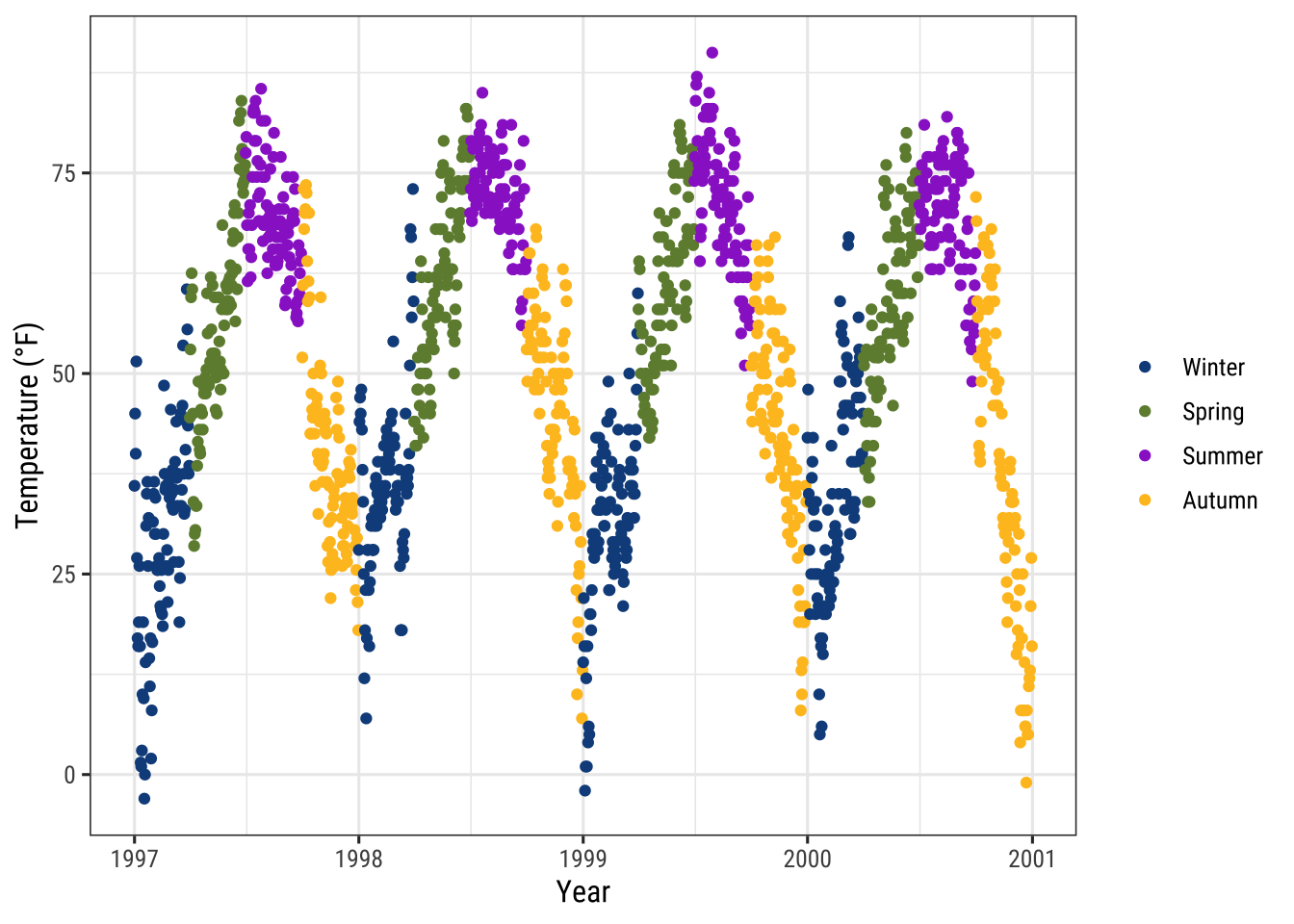
Use Built-In Qualitative Color Palettes
The ColorBrewer palettes is a popular online tool for selecting color schemes for maps.
The different sets of colors have been designed to produce attractive color schemes of similar appearance ranging from three to twelve.
Those palettes are available as built-in functions in the {ggplot2} package and can be applied by calling scale_*_brewer():
ga + scale_color_brewer(palette = "Set1")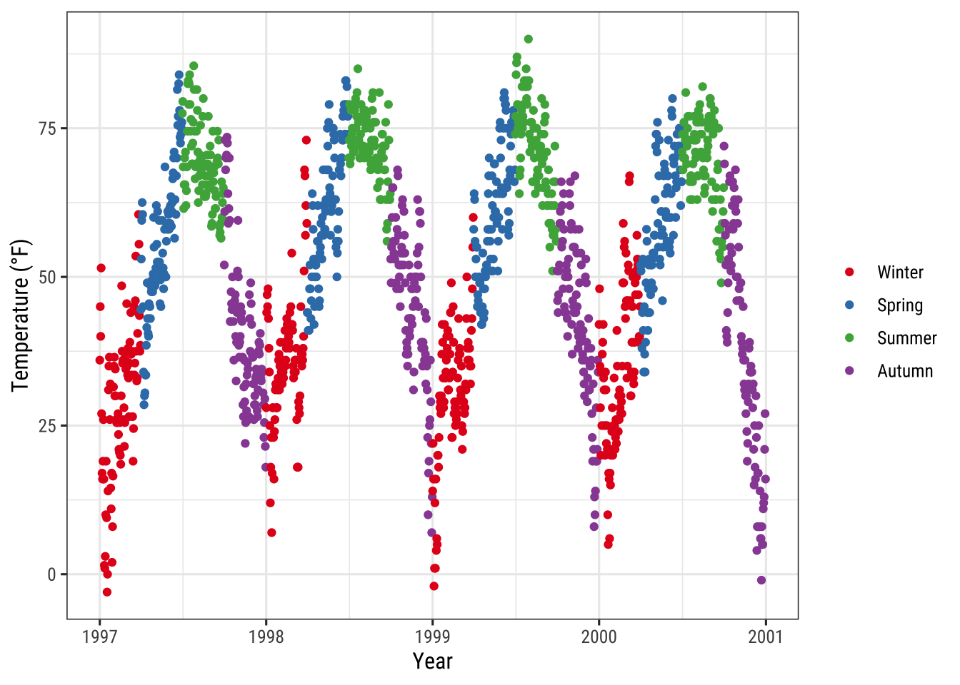
💡 You can explore all schemes available via RColorBrewer::display.brewer.all().
Use Qualitative Color Palettes from Extension Packages
There are many extension packages that provide additional color palettes.
Their use differs depending on the way the package is designed.
For an extensive overview of color palettes available in R, check the collection provided by Emil Hvitfeldt.
One can also use his {paletteer} package, a comprehensive collection of color palettes in R that uses a consistent syntax.
Examples:
The {ggthemes} package for example lets R users access the Tableau colors.
Tableau is a famous visualiztion software with a well-known color palette.
library(ggthemes)
ga + scale_color_tableau()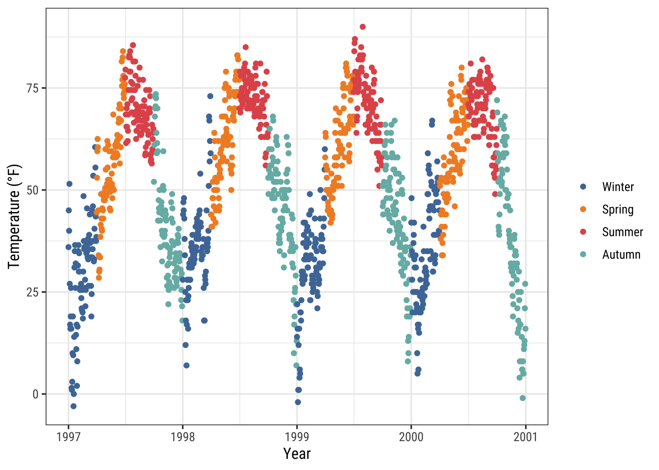
The {ggsci} package provides scientific journal and sci-fi themed color palettes.
Want to have a plot with colors that look like being published in Science or Nature?
Here you go!
library(ggsci)
g1 <- ga + scale_color_aaas()
g2 <- ga + scale_color_npg()

library(patchwork)
(g1 + g2) * theme(legend.position = "top")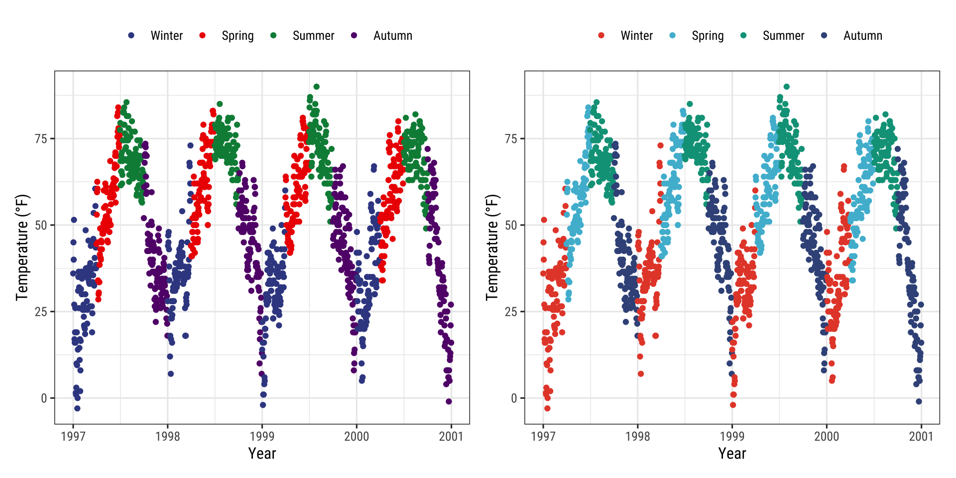
Quantitative Variables
Quantitative variables represent a measurable quantity and are thus numerical. Quantitative data can be further classified as being either continuous (floating numbers possible) or discrete (integers only):
In our example we will change the variable we want to color to ozone, a continuous variable that is strongly related to temperature (higher temperature = higher ozone).
The function scale_*_gradient() is a sequential gradient while scale_*_gradient2() is diverging.
Here is the default {ggplot2} sequential color scheme for continuous variables:
gb <- ggplot(chic, aes(x = date, y = temp, color = temp)) +
  geom_point() +
  labs(x = "Year", y = "Temperature (°F)", color = "Temperature (°F):")

gb + scale_color_continuous()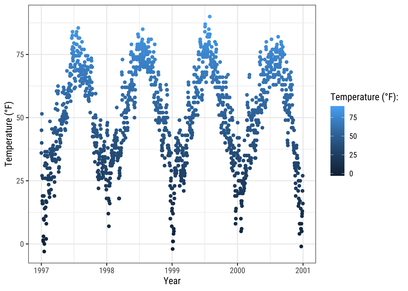
This code produces the same plot:
gb + scale_color_gradient()And here is the diverging default color scheme:
mid <- mean(chic$temp)  ## midpoint

gb + scale_color_gradient2(midpoint = mid)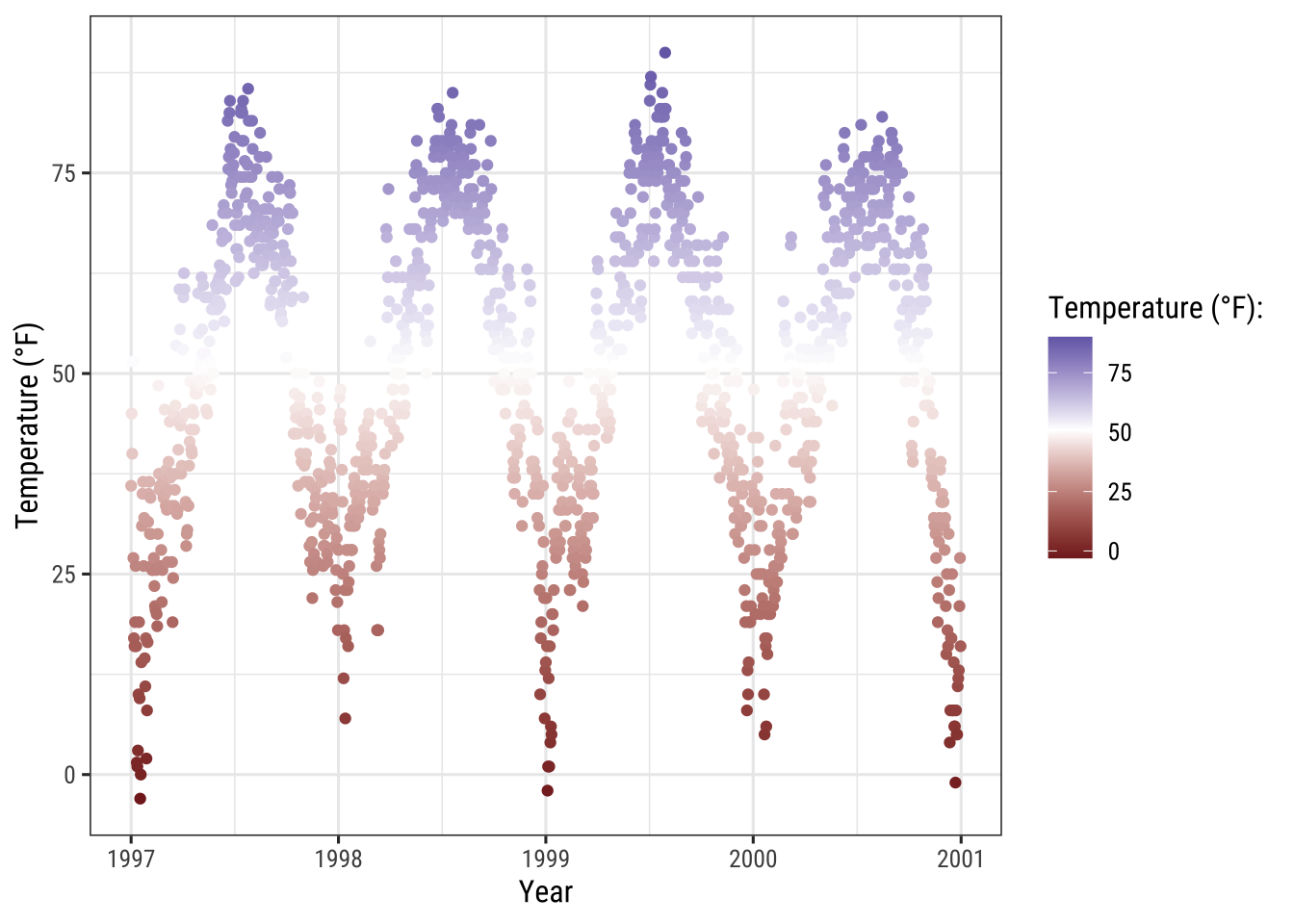
Manually Set a Sequential Color Scheme
You can manually set gradually changing color palettes for continuous variables via scale_*_gradient():
gb + scale_color_gradient(low = "darkkhaki",
                          high = "darkgreen")
Temperature data is normally distributed so how about a diverging color scheme (rather than sequential)… For diverging color you can use the scale_*_gradient2() function:
gb + scale_color_gradient2(midpoint = mid, low = "#dd8a0b",
                           mid = "grey92", high = "#32a676")
The Beautiful Viridis Color Palette
The viridis color palettes do not only make your plots look pretty and good to perceive but also easier to read by those with colorblindness and print well in gray scale.
You can test how your plots might appear under various form of colorblindness using {dichromat} package.
And they also come now shipped with {ggplot2}!
The following multi-panel plot illustrates three out of the four viridis palettes:
p1 <- gb + scale_color_viridis_c() + ggtitle("'viridis' (default)")
p2 <- gb + scale_color_viridis_c(option = "inferno") + ggtitle("'inferno'")
p3 <- gb + scale_color_viridis_c(option = "plasma") + ggtitle("'plasma'")
p4 <- gb + scale_color_viridis_c(option = "cividis") + ggtitle("'cividis'")

library(patchwork)
(p1 + p2 + p3 + p4) * theme(legend.position = "bottom")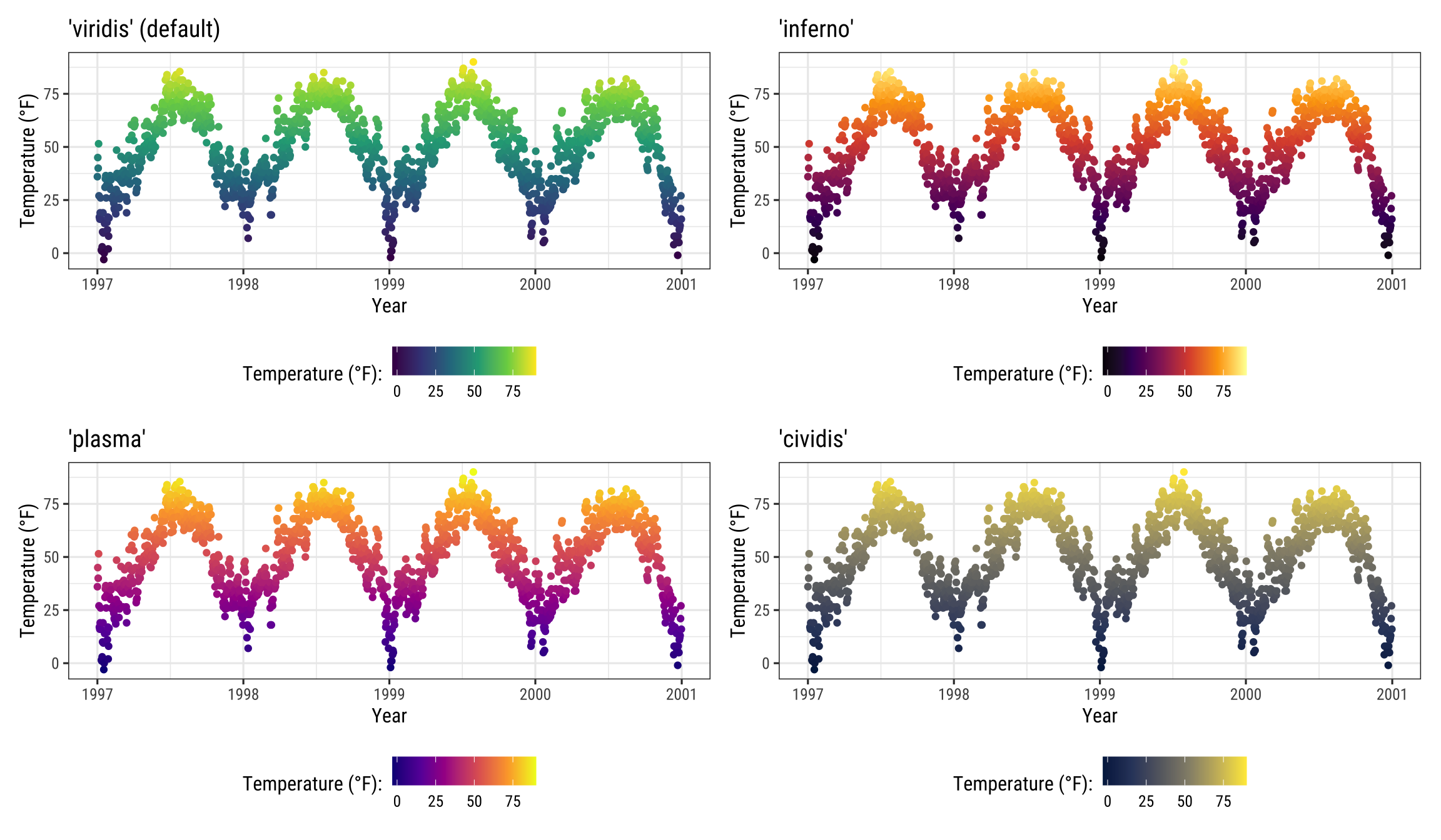
It is also possible to use the viridis color palettes for discrete variables:
ga + scale_color_viridis_d(guide = "none")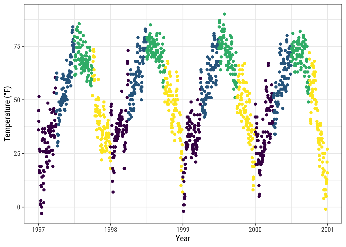
Use Quantitative Color Palettes from Extension Packages
The many extension packages provide not only additional categorical color palettes but also sequential, diverging and even cyclical palettes. Again, I point you to the great collection provided by Emil Hvitfeldt for an overview.
Examples:
The {rcartocolors} packages ports the beautiful CARTOcolors to {ggplot2} and contains several of my most-used palettes:
library(rcartocolor)
g1 <- gb + scale_color_carto_c(palette = "BurgYl")
g2 <- gb + scale_color_carto_c(palette = "Earth")

(g1 + g2) * theme(legend.position = "bottom")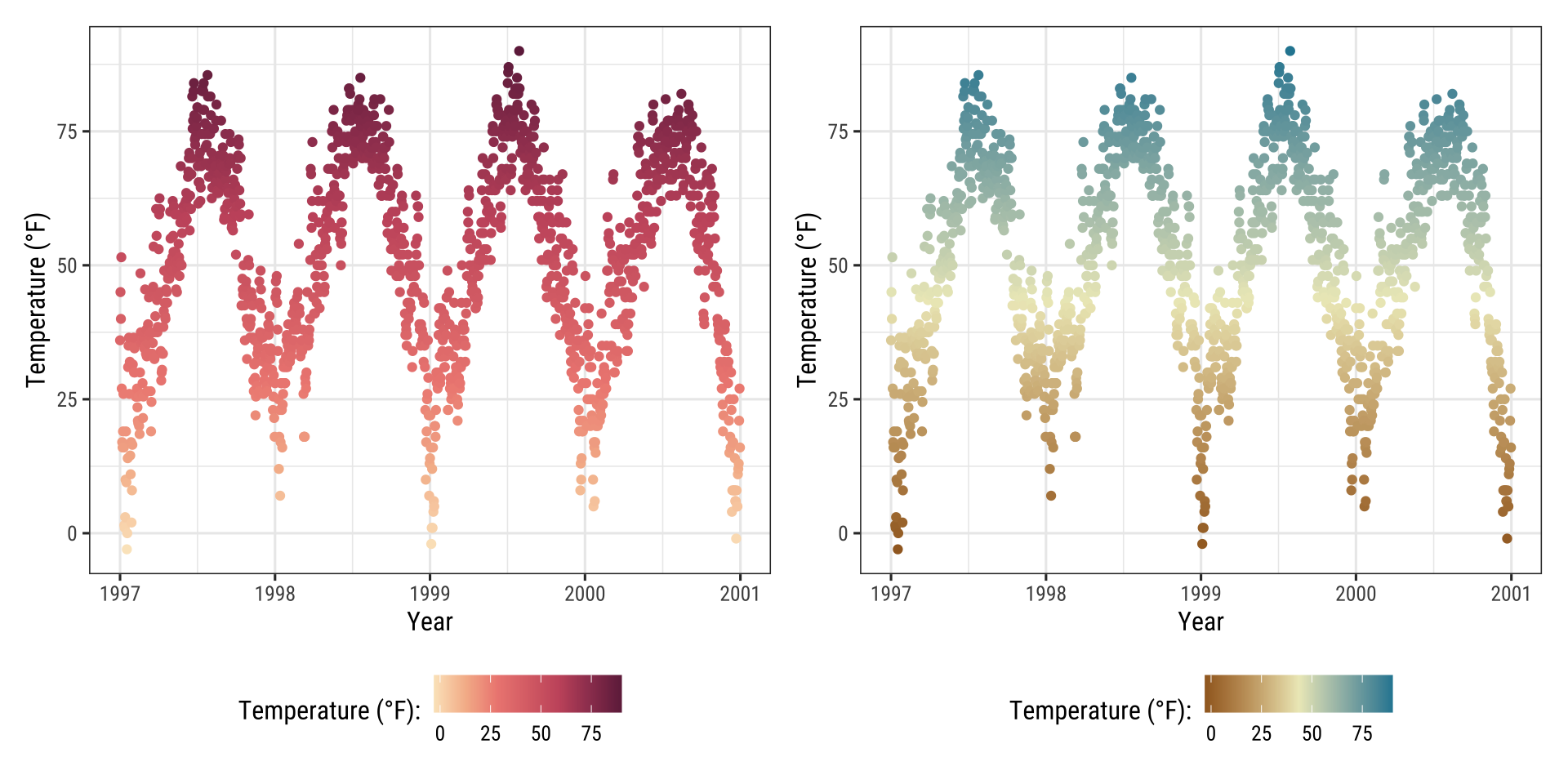
The {scico} package provides access to the color palettes developed by Fabio Crameri.
These color palettes are not only beautiful and often unusual but also a good choice since they have been developed to be perceptually uniform and ordered.
In addition, they work for people with color vision deficiency and in grayscale:
library(scico)
g1 <- gb + scale_color_scico(palette = "berlin")
g2 <- gb + scale_color_scico(palette = "hawaii", direction = -1)

(g1 + g2) * theme(legend.position = "bottom")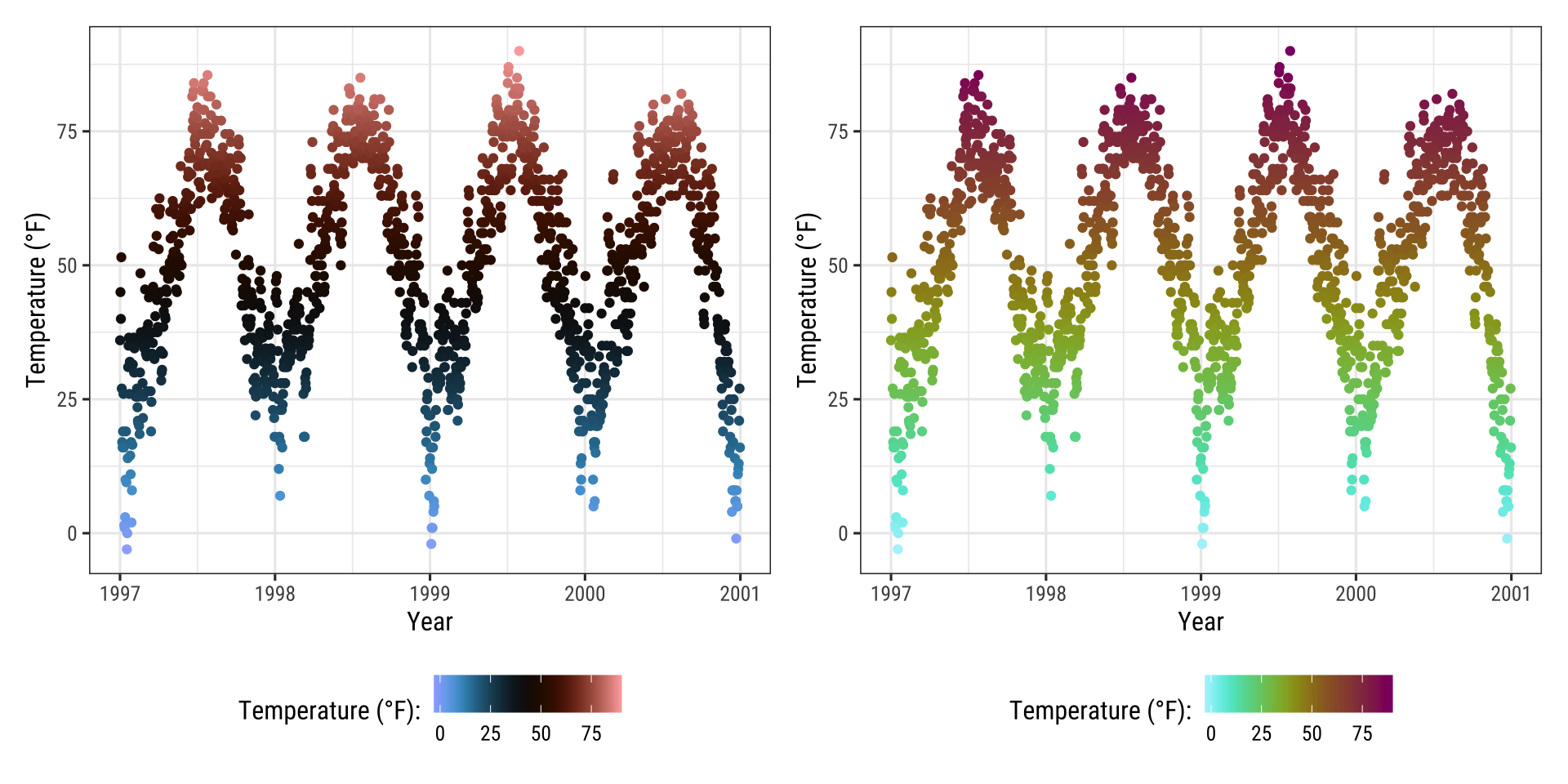
Modify Color Palettes Afterwards
Since the release of ggplot2 3.0.0, one can modify layer aesthetics after they have been mapped to the data.
Or as the {ggplot2} phrases it: “Use after_scale() to flag evaluation of mapping for after data has been scaled.”
So why not use the modified colors in the first place?
Since {ggplot2} can only handle one color and one fill scale, this is an interesting functionality.
Look closer at the following example where we use clr_negate() from the {prismatic} package:
library(prismatic)

ggplot(chic, aes(date, temp, color = temp)) +
  geom_point(size = 5) +
  geom_point(aes(color = temp,
                 color = after_scale(clr_negate(color))),
             size = 2) +
  scale_color_scico(palette = "hawaii", guide = "none") +
  labs(x = "Year", y = "Temperature (°F)")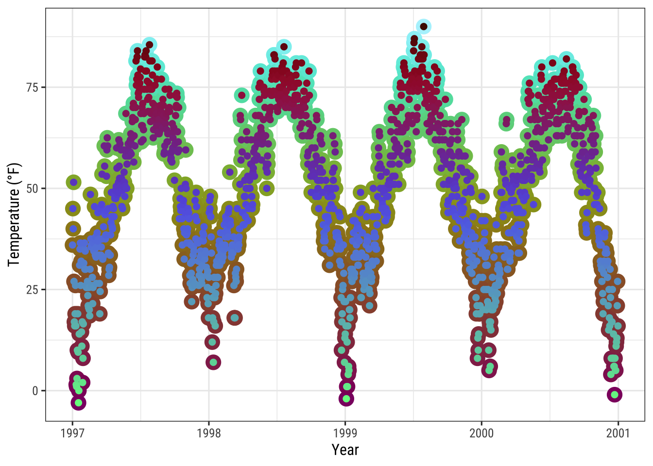
Changing the color scheme afterwards is especially fun with functions from the {prismatic} packages, namely clr_negate(), clr_lighten(), clr_darken() and clr_desaturate().
You can even combine those functions.
Here, we plot a box plot that has both arguments, color and fill:
library(prismatic)

ggplot(chic, aes(date, temp)) +
  geom_boxplot(
    aes(color = season,
        fill = after_scale(clr_desaturate(clr_lighten(color, .6), .6))),
    linewidth = 1
  ) +
  scale_color_brewer(palette = "Dark2", guide = "none") +
  labs(x = "Year", y = "Temperature (°F)")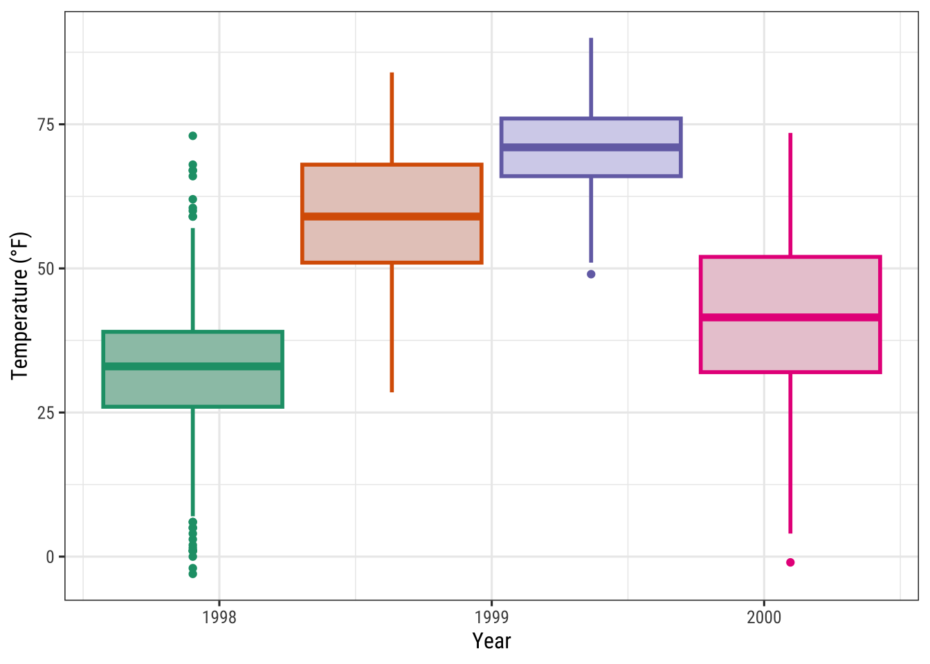
Note that you need to specify the color and/or fill in the aes() of the respective geom_*() or stat_*() to make after_scale() work.
💡 This seems a bit complicated for now—one could simply use the color and fill scales for both. Yes, that is true but think about use cases where you need several color and/or fill scales. In such a case, it would be senseless to occupy the fill scale with a slightly darker version of the palette used for color.
Working with Themes
Change the Overall Plotting Style
You can change the entire look of the plots by using themes.
{ggplot2} comes with eight built-in themes:
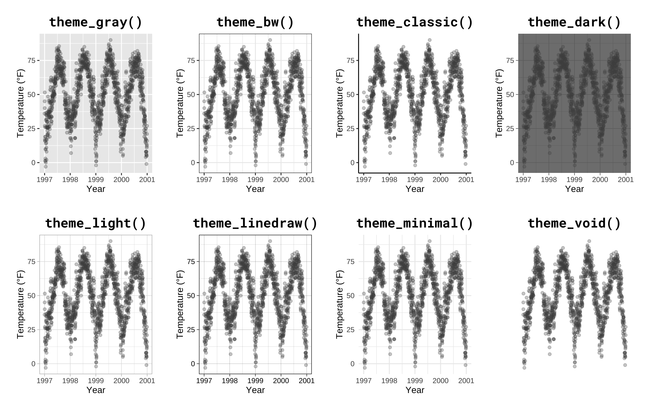
There are several packages that provide additional themes, some even with different default color palettes.
As an example, Jeffrey Arnold has put together the library {ggthemes} with several custom themes imitating popular designs.
For a list you can visit the {ggthemes} package site.
Without any coding you can just adapt several styles, some of them well known for their style and aesthetics.
Here is an example copying the plotting style in the The Economist magazine by using theme_economist() and scale_color_economist():
library(ggthemes)

ggplot(chic, aes(x = date, y = temp, color = season)) +
  geom_point() +
  labs(x = "Year", y = "Temperature (°F)") +
  ggtitle("Ups and Downs of Chicago's Daily Temperatures") +
  theme_economist() +
  scale_color_economist(name = NULL)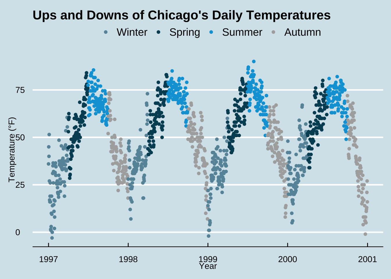
Another example is the plotting style of Tufte, a minimal ink theme based on Edward Tufte’s book The Visual Display of Quantitative Information. This is the book that popularized Minard’s chart depicting Napoleon’s march on Russia as one of the best statistical drawings ever created. Tufte’s plots became famous due to the purism in their style. But see yourself:
library(dplyr)
chic_2000 <- filter(chic, year == 2000)

ggplot(chic_2000, aes(x = temp, y = o3)) +
  geom_point() +
  labs(x = "Temperature (°F)", y = "Ozone") +
  ggtitle("Temperature and Ozone Levels During the Year 2000 in Chicago") +
  theme_tufte()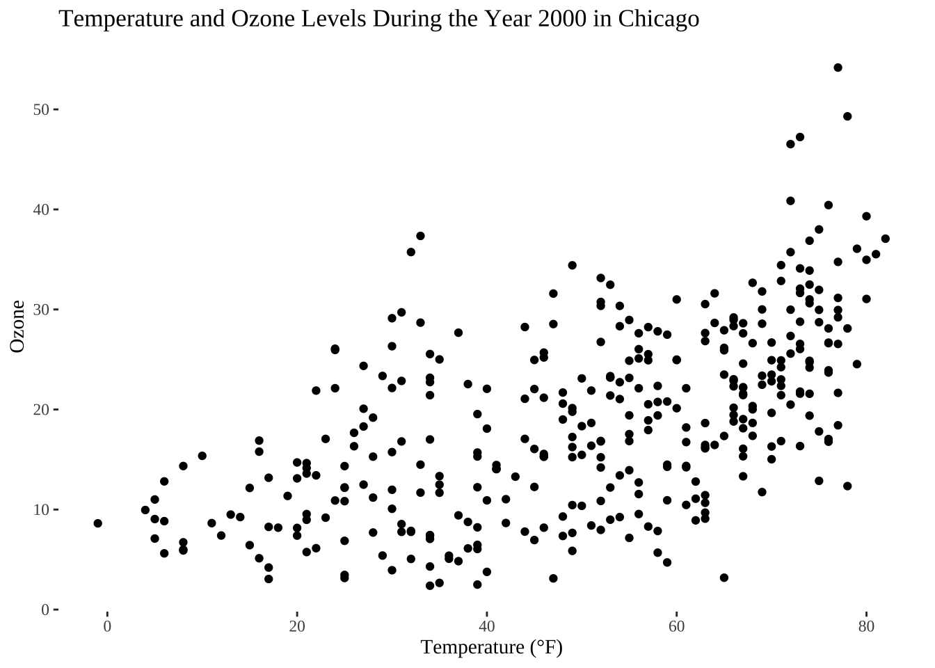
I reduced the number of data points here simply to fit it Tufte’s minimalism style. If you like the way of plotting have a look on this blog entry creating several Tufte plots in R.
Another neat packages with modern themes and a preset of non-default fonts is the {hrbrthemes} package by Bob Rudis with several light but also dark themes:
library(hrbrthemes)

ggplot(chic, aes(x = temp, y = o3)) +
  geom_point(aes(color = dewpoint), show.legend = FALSE) +
  labs(x = "Temperature (°F)", y = "Ozone") +
  ggtitle("Temperature and Ozone Levels in Chicago")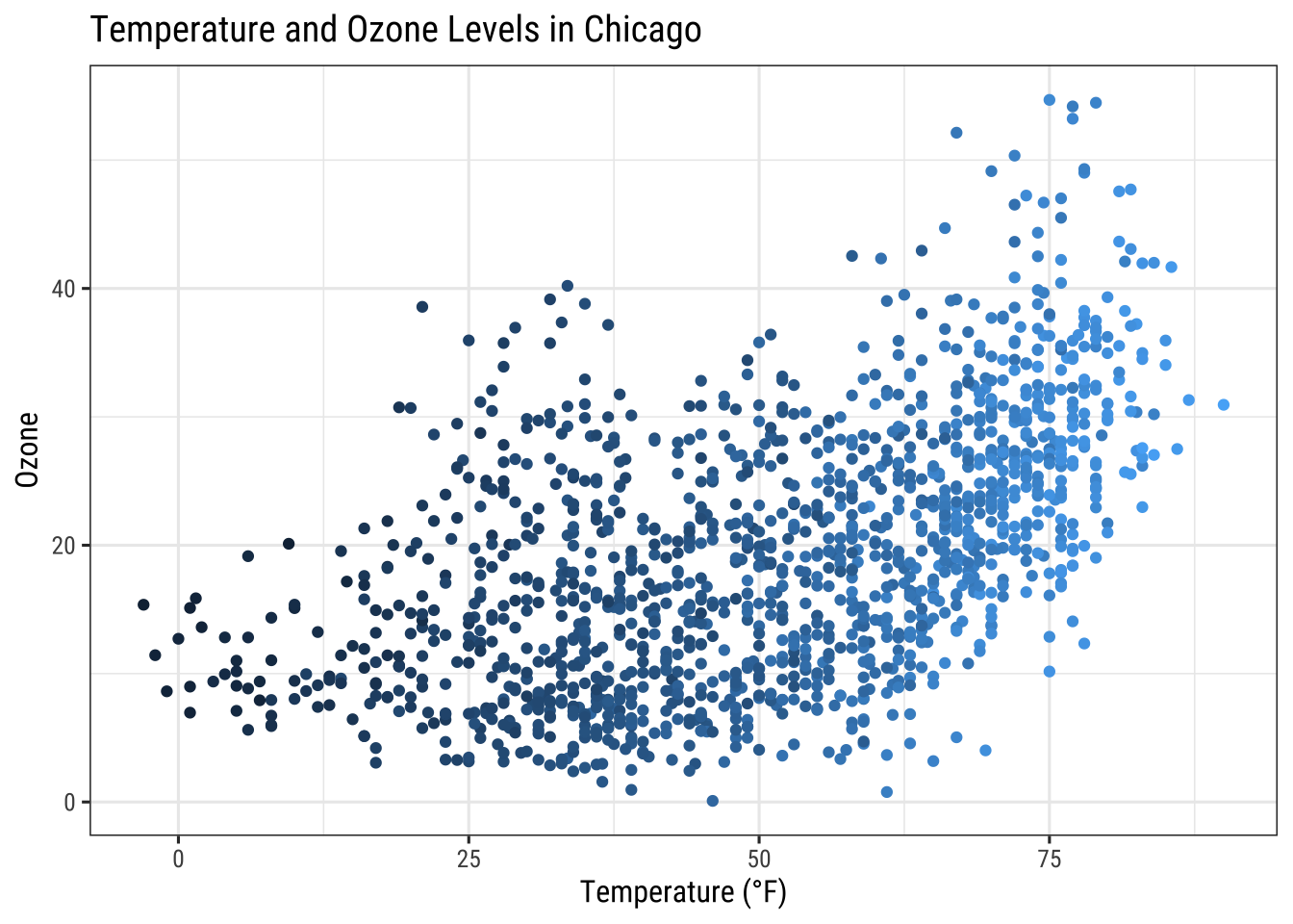
Change the Font of All Text Elements
It is incredibly easy to change the settings of all the text elements at once.
All themes come with an argument called base_family:
g <- ggplot(chic, aes(x = date, y = temp)) +
  geom_point(color = "firebrick") +
  labs(x = "Year", y = "Temperature (°F)",
       title = "Temperatures in Chicago")

g + theme_bw(base_family = "Playfair")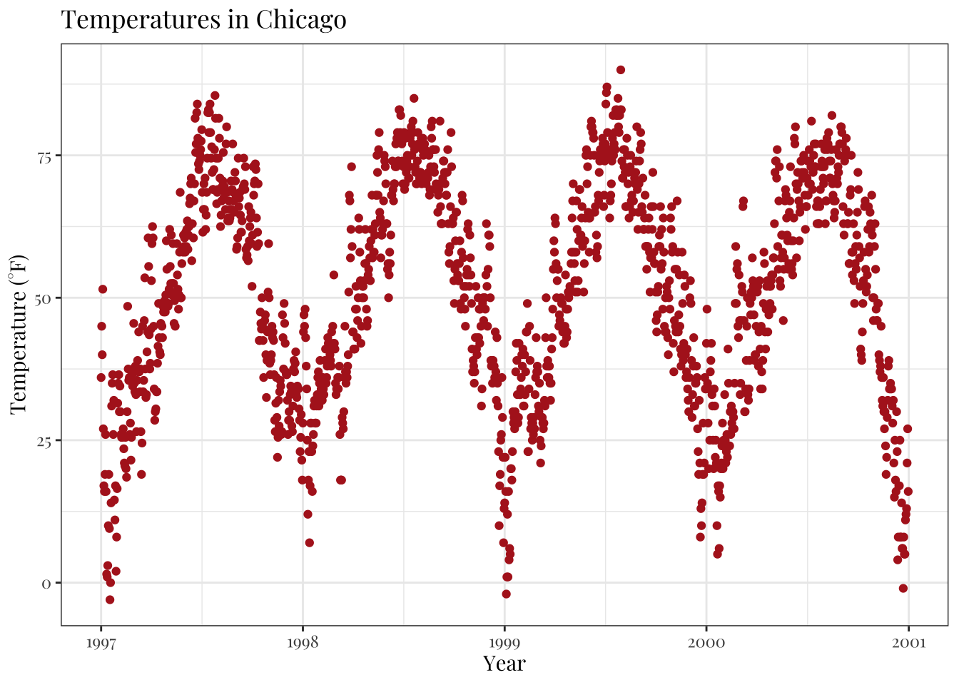
Change the Size of All Text Elements
The theme_*() functions also come with several other base_* arguments.
If you have a closer look at the default theme (see chapter “Create and Use Your Custom Theme” below) you will notice that the sizes of all the elements are relative (rel()) to the base_size.
As a result, you can simply change the base_size if you want to increase readability of your plots:
g + theme_bw(base_size = 30, base_family = "Roboto Condensed")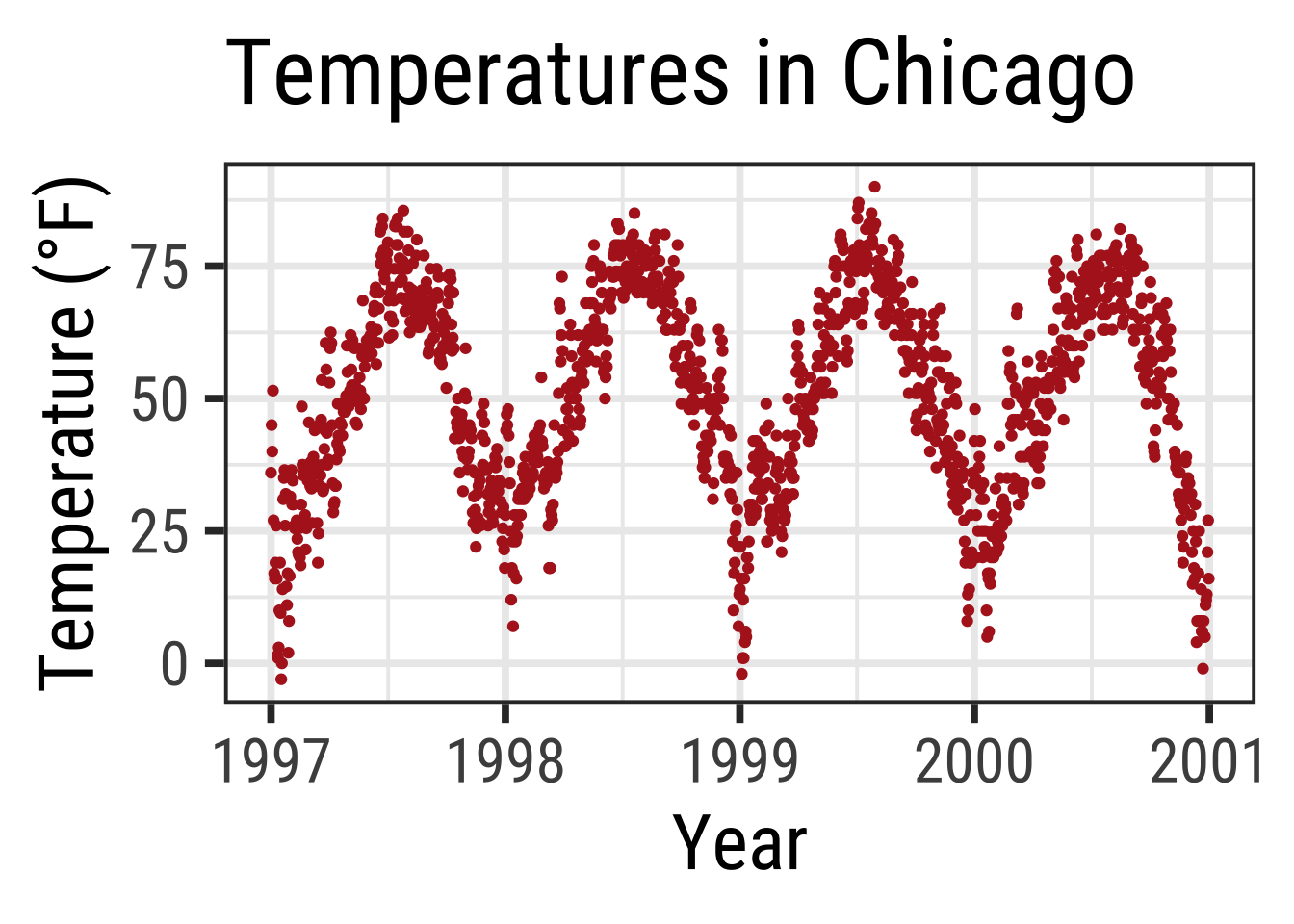
Change the Size of All Line and Rect Elements
Similarly, you can change the size of all elements of type line and rect:
g + theme_bw(base_line_size = 1, base_rect_size = 1)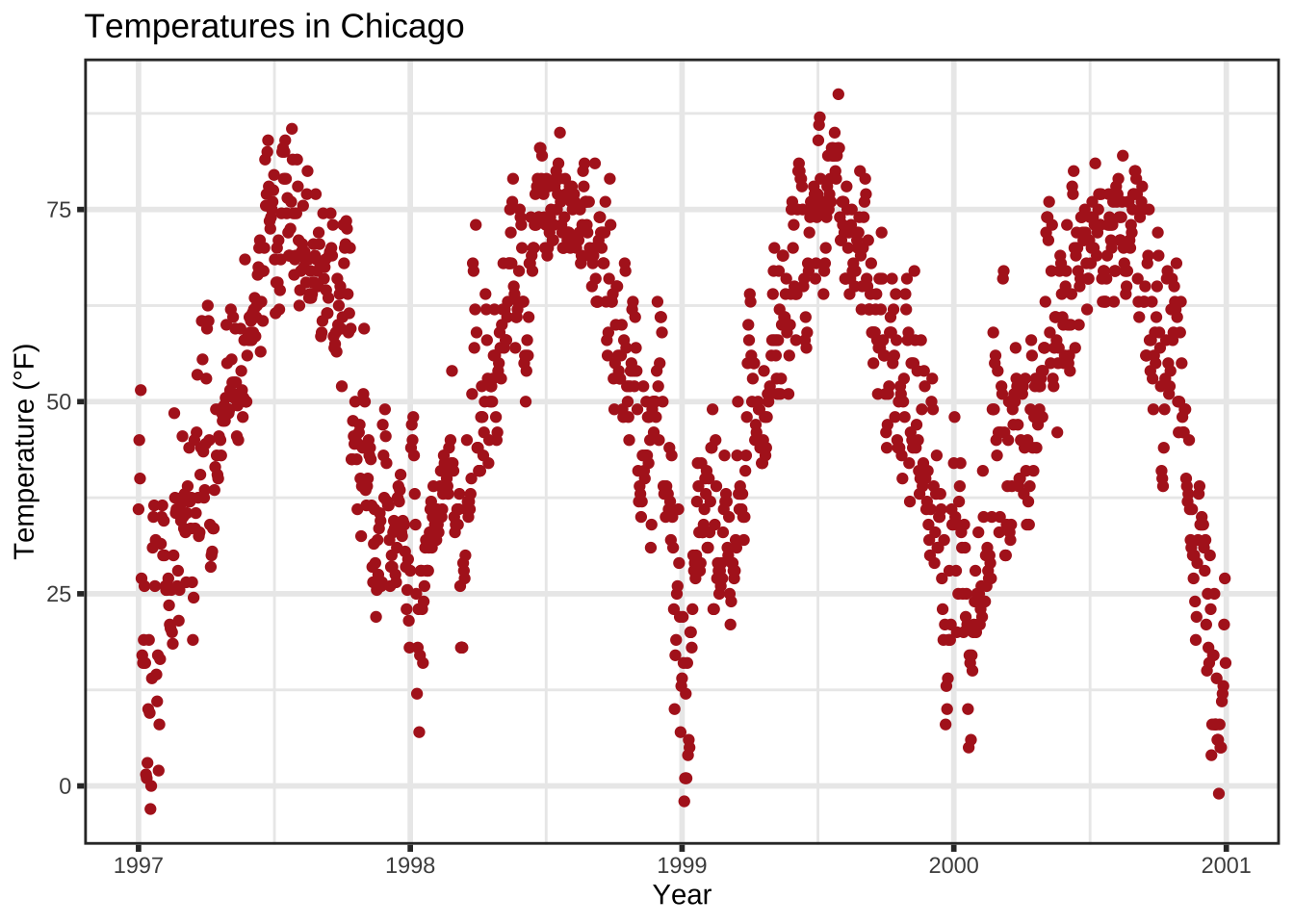
Create Your Own Theme
If you want to change the theme for an entire session you can use theme_set as in theme_set(theme_bw()).
The default is called theme_gray (or theme_gray).
If you wanted to create your own custom theme, you could extract the code directly from the gray theme and modify.
Note that the rel() function change the sizes relative to the base_size.
theme_gray## function (base_size = 11, base_family = "", base_line_size = base_size/22,
## base_rect_size = base_size/22)
## {
## half_line <- base_size/2
## t <- theme(line = element_line(colour = "black", linewidth = base_line_size,
## linetype = 1, lineend = "butt"), rect = element_rect(fill = "white",
## colour = "black", linewidth = base_rect_size, linetype = 1),
## text = element_text(family = base_family, face = "plain",
## colour = "black", size = base_size, lineheight = 0.9,
## hjust = 0.5, vjust = 0.5, angle = 0, margin = margin(),
## debug = FALSE), axis.line = element_blank(), axis.line.x = NULL,
## axis.line.y = NULL, axis.text = element_text(size = rel(0.8),
## colour = "grey30"), axis.text.x = element_text(margin = margin(t = 0.8 *
## half_line/2), vjust = 1), axis.text.x.top = element_text(margin = margin(b = 0.8 *
## half_line/2), vjust = 0), axis.text.y = element_text(margin = margin(r = 0.8 *
## half_line/2), hjust = 1), axis.text.y.right = element_text(margin = margin(l = 0.8 *
## half_line/2), hjust = 0), axis.ticks = element_line(colour = "grey20"),
## axis.ticks.length = unit(half_line/2, "pt"), axis.ticks.length.x = NULL,
## axis.ticks.length.x.top = NULL, axis.ticks.length.x.bottom = NULL,
## axis.ticks.length.y = NULL, axis.ticks.length.y.left = NULL,
## axis.ticks.length.y.right = NULL, axis.title.x = element_text(margin = margin(t = half_line/2),
## vjust = 1), axis.title.x.top = element_text(margin = margin(b = half_line/2),
## vjust = 0), axis.title.y = element_text(angle = 90,
## margin = margin(r = half_line/2), vjust = 1), axis.title.y.right = element_text(angle = -90,
## margin = margin(l = half_line/2), vjust = 0), legend.background = element_rect(colour = NA),
## legend.spacing = unit(2 * half_line, "pt"), legend.spacing.x = NULL,
## legend.spacing.y = NULL, legend.margin = margin(half_line,
## half_line, half_line, half_line), legend.key = element_rect(fill = "grey95",
## colour = NA), legend.key.size = unit(1.2, "lines"),
## legend.key.height = NULL, legend.key.width = NULL, legend.text = element_text(size = rel(0.8)),
## legend.text.align = NULL, legend.title = element_text(hjust = 0),
## legend.title.align = NULL, legend.position = "right",
## legend.direction = NULL, legend.justification = "center",
## legend.box = NULL, legend.box.margin = margin(0, 0, 0,
## 0, "cm"), legend.box.background = element_blank(),
## legend.box.spacing = unit(2 * half_line, "pt"), panel.background = element_rect(fill = "grey92",
## colour = NA), panel.border = element_blank(), panel.grid = element_line(colour = "white"),
## panel.grid.minor = element_line(linewidth = rel(0.5)),
## panel.spacing = unit(half_line, "pt"), panel.spacing.x = NULL,
## panel.spacing.y = NULL, panel.ontop = FALSE, strip.background = element_rect(fill = "grey85",
## colour = NA), strip.clip = "inherit", strip.text = element_text(colour = "grey10",
## size = rel(0.8), margin = margin(0.8 * half_line,
## 0.8 * half_line, 0.8 * half_line, 0.8 * half_line)),
## strip.text.x = NULL, strip.text.y = element_text(angle = -90),
## strip.text.y.left = element_text(angle = 90), strip.placement = "inside",
## strip.placement.x = NULL, strip.placement.y = NULL, strip.switch.pad.grid = unit(half_line/2,
## "pt"), strip.switch.pad.wrap = unit(half_line/2,
## "pt"), plot.background = element_rect(colour = "white"),
## plot.title = element_text(size = rel(1.2), hjust = 0,
## vjust = 1, margin = margin(b = half_line)), plot.title.position = "panel",
## plot.subtitle = element_text(hjust = 0, vjust = 1, margin = margin(b = half_line)),
## plot.caption = element_text(size = rel(0.8), hjust = 1,
## vjust = 1, margin = margin(t = half_line)), plot.caption.position = "panel",
## plot.tag = element_text(size = rel(1.2), hjust = 0.5,
## vjust = 0.5), plot.tag.position = "topleft", plot.margin = margin(half_line,
## half_line, half_line, half_line), complete = TRUE)
## ggplot_global$theme_all_null %+replace% t
## }
## <bytecode: 0x10d212848>
## <environment: namespace:ggplot2>Now, let us modify the default theme function and have a look at the result:
theme_custom <- function (base_size = 12, base_family = "Roboto Condensed") {
  half_line <- base_size/2
  theme(
    line = element_line(color = "black", linewidth = .5,
                        linetype = 1, lineend = "butt"),
    rect = element_rect(fill = "white", color = "black",
                        linewidth = .5, linetype = 1),
    text = element_text(family = base_family, face = "plain",
                        color = "black", size = base_size,
                        lineheight = .9, hjust = .5, vjust = .5,
                        angle = 0, margin = margin(), debug = FALSE),
    axis.line = element_blank(),
    axis.line.x = NULL,
    axis.line.y = NULL,
    axis.text = element_text(size = base_size * 1.1, color = "gray30"),
    axis.text.x = element_text(margin = margin(t = .8 * half_line/2),
                               vjust = 1),
    axis.text.x.top = element_text(margin = margin(b = .8 * half_line/2),
                                   vjust = 0),
    axis.text.y = element_text(margin = margin(r = .8 * half_line/2),
                               hjust = 1),
    axis.text.y.right = element_text(margin = margin(l = .8 * half_line/2),
                                     hjust = 0),
    axis.ticks = element_line(color = "gray30", linewidth = .7),
    axis.ticks.length = unit(half_line / 1.5, "pt"),
    axis.ticks.length.x = NULL,
    axis.ticks.length.x.top = NULL,
    axis.ticks.length.x.bottom = NULL,
    axis.ticks.length.y = NULL,
    axis.ticks.length.y.left = NULL,
    axis.ticks.length.y.right = NULL,
    axis.title.x = element_text(margin = margin(t = half_line),
                                vjust = 1, size = base_size * 1.3,
                                face = "bold"),
    axis.title.x.top = element_text(margin = margin(b = half_line),
                                    vjust = 0),
    axis.title.y = element_text(angle = 90, vjust = 1,
                                margin = margin(r = half_line),
                                size = base_size * 1.3, face = "bold"),
    axis.title.y.right = element_text(angle = -90, vjust = 0,
                                      margin = margin(l = half_line)),
    legend.background = element_rect(color = NA),
    legend.spacing = unit(.4, "cm"),
    legend.spacing.x = NULL,
    legend.spacing.y = NULL,
    legend.margin = margin(.2, .2, .2, .2, "cm"),
    legend.key = element_rect(fill = "gray95", color = "white"),
    legend.key.size = unit(1.2, "lines"),
    legend.key.height = NULL,
    legend.key.width = NULL,
    legend.text = element_text(size = rel(.8)),
    legend.text.align = NULL,
    legend.title = element_text(hjust = 0),
    legend.title.align = NULL,
    legend.position = "right",
    legend.direction = NULL,
    legend.justification = "center",
    legend.box = NULL,
    legend.box.margin = margin(0, 0, 0, 0, "cm"),
    legend.box.background = element_blank(),
    legend.box.spacing = unit(.4, "cm"),
    panel.background = element_rect(fill = "white", color = NA),
    panel.border = element_rect(color = "gray30",
                                fill = NA, linewidth = .7),
    panel.grid.major = element_line(color = "gray90", linewidth = 1),
    panel.grid.minor = element_line(color = "gray90", linewidth = .5,
                                    linetype = "dashed"),
    panel.spacing = unit(base_size, "pt"),
    panel.spacing.x = NULL,
    panel.spacing.y = NULL,
    panel.ontop = FALSE,
    strip.background = element_rect(fill = "white", color = "gray30"),
    strip.text = element_text(color = "black", size = base_size),
    strip.text.x = element_text(margin = margin(t = half_line,
                                                b = half_line)),
    strip.text.y = element_text(angle = -90,
                                margin = margin(l = half_line,
                                                r = half_line)),
    strip.text.y.left = element_text(angle = 90),
    strip.placement = "inside",
    strip.placement.x = NULL,
    strip.placement.y = NULL,
    strip.switch.pad.grid = unit(0.1, "cm"),
    strip.switch.pad.wrap = unit(0.1, "cm"),
    plot.background = element_rect(color = NA),
    plot.title = element_text(size = base_size * 1.8, hjust = .5,
                              vjust = 1, face = "bold",
                              margin = margin(b = half_line * 1.2)),
    plot.title.position = "panel",
    plot.subtitle = element_text(size = base_size * 1.3,
                                 hjust = .5, vjust = 1,
                                 margin = margin(b = half_line * .9)),
    plot.caption = element_text(size = rel(0.9), hjust = 1, vjust = 1,
                                margin = margin(t = half_line * .9)),
    plot.caption.position = "panel",
    plot.tag = element_text(size = rel(1.2), hjust = .5, vjust = .5),
    plot.tag.position = "topleft",
    plot.margin = margin(rep(base_size, 4)),
    complete = TRUE
  )
}
💡 You can only overwrite the defaults for all elements you want to change. Here I listed all so you can see that you can change literally change everything!
Have a look on the modified aesthetics with its new look of panel and gridlines as well as axes ticks, texts and titles:
theme_set(theme_custom())

ggplot(chic, aes(x = date, y = temp, color = season)) +
  geom_point() + labs(x = "Year", y = "Temperature (°F)") + guides(color = "none")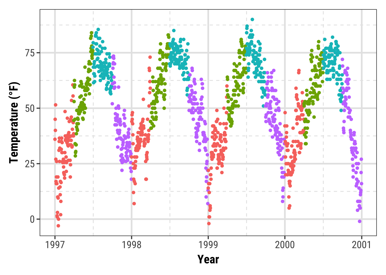
This way of changing the plot design is highly recommended! It allows you to quickly change any element of your plots by changing it once. You can within a few seconds plot all your results in a congruent style and adapt it to other needs (e.g. a presentation with bigger font size or journal requirements).
Update the Current Theme
You can also set quick changes using theme_update():
theme_custom <- theme_update(panel.background = element_rect(fill = "gray60"))

ggplot(chic, aes(x = date, y = temp, color = season)) +
  geom_point() + labs(x = "Year", y = "Temperature (°F)") + guides(color = "none")
For further exercises, we are going to use our own theme with a white filling and without the minor grid lines:
theme_custom <- theme_update(
  panel.background = element_rect(fill = "white"),
  panel.grid.major = element_line(linewidth = .5),
  panel.grid.minor = element_blank()
)Working with Lines
Add Horizonal or Vertical Lines to a Plot
You might want to highlight a given range or threshold, which can be done plotting a line at defined coordinates using geom_hline() (for “horizontal lines”) or geom_vline() (for “vertical lines”):
ggplot(chic, aes(x = date, y = temp, color = o3)) +
  geom_point() +
  geom_hline(yintercept = c(0, 73)) +
  labs(x = "Year", y = "Temperature (°F)")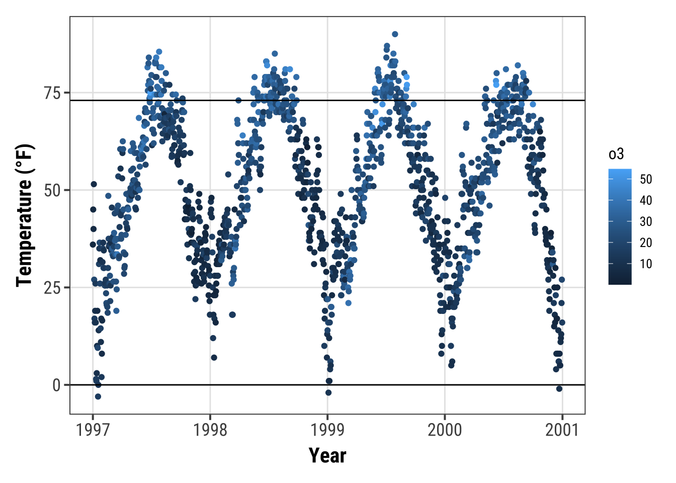
g <- ggplot(chic, aes(x = temp, y = dewpoint)) +
  geom_point(color = "dodgerblue", alpha = .5) +
  labs(x = "Temperature (°F)", y = "Dewpoint")

g +
  geom_vline(aes(xintercept = median(temp)), linewidth = 1.5,
             color = "firebrick", linetype = "dashed") +
  geom_hline(aes(yintercept = median(dewpoint)), linewidth = 1.5,
             color = "firebrick", linetype = "dashed")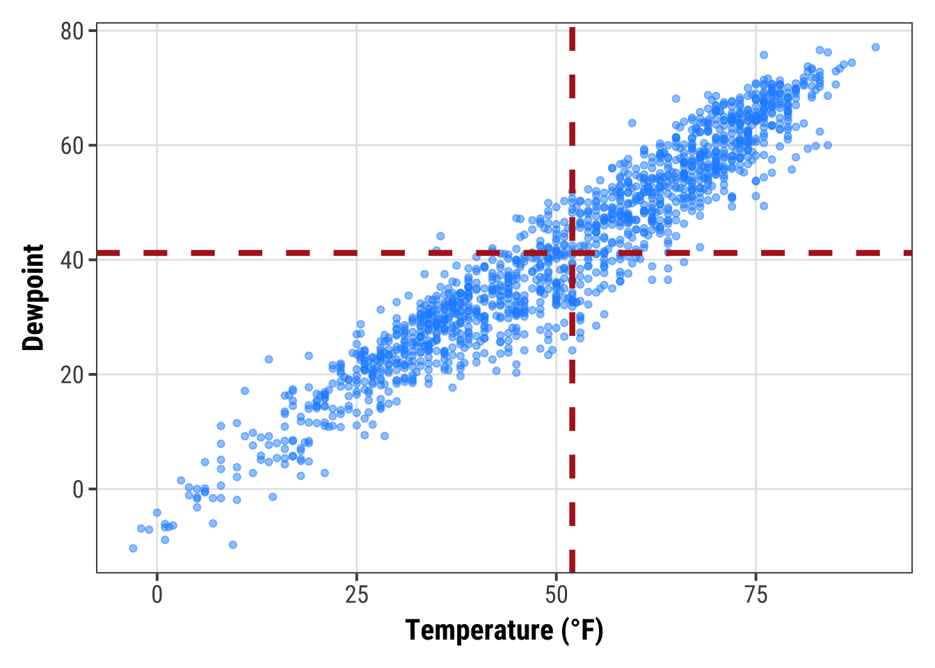
If you want to add a line with a slope not being 0 or 1, respectively, you need to use geom_abline().
This is for example the case if you want to add a regression line using the arguments intercept and slope:
reg <- lm(dewpoint ~ temp, data = chic)

g +
  geom_abline(intercept = coefficients(reg)[1],
              slope = coefficients(reg)[2],
              color = "darkorange2",
              linewidth = 1.5) +
  labs(title = paste0("y = ", round(coefficients(reg)[2], 2),
                      " * x + ", round(coefficients(reg)[1], 2)))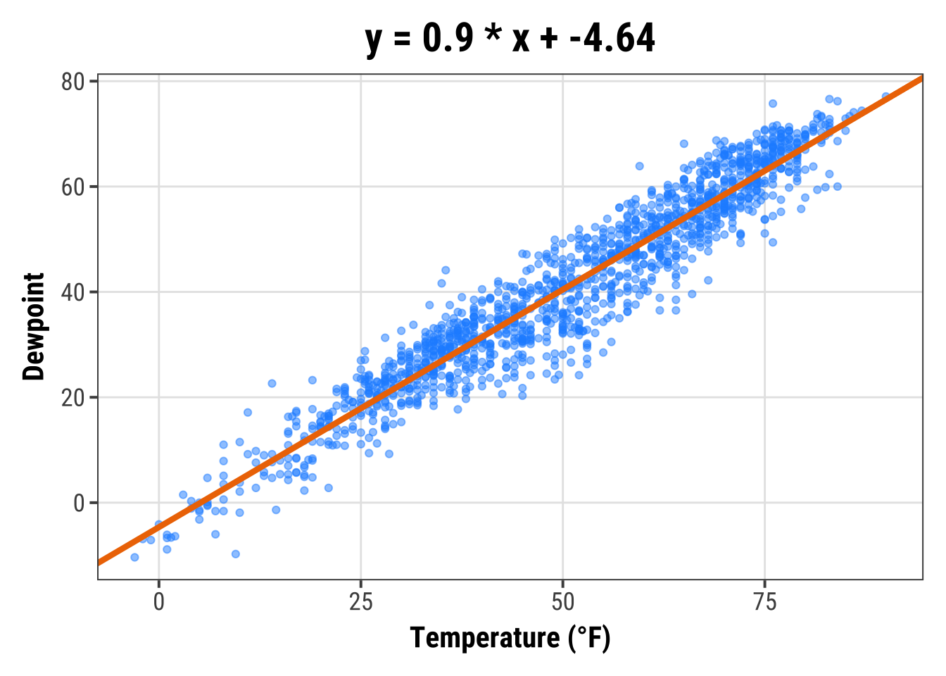
Later, we will learn how to add a linear fit with one command using stat_smooth(method = "lm").
However, there might be other reasons to add a line with a given slope and this is how one does it 🤷
Add a Line within a Plot
The previous approaches always covered the whole range of the plot panel, but sometimes one wants to highlight only a given area or use lines for annotations.
In this case, geom_linerange() is here to help:
g +
  ## vertical line
  geom_linerange(aes(x = 50, ymin = 20, ymax = 55),
                 color = "steelblue", linewidth = 2) +
  ## horizontal line
  geom_linerange(aes(xmin = -Inf, xmax = 25, y = 0),
                 color = "red", linewidth = 1)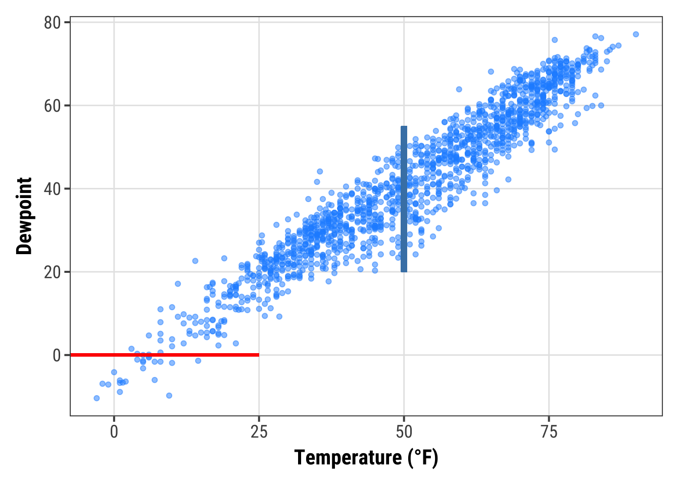
Or you can use annotate(geom = "segment") to draw lines with a slope differing from 0 and 1:
g +
  annotate(geom = "segment",
           x = 50, xend = 75,
                   y = 20, yend = 45,
               color = "purple", linewidth = 2)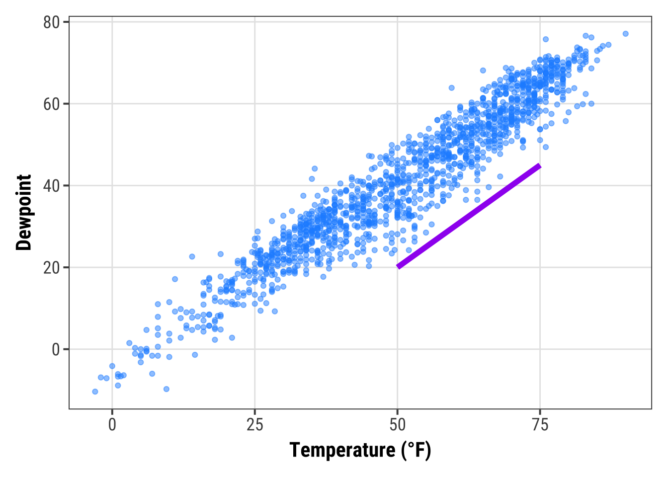
Add Curved Lines and Arrows to a Plot
annotate(geom = "curve") adds curves.
Well, and straight lines if you like:
g +
  annotate(geom = "curve",x = 0, y = 60, xend = 75, yend = 0,
             color = "tan", linewidth = 2) +
  annotate(geom = "curve",
           x = 0, y = 60, xend = 75, yend = 0,
             curvature = -0.7, angle = 45,
             color = "darkgoldenrod1", linewidth = 1) +
  annotate(geom = "curve", x = 0, y = 60, xend = 75, yend = 0,
             curvature = 0, linewidth = 1.5)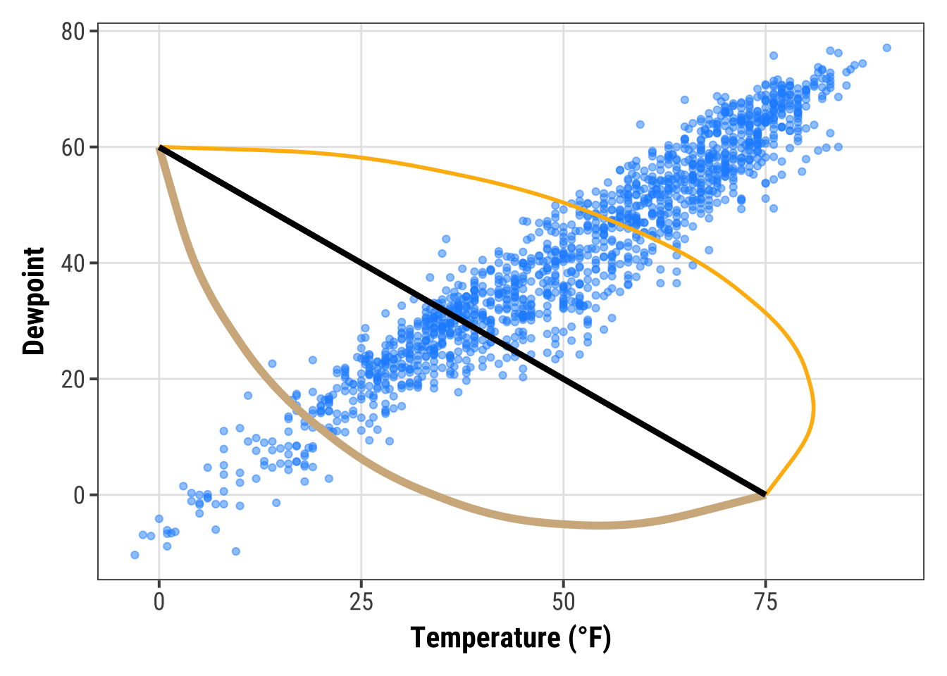
The same geom can be used to draw arrows:
g +
  annotate(geom = "curve", x = 0, y = 60, xend = 75, yend = 0,
             color = "tan", linewidth = 2,
             arrow = arrow(length = unit(0.07, "npc"))) +
  annotate(geom = "curve", x = 5, y = 55, xend = 70, yend = 5,
             curvature = -0.7, angle = 45,
             color = "darkgoldenrod1", linewidth = 1,
             arrow = arrow(length = unit(0.03, "npc"),
                           type = "closed",
                           ends = "both"))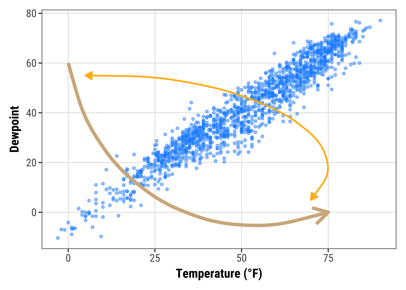
Working with Text
Add Labels to Your Data
Sometimes, we want to label our data points.
To avoid overlaying and crowding by text labels, we use a 1% sample of the original data, equally representing the four seasons.
We are using geom_label() which comes with a new aesthetic called label:
set.seed(2020)

sample <- chic |>
  dplyr::group_by(season) |>
  dplyr::sample_frac(0.01)

## code without pipes:
## sample <- sample_frac(group_by(chic, season), .01)

ggplot(sample, aes(x = date, y = temp, color = season)) +
  geom_point() +
  geom_label(aes(label = season), hjust = .5, vjust = -.5) +
  labs(x = "Year", y = "Temperature (°F)") +
  xlim(as.Date(c('1997-01-01', '2000-12-31'))) +
  ylim(c(0, 90)) +
  theme(legend.position = "none")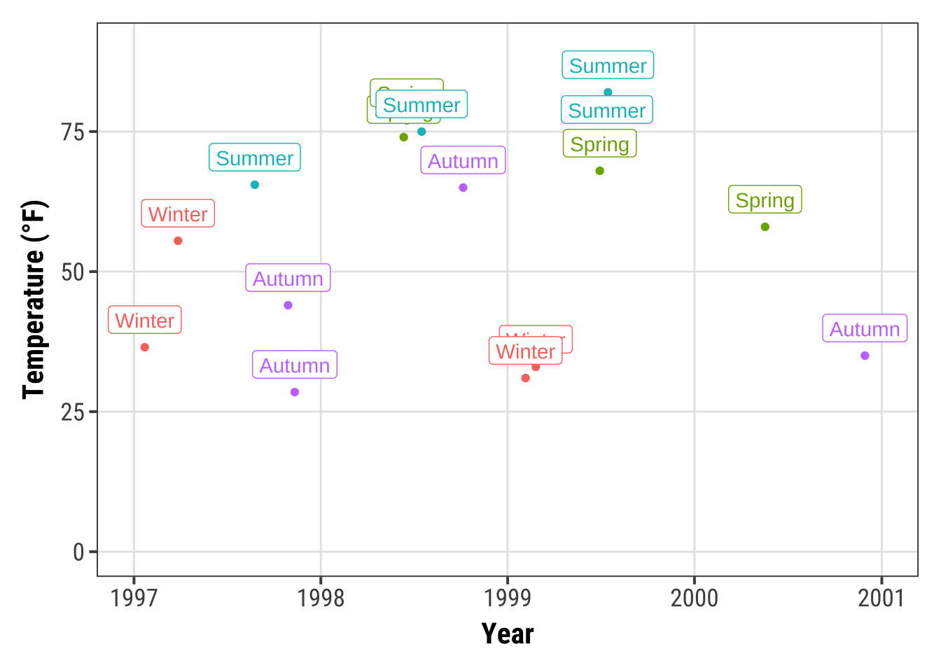
Okay, avoiding overlap of labels did not work out. But don’t worry, we are going to fix it in a minute!
💁 You can also use geom_text() if you don’t like boxes around your labels.
Expand to see example.
ggplot(sample, aes(x = date, y = temp, color = season)) +
  geom_point() +
  geom_text(aes(label = season), fontface = "bold",
            hjust = .5, vjust = -.25) +
  labs(x = "Year", y = "Temperature (°F)") +
  xlim(as.Date(c('1997-01-01', '2000-12-31'))) +
  ylim(c(0, 90)) +
  theme(legend.position = "none")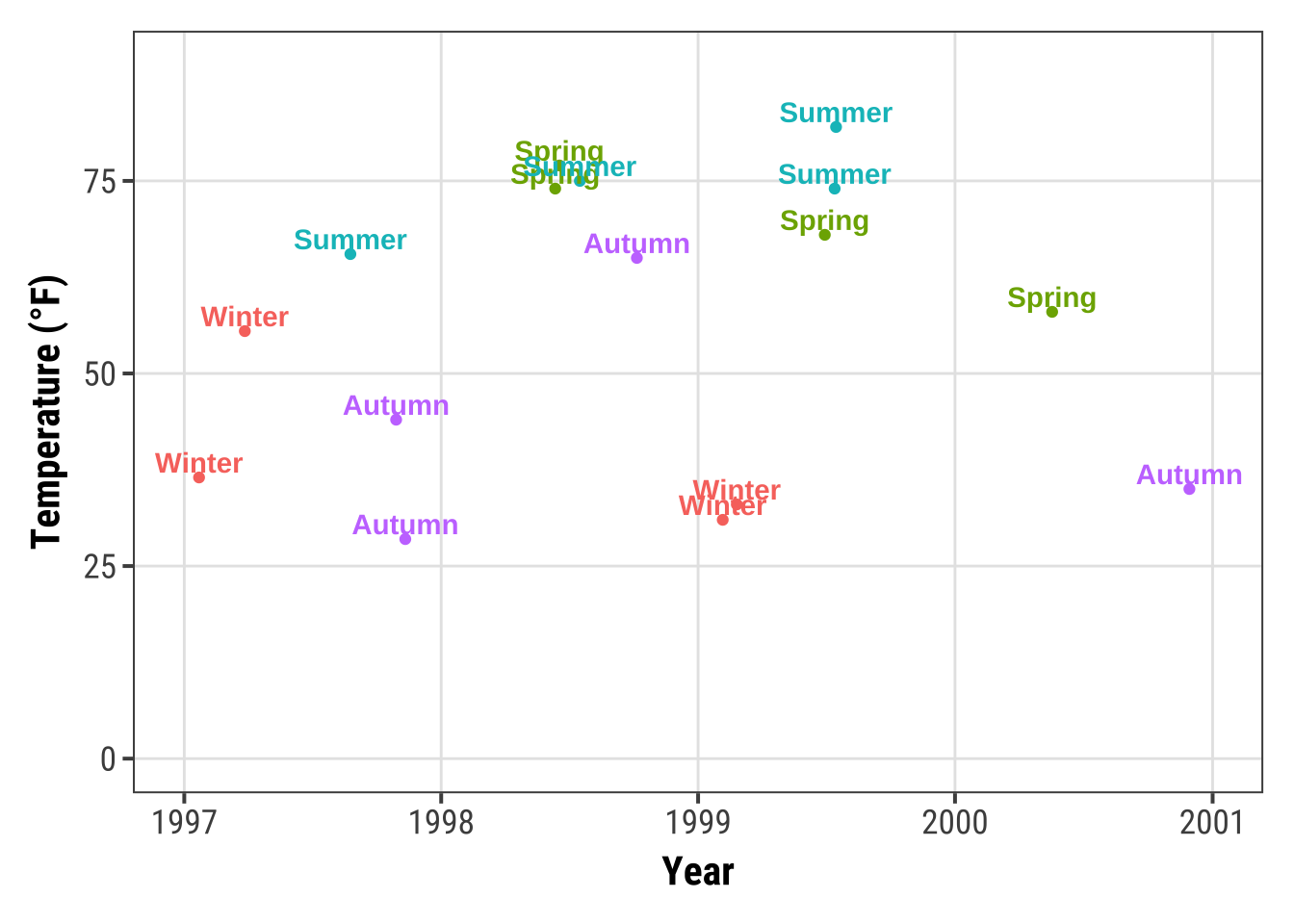
The {ggrepel} package offers some great utilities by providing geoms for {ggplot2} to repel overlapping text as in our examples above.
We simply replace geom_text() by geom_text_repel() and geom_label() by geom_label_repel():
library(ggrepel)

ggplot(sample, aes(x = date, y = temp, color = season)) +
  geom_point() +
  geom_label_repel(aes(label = season), fontface = "bold") +
  labs(x = "Year", y = "Temperature (°F)") +
  theme(legend.position = "none")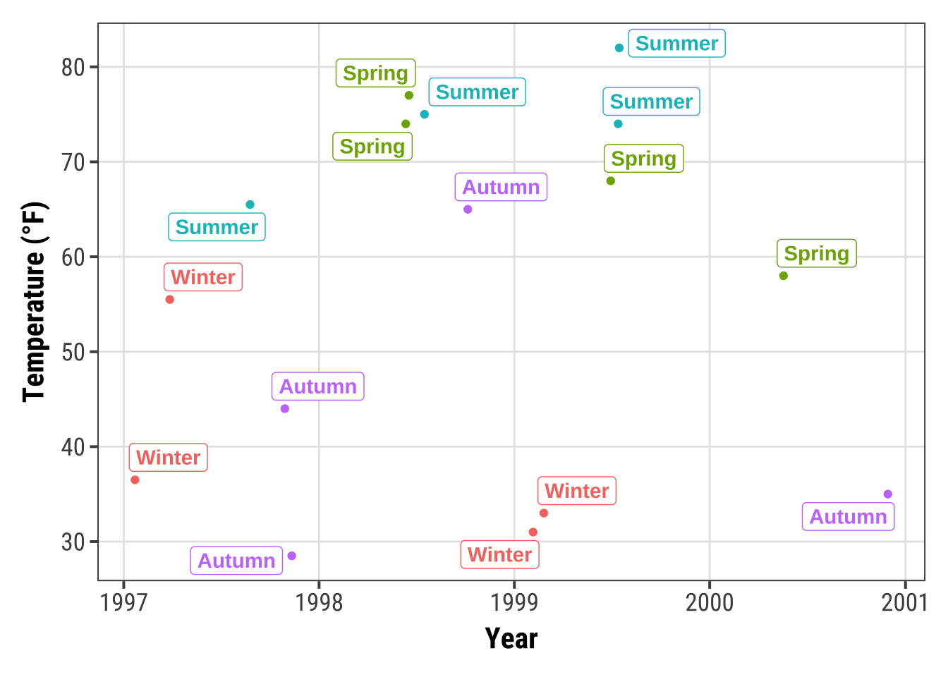
It may look nicer with filled boxes so we map season to fill instead to color and set a white color for the text:
ggplot(sample, aes(x = date, y = temp)) +
  geom_point(data = chic, size = .5) +
  geom_point(aes(color = season), size = 1.5) +
  geom_label_repel(aes(label = season, fill = season),
                   color = "white", fontface = "bold",
                   segment.color = "grey30") +
  labs(x = "Year", y = "Temperature (°F)") +
  theme(legend.position = "none")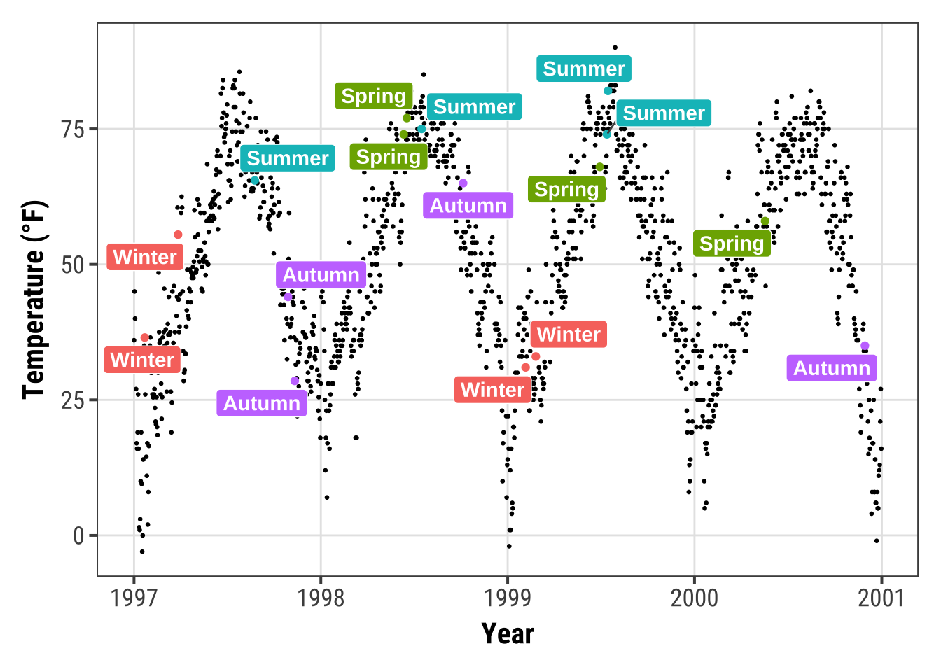
This also works for the pure text labels by using geom_text_repel().
Have a look at all the usage examples.
Add Text Annotations
There are several ways how one can add annotations to a ggplot.
We can again use annotate(geom = "text"), annotate(geom = "label"), geom_text() or geom_label():
g <-
  ggplot(chic, aes(x = temp, y = dewpoint)) +
  geom_point(alpha = .5) +
  labs(x = "Temperature (°F)", y = "Dewpoint")

g +
  annotate(geom = "text", x = 25, y = 60, fontface = "bold",
                label = "This is a useful annotation")
However, now ggplot has drawn one text label per data point—that’s 1,461 labels and you only see one!
You can solve that by setting the stat argument to "unique":
g +
  geom_text(aes(x = 25, y = 60,
                label = "This is a useful annotation"),
            stat = "unique")
By the way, of course one can change the properties of the displayed text:
g +
  geom_text(aes(x = 25, y = 60,
                label = "This is a useful annotation"),
            stat = "unique", family = "Bangers",
            size = 7, color = "darkcyan")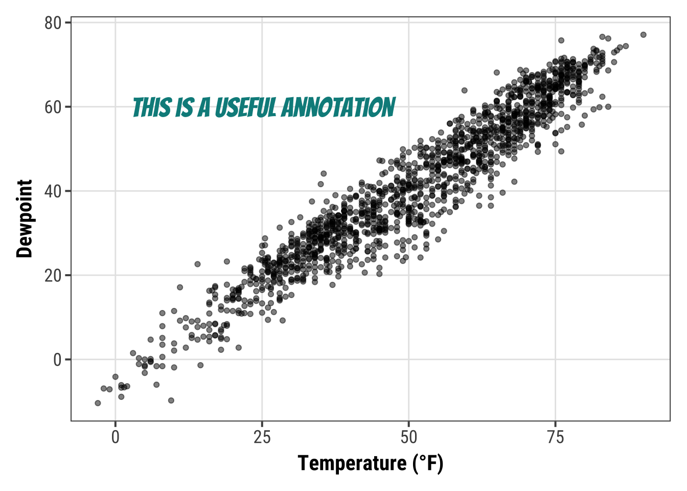
In case you use one of the facet functions to visualize your data you might run into trouble. One thing is that you may want to include the annotation only once:
ann <- data.frame(
  o3 = 30,
  temp = 20,
  season = factor("Summer", levels = levels(chic$season)),
  label = "Here is enough space\nfor some annotations."
)

g <-
  ggplot(chic, aes(x = o3, y = temp)) +
  geom_point() +
  labs(x = "Ozone", y = "Temperature (°F)")

g +
  geom_text(data = ann, aes(label = label),
            size = 7, fontface = "bold",
            family = "Roboto Condensed") +
  facet_wrap(~season)
Another challenge are facets in combination with free scales that might cut your text:
g +
  geom_text(aes(x = 23, y = 97,
                label = "This is not a useful annotation"),
            size = 5, fontface = "bold") +
  scale_y_continuous(limits = c(NA, 100)) +
  facet_wrap(~season, scales = "free_x")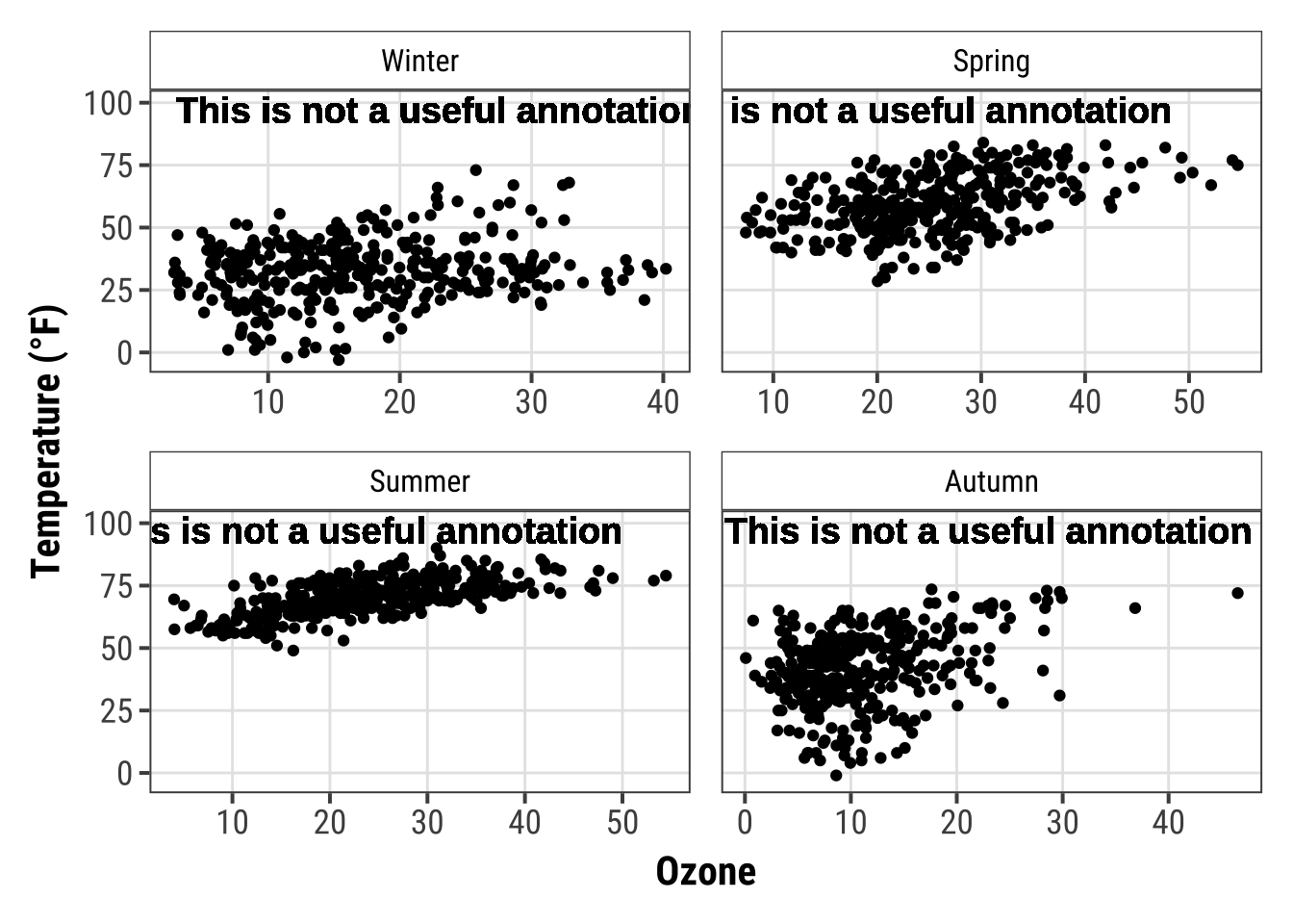
One solution is to calculate the midpoint of the axis, here x, beforehand:
ann <-
  chic |>
  dplyr::group_by(season) |>
  dplyr::summarize(
    o3 = min(o3, na.rm = TRUE) +
          (max(o3, na.rm = TRUE) - min(o3, na.rm = TRUE)) / 2
)

ann
## # A tibble: 4 × 2
## season o3
## <fct> <dbl>
## 1 Winter 21.5
## 2 Spring 31.0
## 3 Summer 29.2
## 4 Autumn 23.3… and use the aggreated data to specify the placement of the annotation:
g +
  geom_text(data = ann,
            aes(x = o3, y = 97,
                label = "This is a useful annotation"),
            size = 5, fontface = "bold") +
  scale_y_continuous(limits = c(NA, 100)) +
  facet_wrap(~season, scales = "free_x")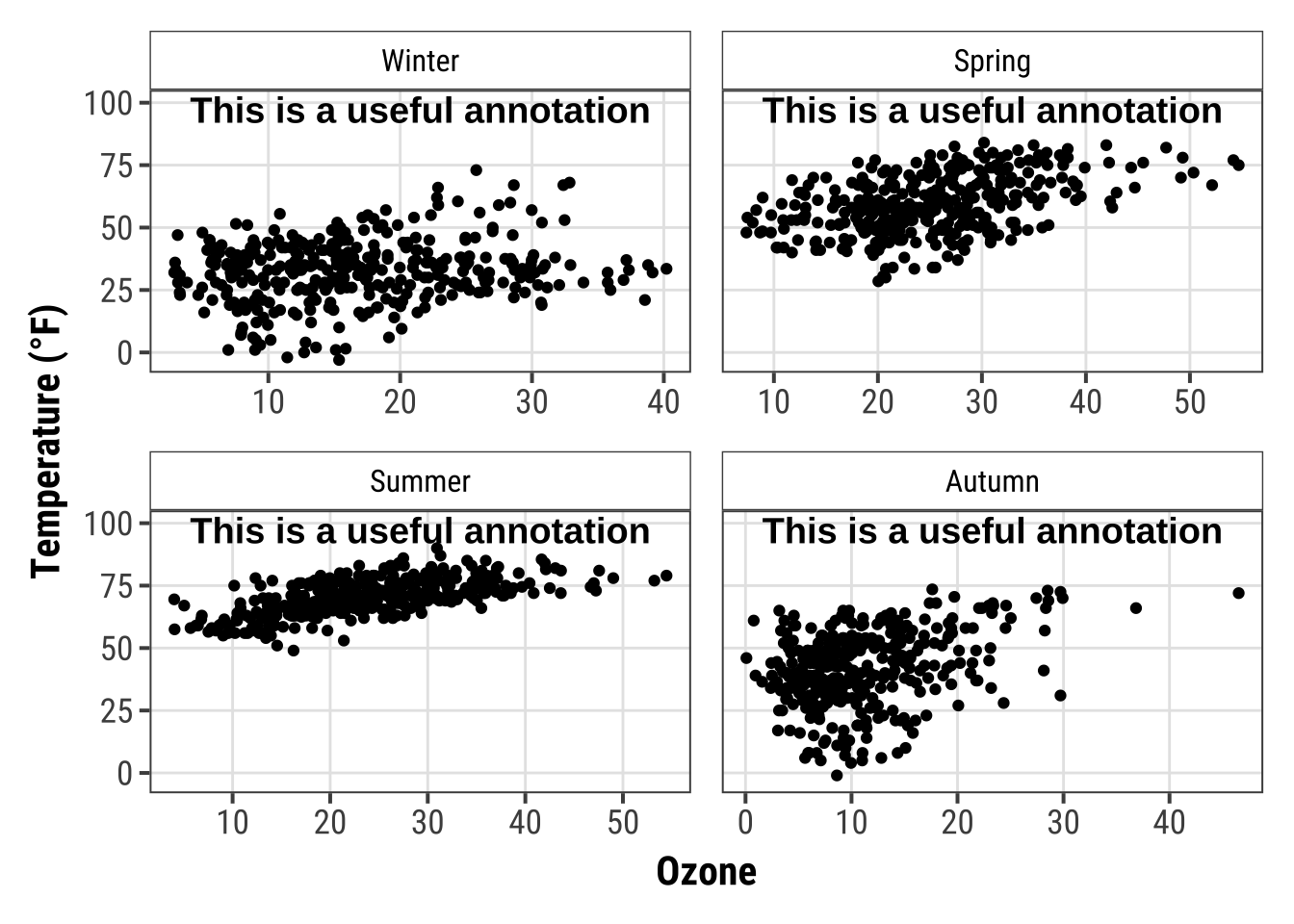
However, there is a simpler approach (in terms of fixing the cordinates)—but it also takes a while to know the code by heart.
The {grid} package in combination with {ggplot2}’s annotation_custom() allows you to specify the location based on scaled coordinates where 0 is low and 1 is high.
grobTree() creates a grid graphical object and textGrob creates the text graphical object.
The value of this is particularly evident when you have multiple plots with different scales.
library(grid)
my_grob <- grobTree(textGrob("This text stays in place!",
                             x = .1, y = .9, hjust = 0,
                             gp = gpar(col = "black",
                                       fontsize = 15,
                                       fontface = "bold")))

g +
  annotation_custom(my_grob) +
  facet_wrap(~season, scales = "free_x") +
  scale_y_continuous(limits = c(NA, 100))
Use Markdown and HTML Rendering for Annotations
Again, we are using Claus Wilke’s {ggtext} package that is designed for improved text rendering support for {ggplot2}.
The {ggtext} package defines two new theme elements, element_markdown() and element_textbox().
The package also provides additional geoms.
geom_richtext() is a replacement for geom_text() and geom_label() and renders text as markdown…
library(ggtext)

lab_md <- "This plot shows **temperature** in *°F* versus **ozone level** in *ppm*"

g +
  geom_richtext(aes(x = 35, y = 3, label = lab_md),
                stat = "unique")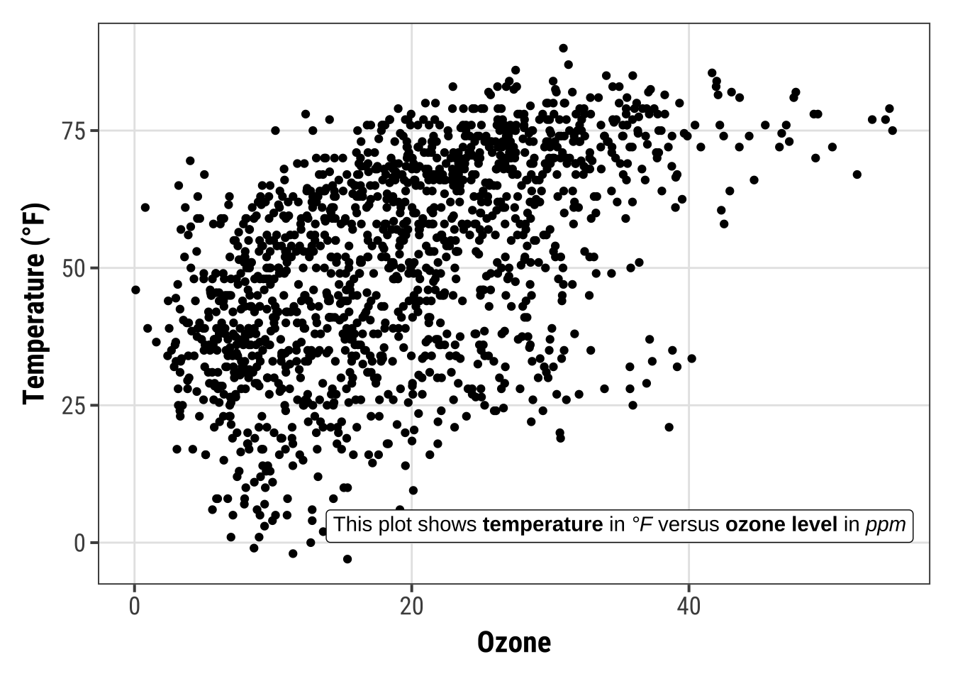
… or html:
lab_html <- "★ This plot shows <b style='color:red;'>temperature</b> in <i>°F</i> versus <b style='color:blue;'>ozone level</b>in <i>ppm</i> ★"
g +
geom_richtext(aes(x = 33, y = 3, label = lab_html),
stat = "unique")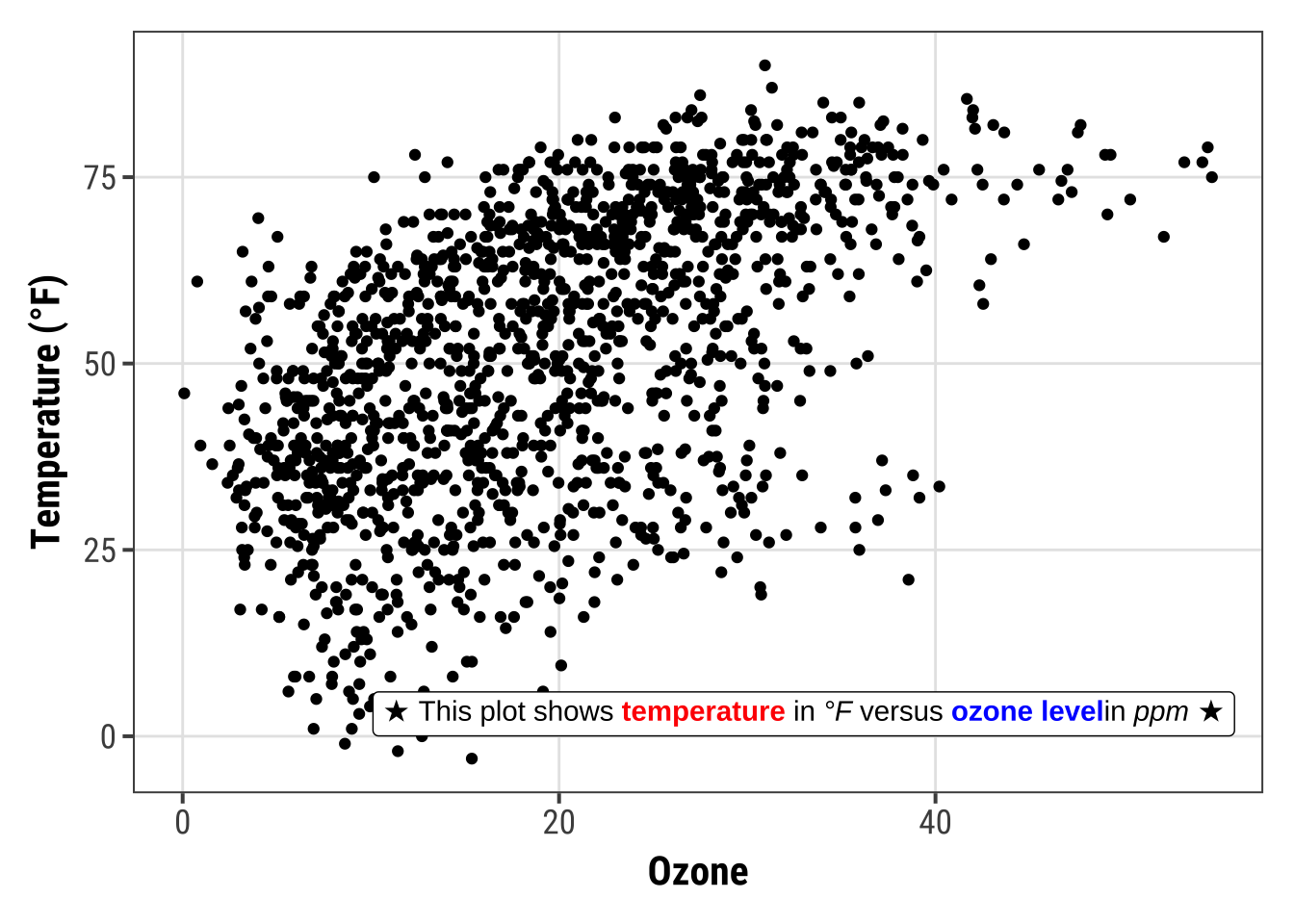
The geom comes with a lot of details one can modify, such as angle (which is not possible in the default geom_text() and geom_label()), properties of the box and properties of the text.
g +
  geom_richtext(aes(x = 10, y = 25, label = lab_md),
                stat = "unique", angle = 30,
                color = "white", fill = "steelblue",
                label.color = NA, hjust = 0, vjust = 0,
                family = "Playfair Display")
The other geom from the {ggtext} package is geom_textbox().
This geom allows for dynamic wrapping of strings which is very useful for longer annotations such as info boxes and subtitles.
lab_long <- "**Lorem ipsum dolor**<br><i style='font-size:8pt;color:red;'>Lorem ipsum dolor sit amet, consectetur adipiscing elit, sed do eiusmod tempor incididunt ut labore et dolore magna aliqua.<br>Ut enim ad minim veniam, quis nostrud exercitation ullamco laboris nisi ut aliquip ex ea commodo consequat.</i>"

g +
  geom_textbox(aes(x = 40, y = 10, label = lab_long),
               width = unit(15, "lines"), stat = "unique")
Note that it is not possible to either rotate the textbox (always horizontal) nor to change the justification of the text (always left-aligned).
Working with Coordinates
Flip a Plot
It is incredibly easy to flip a plot on its side.
Here I have added the coord_flip() which is all you need to flip the plot.
This makes most sense when using geom’s to represent categorical data, for example bar charts or, as in the following example, box and whiskers plots:
ggplot(chic, aes(x = season, y = o3)) +
  geom_boxplot(fill = "indianred") +
  labs(x = "Season", y = "Ozone") +
  coord_flip()
💁 Since {ggplot2} version 3.0.0 it is also possible to draw geom’s horizontally via the argument orientation = "y".
Expand to see example.
ggplot(chic, aes(x = o3, y = season)) +
  geom_boxplot(fill = "indianred", orientation = "y") +
  labs(x = "Ozone", y = "Season")
Fix an Axis
One can fix the aspect ratio of the Cartesian coordinate system and literally force a physical representation of the units along the x and y axes:
ggplot(chic, aes(x = temp, y = o3)) +
  geom_point() +
  labs(x = "Temperature (°F)", y = "Ozone Level") +
  scale_x_continuous(breaks = seq(0, 80, by = 20)) +
  coord_fixed(ratio = 1)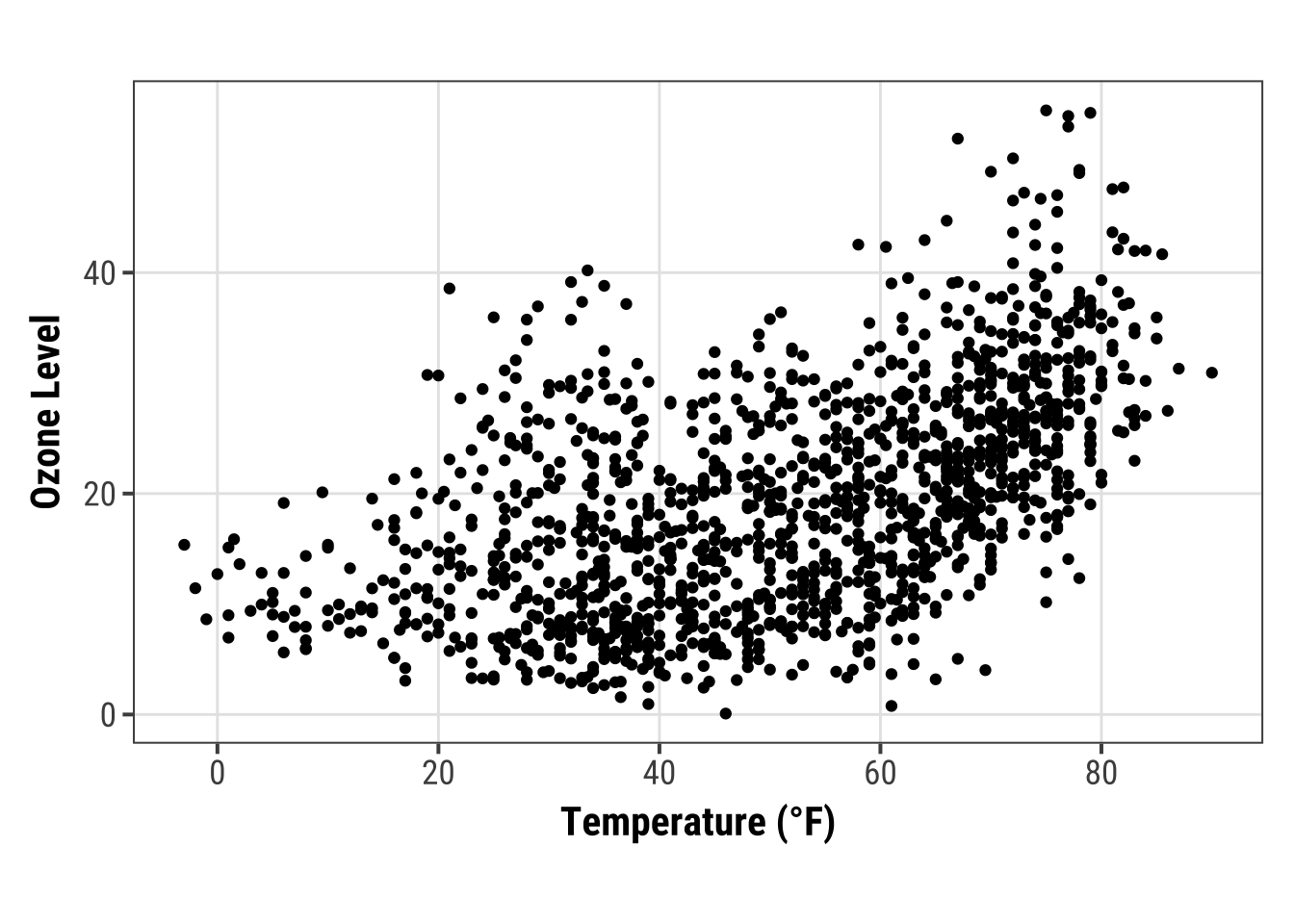
This way one can ensure not only a fixed step length on the axes but also that the exported plot looks as expected. However, your saved plot likely contains a lot of white space in case you do not use a suitable aspect ratio:
ggplot(chic, aes(x = temp, y = o3)) +
  geom_point() +
  labs(x = "Temperature (°F)", y = "Ozone Level") +
  scale_x_continuous(breaks = seq(0, 80, by = 20)) +
  coord_fixed(ratio = 1/3) +
  theme(plot.background = element_rect(fill = "grey80"))
Reverse an Axis
You can also easily reverse an axis using scale_x_reverse() or scale_y_reverse(), respectively:
ggplot(chic, aes(x = date, y = temp, color = o3)) +
  geom_point() +
  labs(x = "Year", y = "Temperature (°F)") +
  scale_y_reverse()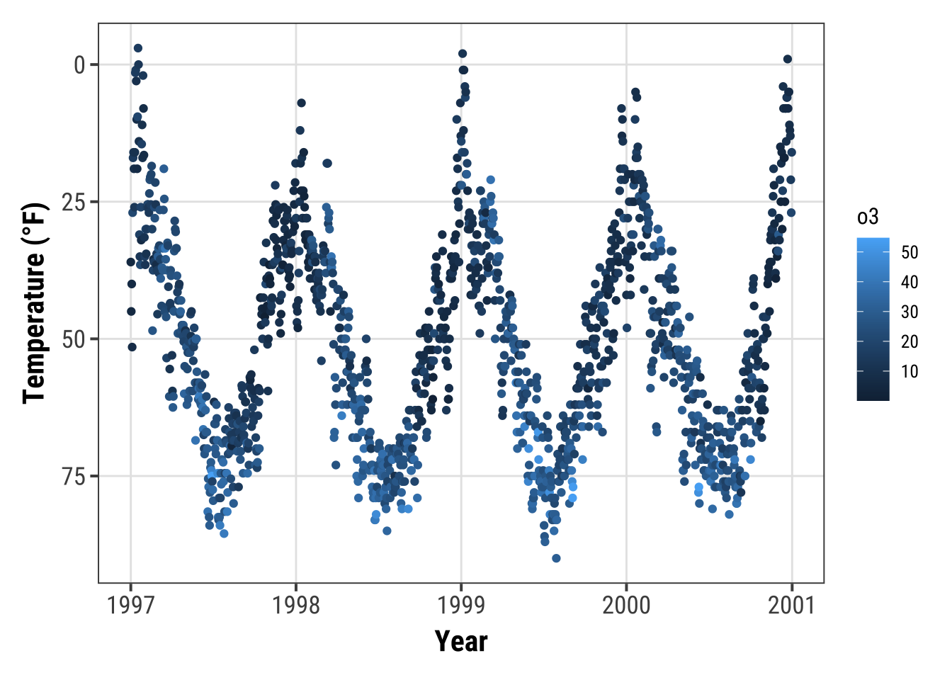
💁 Note that this will only work for continuous data.
If you want to reverse discrete data, use the fct_rev() function from the {forcats} package.
Expand to see example.
## the default
ggplot(chic, aes(x = temp, y = season)) +
  geom_jitter(aes(color = season), show.legend = FALSE) +
  labs(x = "Temperature (°F)", y = NULL)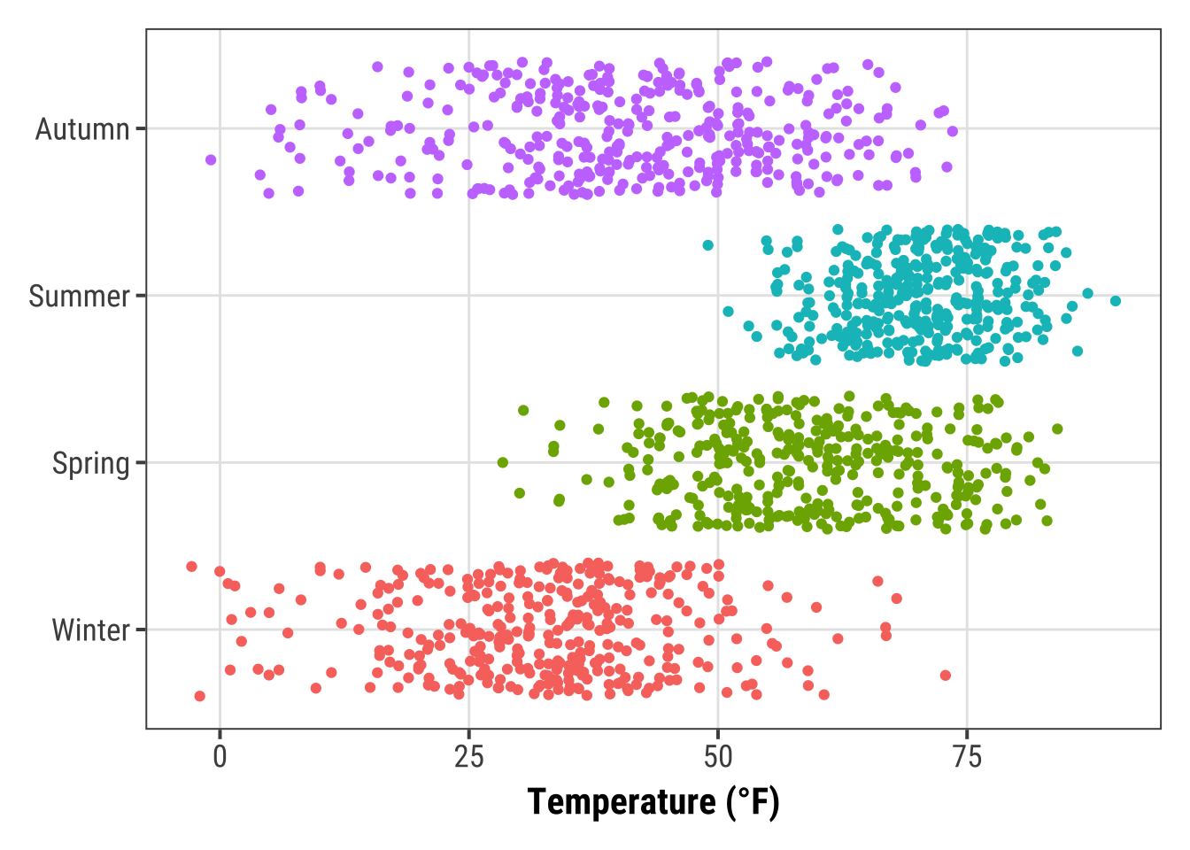
library(forcats)
set.seed(10)
ggplot(chic, aes(x = temp, y = fct_rev(season))) +
  geom_jitter(aes(color = season), show.legend = FALSE) +
  labs(x = "Temperature (°F)", y = NULL)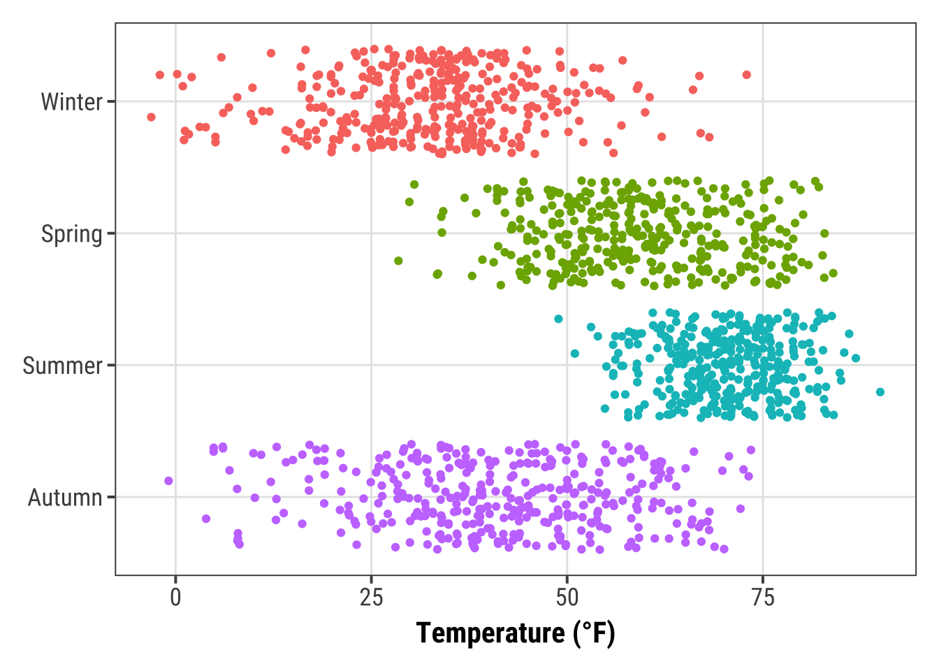
Transform an Axis
… or transform the default linear mapping by using scale_y_log10() or scale_y_sqrt().
As an example, here is a log10-transformed axis (which introduces NA’s in this case so be careful):
ggplot(chic, aes(x = date, y = temp, color = o3)) +
  geom_point() +
  labs(x = "Year", y = "Temperature (°F)") +
  scale_y_log10(lim = c(0.1, 100))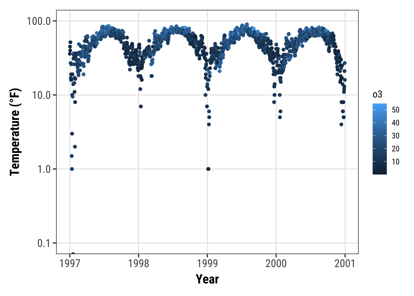
Circularize a Plot
It is also possible to circularize (polarize?) the coordinate system by calling coord_polar().
chic |>
  dplyr::group_by(season) |>
  dplyr::summarize(o3 = median(o3)) |>
  ggplot(aes(x = season, y = o3)) +
    geom_col(aes(fill = season), color = NA) +
    labs(x = "", y = "Median Ozone Level") +
    coord_polar() +
    guides(fill = "none")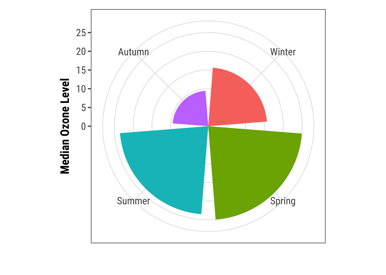
This coordinate system allows to draw pie charts as well:
chic_sum <-
  chic |>
  dplyr::mutate(o3_avg = median(o3)) |>
  dplyr::filter(o3 > o3_avg) |>
  dplyr::mutate(n_all = n()) |>
  dplyr::group_by(season) |>
  dplyr::summarize(rel = n() / unique(n_all))

ggplot(chic_sum, aes(x = "", y = rel)) +
  geom_col(aes(fill = season), width = 1, color = NA) +
  labs(x = "", y = "Proportion of Days Exceeding\nthe Median Ozone Level") +
  coord_polar(theta = "y") +
  scale_fill_brewer(palette = "Set1", name = "Season:") +
  theme(axis.ticks = element_blank(),
        panel.grid = element_blank())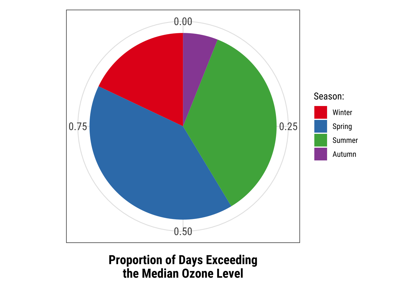
I suggest to always look also at the outcome of the same code in a Cartesian coordinate system, which is the default, to understand the logic behind coord_polar() and theta:
ggplot(chic_sum, aes(x = "", y = rel)) +
  geom_col(aes(fill = season), width = 1, color = NA) +
  labs(x = "", y = "Proportion of Days Exceeding\nthe Median Ozone Level") +
  #coord_polar(theta = "y") +
  scale_fill_brewer(palette = "Set1", name = "Season:") +
  theme(axis.ticks = element_blank(),
        panel.grid = element_blank())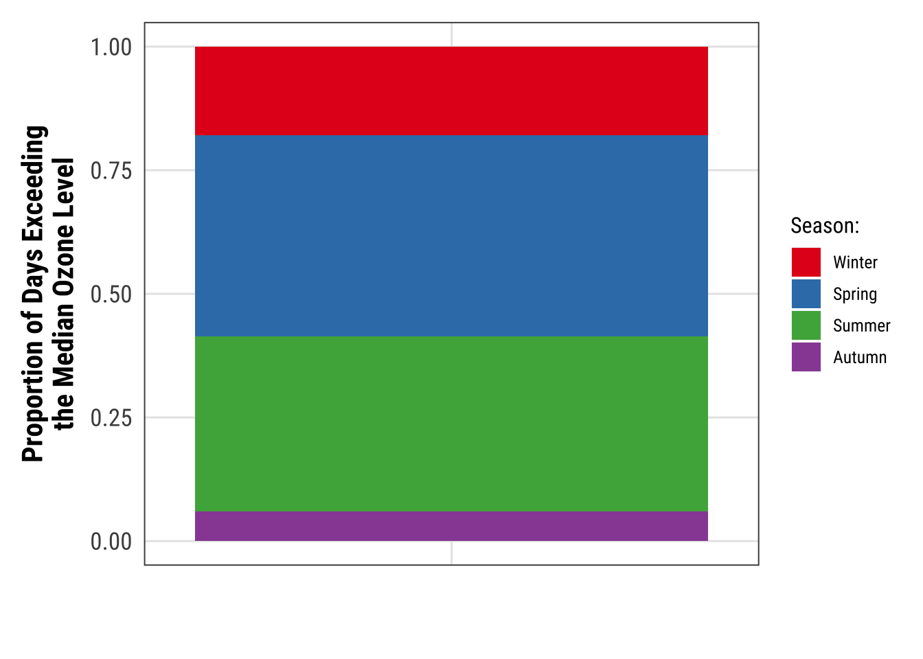
Working with Chart Types
Alternatives to a Box Plot
Box plots are great, but they can be so incredibly boring. Also, even if you are used to looking at box plots, remember there might be plenty people looking at your plot that have never seen a box and whisker plot before.
💁 Expand for a short recap on box and whiskers plots.
A box-and-whisker plot (sometimes called simply a box plot) is a histogram-like method of displaying data, invented by J.
Tukey.
The thick middle line notates the median, also known as quartile Q2.
The limits of the box are determined by the lower and upper quartiles, Q1 and Q3.
The box contains thus 50% of the data and is called “interquartile range” (IQR).
The length of the whiskers is determined by the most extreme values that are not considered as outliers (i.e. values that are within 3/2 times the interquartile range).
There are alternatives, but first we are plotting a common box plot:
g <-
  ggplot(chic, aes(x = season, y = o3,
                   color = season)) +
    labs(x = "Season", y = "Ozone") +
    scale_color_brewer(palette = "Dark2", guide = "none")

g + geom_boxplot()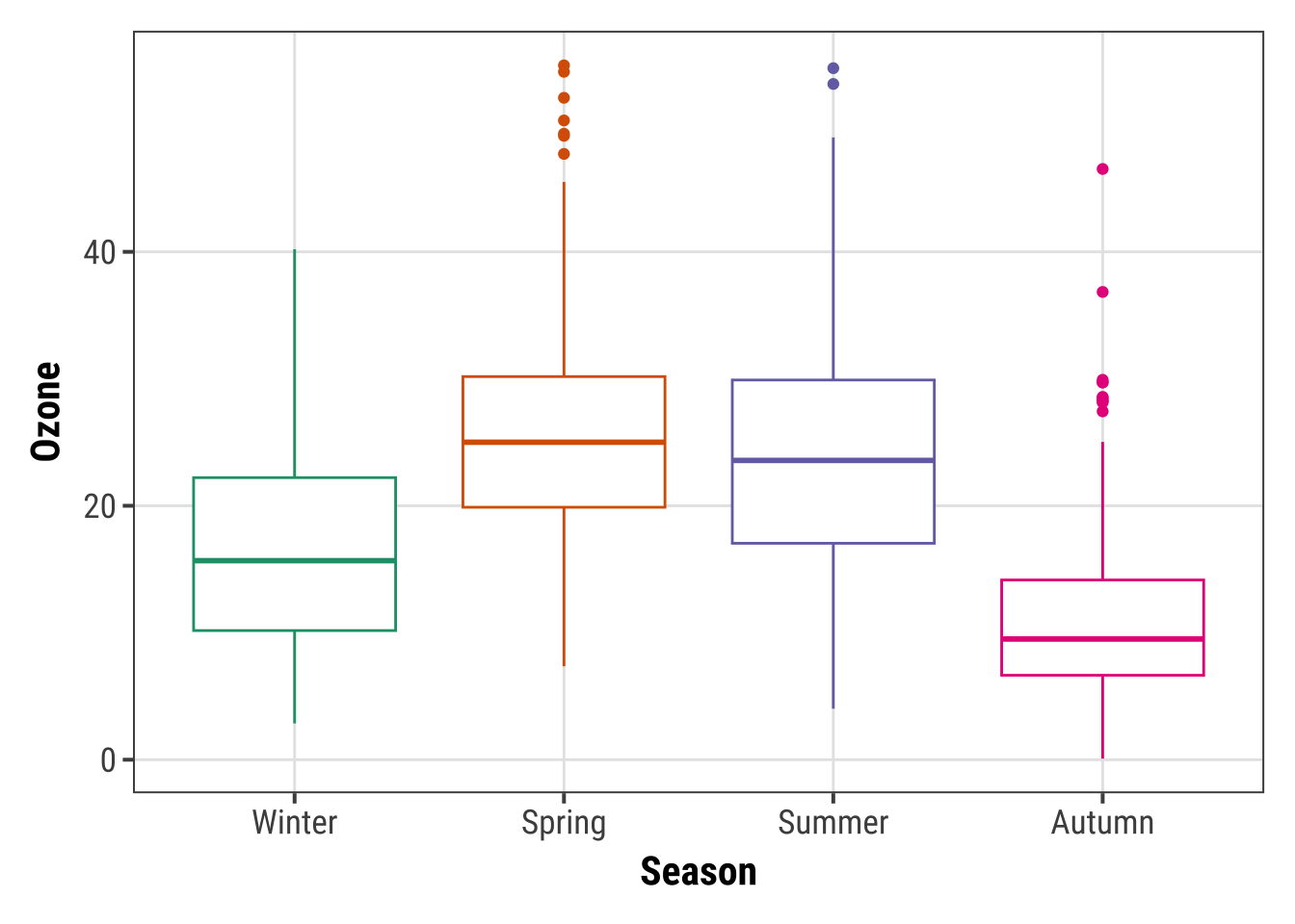
1. Alternative: Plot of Points
Let’s plot just each data point of the raw data:
g + geom_point()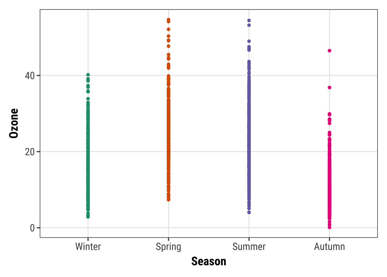
Not only boring but uninformative. To improve the plot, one could add transparency to deal with overplotting:
g + geom_point(alpha = .1)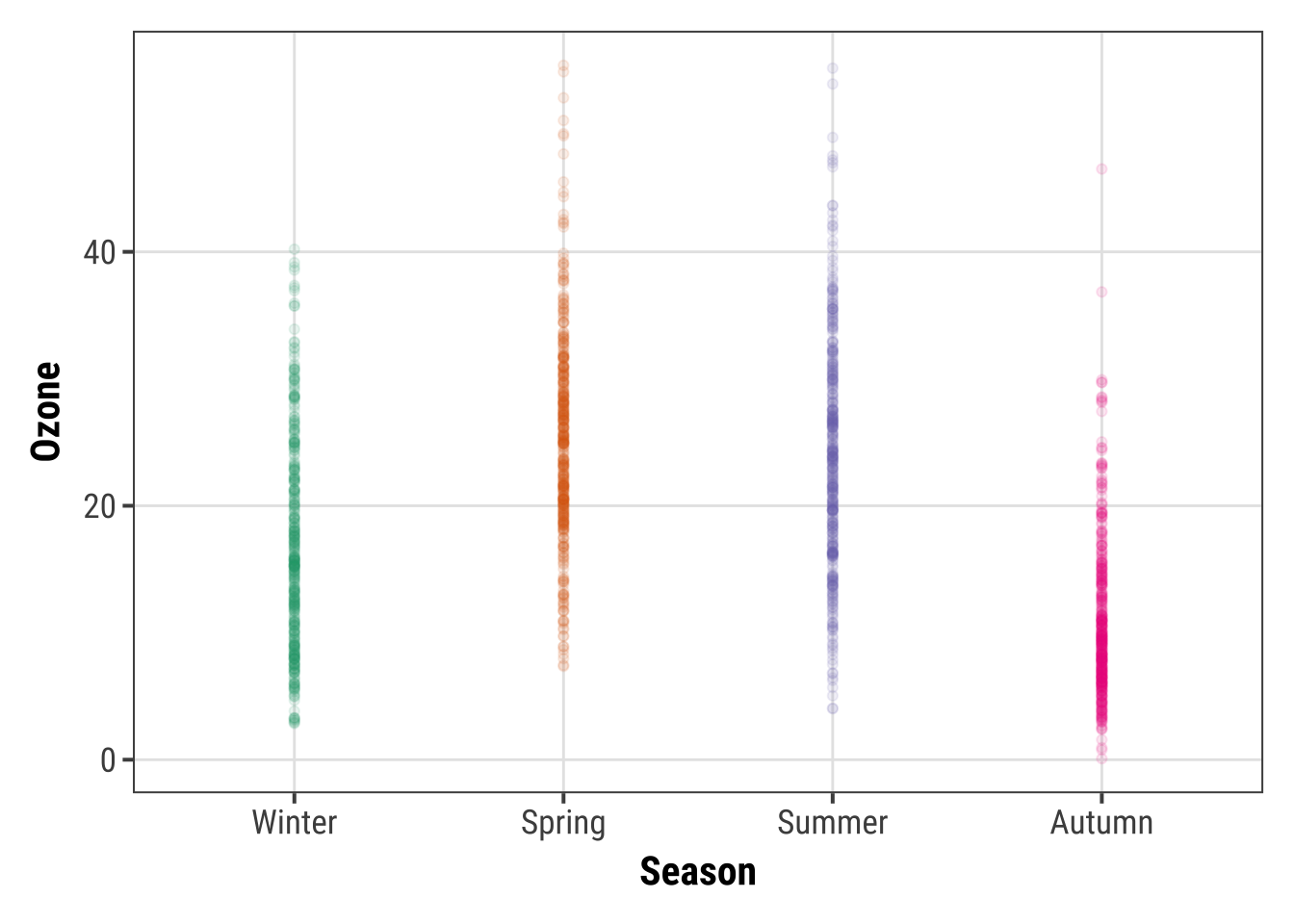
However, setting transparency is difficult here since either the overlap is still too high or the extreme values are not visible. Bad, so let’s try something else.
2. Alternative: Jitter the Points
Try adding a little jitter to the data. I like this for in-house visualization but be careful using jittering because you are purposely adding noise to your data and this can result in misinterpretation of your data.
g + geom_jitter(width = .3, alpha = .5)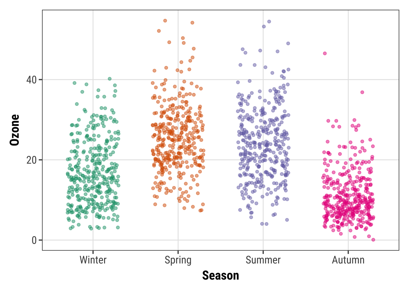
3. Alternative: Violin Plots
Violin plots, similar to box plots except you are using a kernel density to show where you have the most data, are a useful visualization.
g + geom_violin(fill = "gray80", linewidth = 1, alpha = .5)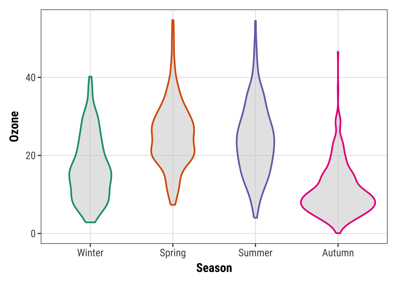
4. Alternative: Combining Violin Plots with Jitter
We can of course combine both, estimated densities and the raw data points:
g + geom_violin(fill = "gray80", linewidth = 1, alpha = .5) +
    geom_jitter(alpha = .25, width = .3) +
    coord_flip()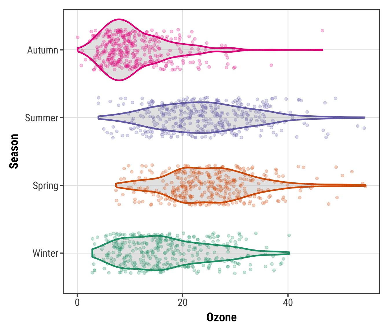
The {ggforce} package provides so-called sina functions where the width of the jitter is controlled by the density distribution of the data—that makes the jittering a bit more visually appealing:
library(ggforce)

g + geom_violin(fill = "gray80", linewidth = 1, alpha = .5) +
    geom_sina(alpha = .25) +
    coord_flip()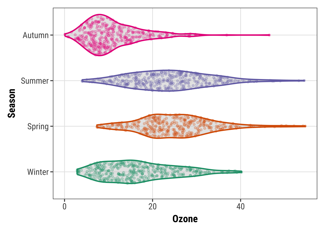
5. Alternative: Combining Violin Plots with Box Plots
To allow for easy estimation of quantiles, we can also add the box of the box plot inside the violins to indicate 25%-quartile, median and 75%-quartile:
g + geom_violin(aes(fill = season), linewidth = 1, alpha = .5) +
    geom_boxplot(outlier.alpha = 0, coef = 0,
                 color = "gray40", width = .2) +
    scale_fill_brewer(palette = "Dark2", guide = "none") +
    coord_flip()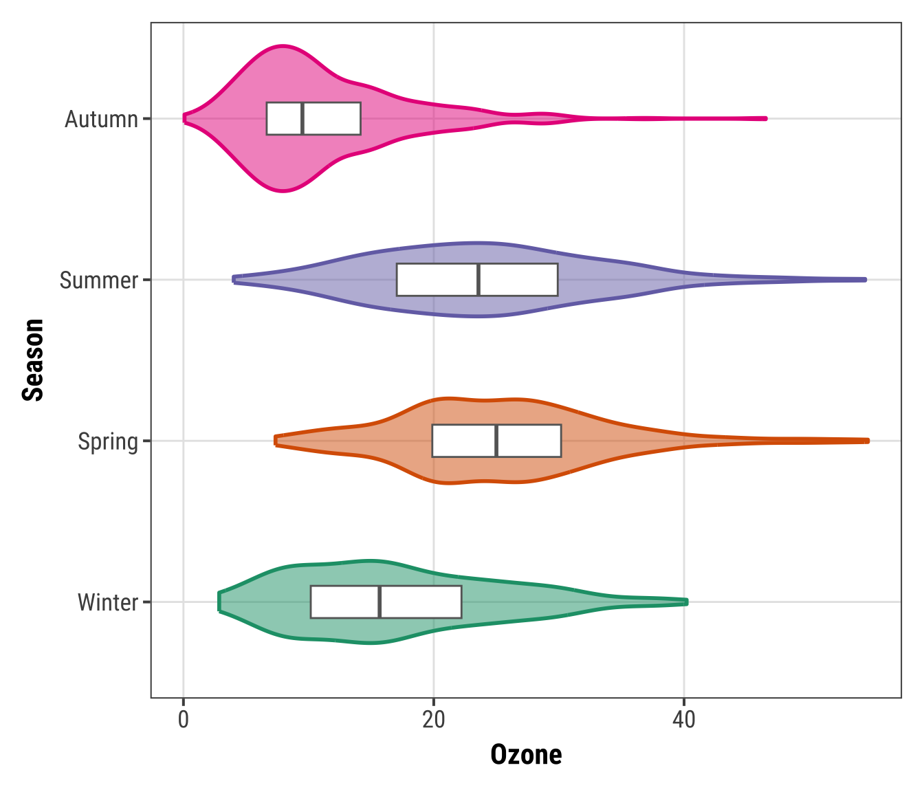
Create a Rug Representation to a Plot
A rug represents the data of a single quantitative variable, displayed as marks along an axis. In most cases, it is used in addition to scatter plots or heatmaps to visualize the overall distribution of one or both of the variables:
ggplot(chic, aes(x = date, y = temp,
                 color = season)) +
  geom_point(show.legend = FALSE) +
  geom_rug(show.legend = FALSE) +
  labs(x = "Year", y = "Temperature (°F)")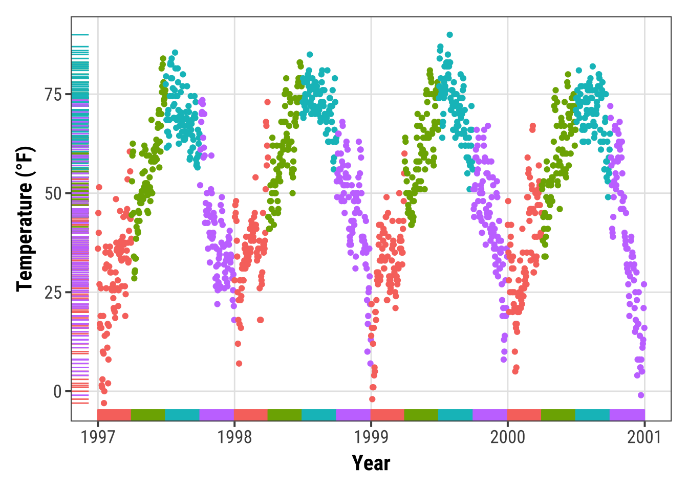
ggplot(chic, aes(x = date, y = temp, color = season)) +
  geom_point(show.legend = FALSE) +
  geom_rug(sides = "r", alpha = .3, show.legend = FALSE) +
  labs(x = "Year", y = "Temperature (°F)")
Create a Correlation Matrix
There are several packages that allow to create correlation matrix plots, some also using the{ggplot2} infrastructure and thus returning ggplots.
I am going to show you how to do this without extension packages.
First step is to create the correlation matrix.
Here, we use the {corrr} package that works nicely with pipes but there are also many others out there.
We are using Pearson because all the variables are fairly normally distributed (but you may consider Spearman if your variables follow a different pattern).
Note that since a correlation matrix has redundant information we are setting half of it to NA.
corm <-
  chic |>
  dplyr::select(temp, dewpoint, pm10, o3) |>
  corrr::correlate(diagonal = 1) |>
  corrr::shave(upper = FALSE)

corm
## # A tibble: 4 × 5
## term temp dewpoint pm10 o3
## <chr> <dbl> <dbl> <dbl> <dbl>
## 1 temp 1 0.958 0.368 0.535
## 2 dewpoint NA 1 0.327 0.454
## 3 pm10 NA NA 1 0.206
## 4 o3 NA NA NA 1Now we put the resulting matrix in long format using the pivot_longer() function from the {tidyr} package.
We also directly format the labels and place empty quotes for the upper triangle.
Note that I use sprintf() to ensure that the label always display two digits.
corm <- corm |>
  tidyr::pivot_longer(
    cols = -term,
    names_to = "colname",
    values_to = "corr"
  ) |>
  dplyr::mutate(
    rowname = forcats::fct_inorder(term),
    colname = forcats::fct_inorder(colname),
    label = dplyr::if_else(is.na(corr), "", sprintf("%1.2f", corr))
  )
## # A tibble: 16 × 5
## term colname corr rowname label
## <chr> <fct> <dbl> <fct> <chr>
## 1 temp temp 1 temp "1.00"
## 2 temp dewpoint 0.958 temp "0.96"
## 3 temp pm10 0.368 temp "0.37"
## 4 temp o3 0.535 temp "0.53"
## 5 dewpoint temp NA dewpoint ""
## 6 dewpoint dewpoint 1 dewpoint "1.00"
## 7 dewpoint pm10 0.327 dewpoint "0.33"
## 8 dewpoint o3 0.454 dewpoint "0.45"
## 9 pm10 temp NA pm10 ""
## 10 pm10 dewpoint NA pm10 ""
## 11 pm10 pm10 1 pm10 "1.00"
## 12 pm10 o3 0.206 pm10 "0.21"
## 13 o3 temp NA o3 ""
## 14 o3 dewpoint NA o3 ""
## 15 o3 pm10 NA o3 ""
## 16 o3 o3 1 o3 "1.00"For the plot we will use geom_tile() for the heatmap and geom_text() for the labels:
ggplot(corm, aes(rowname, fct_rev(colname),
                 fill = corr)) +
  geom_tile() +
  geom_text(aes(label = label)) +
  coord_fixed() +
  labs(x = NULL, y = NULL)
I like to have a diverging color palette—it is important that the scale is centered at zero correlation!—with white indicating missing data. Also I like to have no grid lines and padding around the heatmap as well as labels that are colored depending on the underlying fill:
ggplot(corm, aes(rowname, fct_rev(colname),
                 fill = corr)) +
  geom_tile() +
  geom_text(aes(
    label = label,
    color = abs(corr) < .75
  )) +
  coord_fixed(expand = FALSE) +
  scale_color_manual(
    values = c("white", "black"),
    guide = "none"
  ) +
  scale_fill_distiller(
    palette = "PuOr", na.value = "white",
    direction = 1, limits = c(-1, 1),
    name = "Pearson\nCorrelation:"
  ) +
  labs(x = NULL, y = NULL) +
  theme(panel.border = element_rect(color = NA, fill = NA),
        legend.position = c(.85, .8))
Create a Contour Plot
Contour plots are nice way to display eatesholds of values. One can use them to bin data, showing the density of observations:
ggplot(chic, aes(temp, o3)) +
  geom_density_2d() +
  labs(x = "Temperature (°F)", x = "Ozone Level")
ggplot(chic, aes(temp, o3)) +
  geom_density_2d_filled(show.legend = FALSE) +
  coord_cartesian(expand = FALSE) +
  labs(x = "Temperature (°F)", x = "Ozone Level")
But now, we are plotting three-dimensional data. We are going to plot the thresholds in dewpoint (i.e. the temperature at which airborne water vapor will condense to form liquid dew) related to temperature and ozone levels:
## interpolate data
fld <- with(chic, akima::interp(x = temp, y = o3, z = dewpoint))

## prepare data in long format
df <- fld$z |>
  tibble::as_tibble(.name_repair = "universal_quiet") |>
  dplyr::mutate(x = dplyr::row_number()) |>
  tidyr::pivot_longer(
    cols = -x,
    names_to = "y",
    names_transform = as.integer,
    values_to = "Dewpoint",
    names_prefix = "...",
    values_drop_na = TRUE
  )

g <- ggplot(data = df, aes(x = x, y = y, z = Dewpoint))  +
  labs(x = "Temperature (°F)", y = "Ozone Level",
       color = "Dewpoint")

g + stat_contour(aes(color = after_stat(level)))
Surprise! As it is defined, the drew point is in most cases equal to the measured temperature.
The lines are indicating different levels of drew points, but this is not a pretty plot and also hard to read due to missing borders. Let’s try a tile plot using the viridis color palette to encode the dewpoint of each combination of ozone level and temperature:
g + geom_tile(aes(fill = Dewpoint)) +
    scale_fill_viridis_c(option = "inferno")
How does it look if we combine a contour plot and a tile plot to fill the area under the contour lines?
g + geom_tile(aes(fill = Dewpoint)) +
    stat_contour(color = "white", linewidth = .7, bins = 5) +
    scale_fill_viridis_c()
Create a Heatmap of Counts
Similarly to our first contour maps, one can easily show the counts or densities of points binned to a hexagonal grid via geom_hex():
ggplot(chic, aes(temp, o3)) +
  geom_hex() +
  scale_fill_distiller(palette = "YlOrRd", direction = 1) +
  labs(x = "Temperature (°F)", y = "Ozone Level")
Often, white lines pop up in the resulting plot.
One can fix that by mapping also color to either after_stat(count) (the default) or after_stat(density)…
ggplot(chic, aes(temp, o3)) +
  geom_hex(aes(color = after_stat(count))) +
  scale_fill_distiller(palette = "YlOrRd", direction = 1) +
  scale_color_distiller(palette = "YlOrRd", direction = 1) +
  labs(x = "Temperature (°F)", y = "Ozone Level")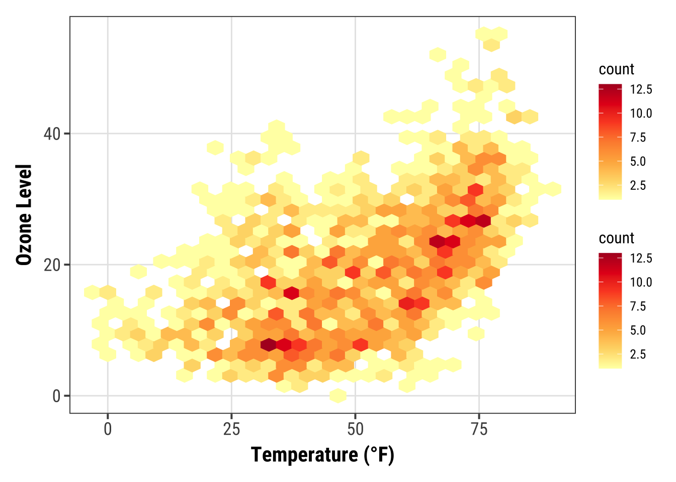
… or by setting the same color as outline for all hexagonal cells:
ggplot(chic, aes(temp, o3)) +
  geom_hex(color = "grey") +
  scale_fill_distiller(palette = "YlOrRd", direction = 1) +
  labs(x = "Temperature (°F)", y = "Ozone Level")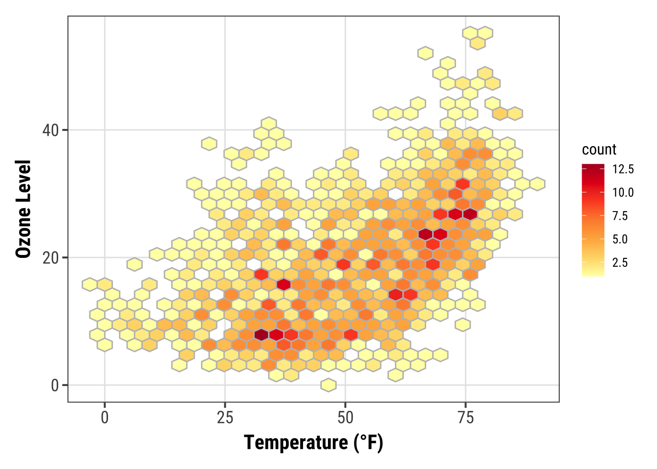
One can also change the default binning to in- or decrease the number of hexagonal cells:
ggplot(chic, aes(temp, o3, fill = after_stat(density))) +
  geom_hex(bins = 50, color = "grey") +
  scale_fill_distiller(palette = "YlOrRd", direction = 1) +
  labs(x = "Temperature (°F)", y = "Ozone Level")
If you want to have a regular grid, one can also use geom_bin2d() which summarizes the data to rectangular grid cells based on bins:
ggplot(chic, aes(temp, o3, fill = after_stat(density))) +
  geom_bin2d(bins = 15, color = "grey") +
  scale_fill_distiller(palette = "YlOrRd", direction = 1) +
  labs(x = "Temperature (°F)", y = "Ozone Level")
Create a Ridge Plot
Ridge(line) plots are a new type of plots which is very popular at the moment.
While you can create those plots with basic {ggplot2} commands the popularity lead to a package that make it easier create those plots: {ggridges}.
We are going to use this package here.
library(ggridges)
ggplot(chic, aes(x = temp, y = factor(year))) +
   geom_density_ridges(fill = "gray90") +
   labs(x = "Temperature (°F)", y = "Year")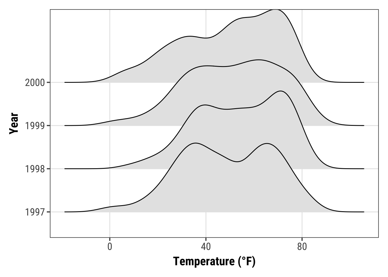
You can easily specify the overlap and the trailing tails by using the arguments rel_min_height and scale, respectively.
The package also comes with its own theme (but I would prefer to build my own, see chapter “Create and Use Your Custom Theme”).
Additionally, we change the colors based on year to make it more appealing.
ggplot(chic, aes(x = temp, y = factor(year), fill = year)) +
  geom_density_ridges(alpha = .8, color = "white",
                      scale = 2.5, rel_min_height = .01) +
  labs(x = "Temperature (°F)", y = "Year") +
  guides(fill = "none") +
  theme_ridges()
You can also get rid of the overlap using values below 1 for the scaling argument (but this somehow contradicts the idea of ridge plots…). Here is an example additionally using the viridis color gradient and the in-build theme:
ggplot(chic, aes(x = temp, y = season, fill = after_stat(x))) +
  geom_density_ridges_gradient(scale = .9, gradient_lwd = .5,
                               color = "black") +
  scale_fill_viridis_c(option = "plasma", name = "") +
  labs(x = "Temperature (°F)", y = "Season") +
  theme_ridges(font_family = "Roboto Condensed", grid = FALSE)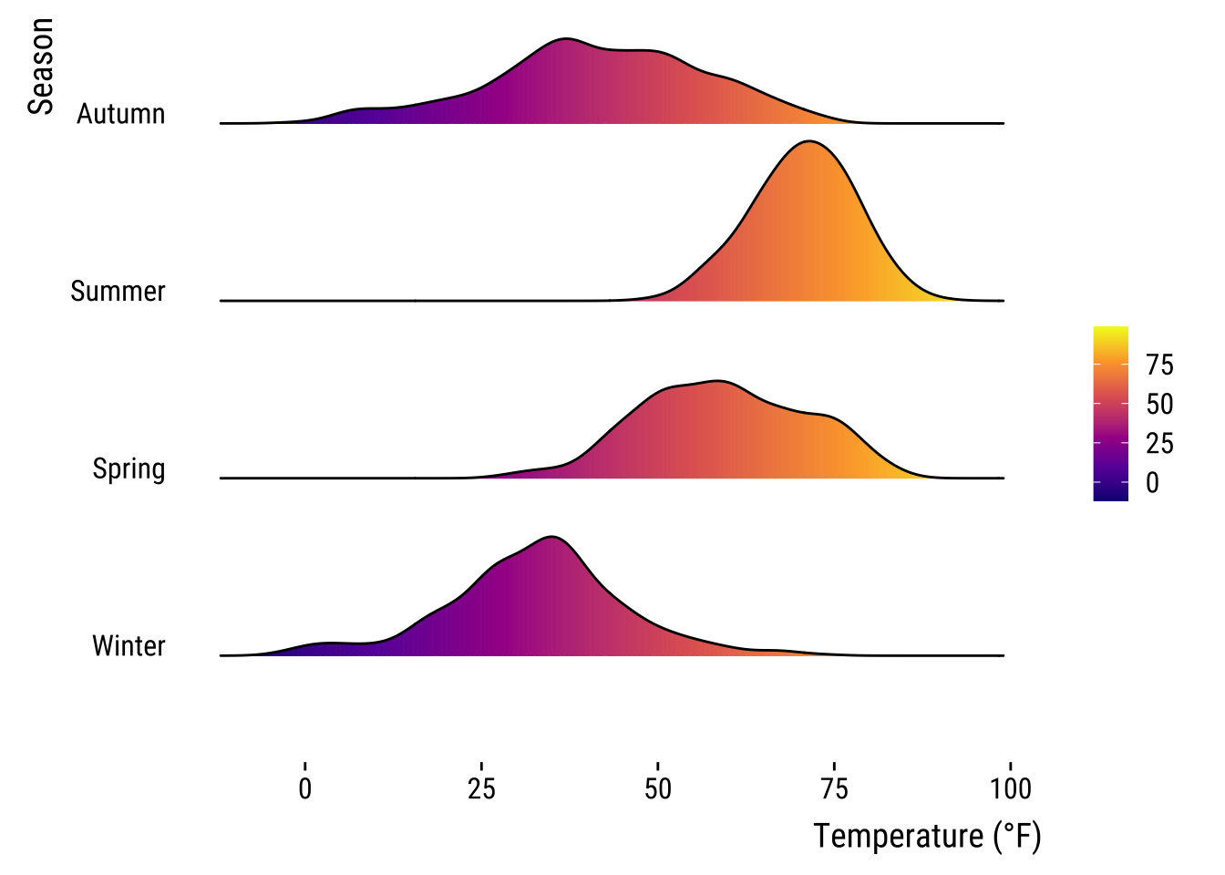
We can also compare several groups per ridgeline and coloring them according to their group. This follows the idea of Marc Belzunces.
library(dplyr)

## only plot extreme season using dplyr from the tidyverse
ggplot(data = dplyr::filter(chic, season %in% c("Summer", "Winter")),
         aes(x = temp, y = year, fill = paste(year, season))) +
  geom_density_ridges(alpha = .7, rel_min_height = .01,
                      color = "white", from = -5, to = 95) +
  scale_fill_cyclical(breaks = c("1997 Summer", "1997 Winter"),
                      labels = c(`1997 Summer` = "Summer",
                                 `1997 Winter` = "Winter"),
                      values = c("tomato", "dodgerblue"),
                      name = "Season:", guide = "legend") +
  theme_ridges(grid = FALSE) +
  labs(x = "Temperature (°F)", y = "Year")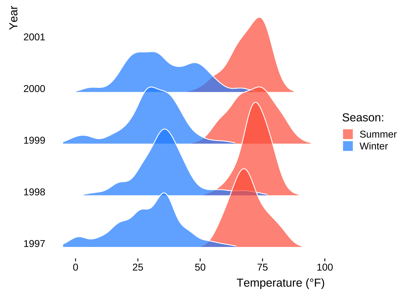
The {ggridges} package is also helpful to create histograms for different groups using stat = "binline" in the geom_density_ridges() command:
ggplot(chic, aes(x = temp, y = factor(year), fill = year)) +
  geom_density_ridges(stat = "binline", bins = 25, scale = .9,
                      draw_baseline = FALSE, show.legend = FALSE) +
  theme_minimal() +
  labs(x = "Temperature (°F)", y = "Season")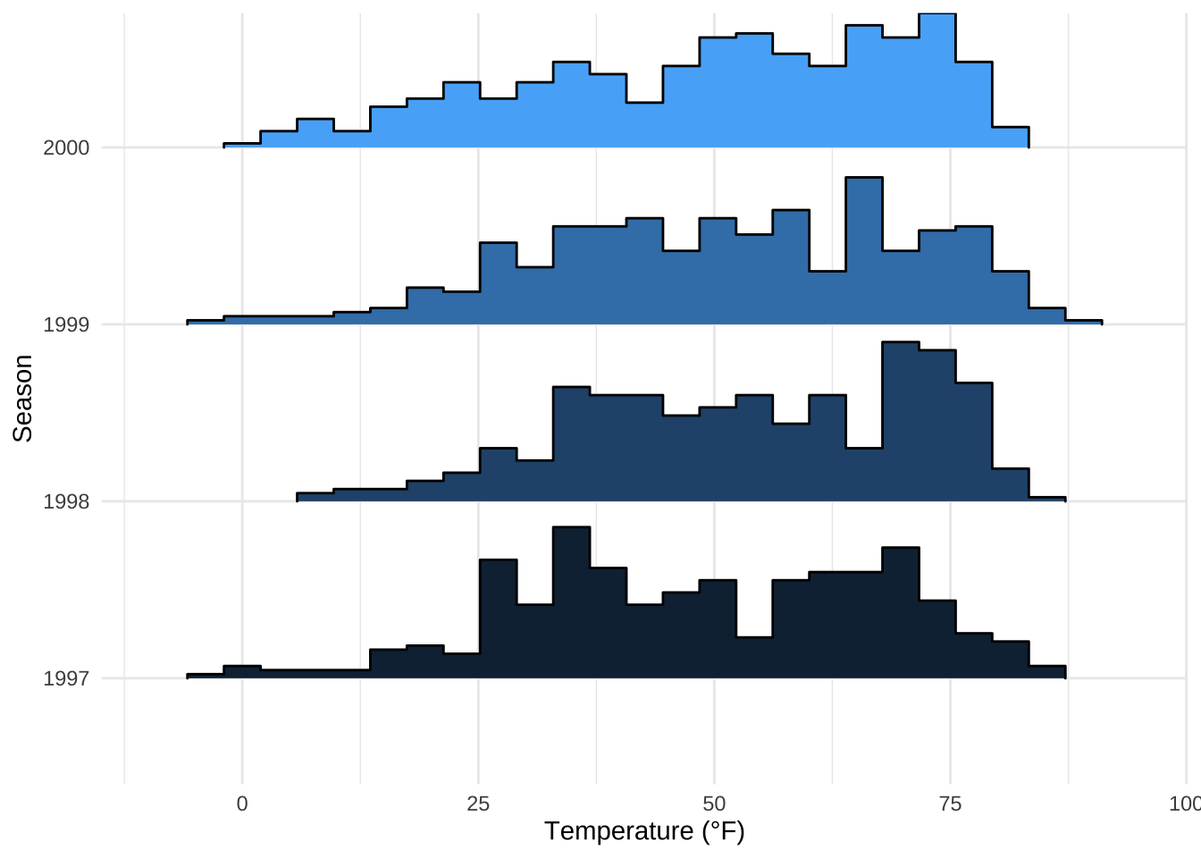
Working with Ribbons (AUC, CI, etc.)
This is not a perfect dataset for demonstrating this, but using ribbon can be useful. In this example we will create a 30-day running average using the filter() function so that our ribbon is not too noisy.
chic$o3run <- as.numeric(stats::filter(chic$o3, rep(1/30, 30), sides = 2))

ggplot(chic, aes(x = date, y = o3run)) +
   geom_line(color = "chocolate", lwd = .8) +
   labs(x = "Year", y = "Ozone")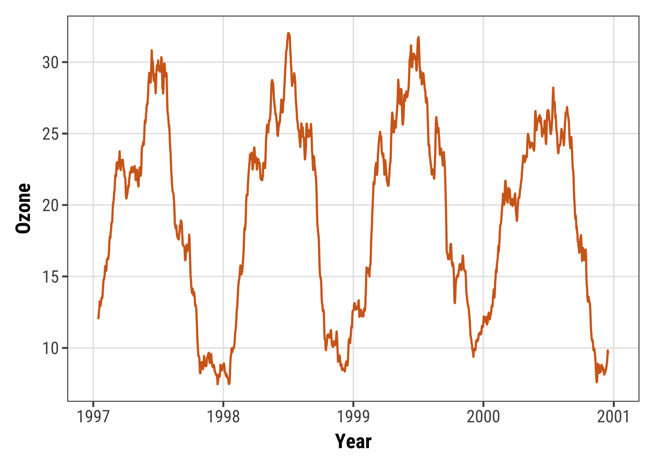
How does it look if we fill in the area below the curve using the geom_ribbon() function?
ggplot(chic, aes(x = date, y = o3run)) +
   geom_ribbon(aes(ymin = 0, ymax = o3run),
               fill = "orange", alpha = .4) +
   geom_line(color = "chocolate", lwd = .8) +
   labs(x = "Year", y = "Ozone")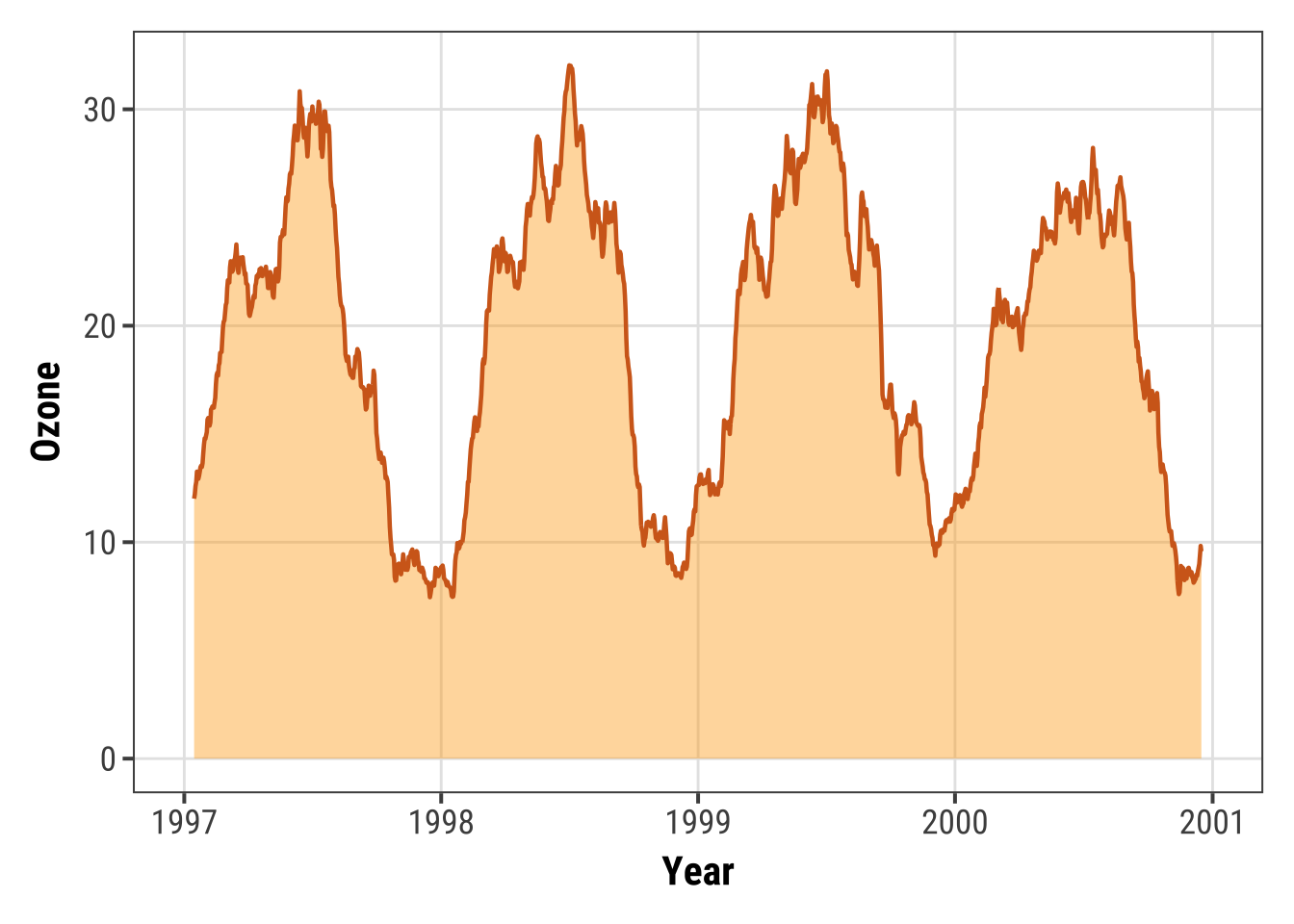
Nice to indicate the area under the curve (AUC) but this is not the conventional way to use geom_ribbon().
💁 And actually a nicer way to achieve the same is geom_area().
Expand to see example.
ggplot(chic, aes(x = date, y = o3run)) +
   geom_area(color = "chocolate", lwd = .8,
             fill = "orange", alpha = .4) +
   labs(x = "Year", y = "Ozone")
Instead, we draw a ribbon that gives us one standard deviation above and below our data:
chic$mino3 <- chic$o3run - sd(chic$o3run, na.rm = TRUE)
chic$maxo3 <- chic$o3run + sd(chic$o3run, na.rm = TRUE)

ggplot(chic, aes(x = date, y = o3run)) +
   geom_ribbon(aes(ymin = mino3, ymax = maxo3), alpha = .5,
               fill = "darkseagreen3", color = "transparent") +
   geom_line(color = "aquamarine4", lwd = .7) +
   labs(x = "Year", y = "Ozone")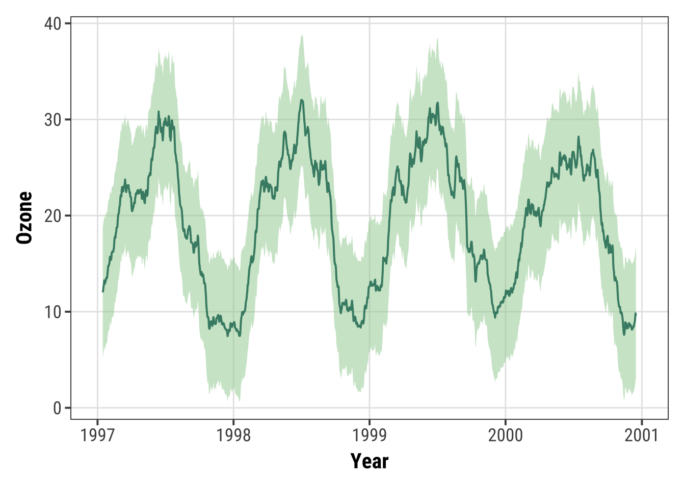
Working with Smoothings
It is amazingly easy to add smoothing to your data using {ggplot2}.
Default: Adding a LOESS or GAM Smoothing
You can simply use stat_smooth()—not even a formula is required.
This adds a LOESS (locally weighted scatter plot smoothing, method = "loess") if you have fewer than 1000 points or a GAM (generalized additive model, method = "gam") otherwise.
Since we have more than 1000 points, the smoothing is based on a GAM:
ggplot(chic, aes(x = date, y = temp)) +
  geom_point(color = "gray40", alpha = .5) +
  stat_smooth() +
  labs(x = "Year", y = "Temperature (°F)")
## `geom_smooth()` using method = 'gam' and formula = 'y ~ s(x, bs = "cs")'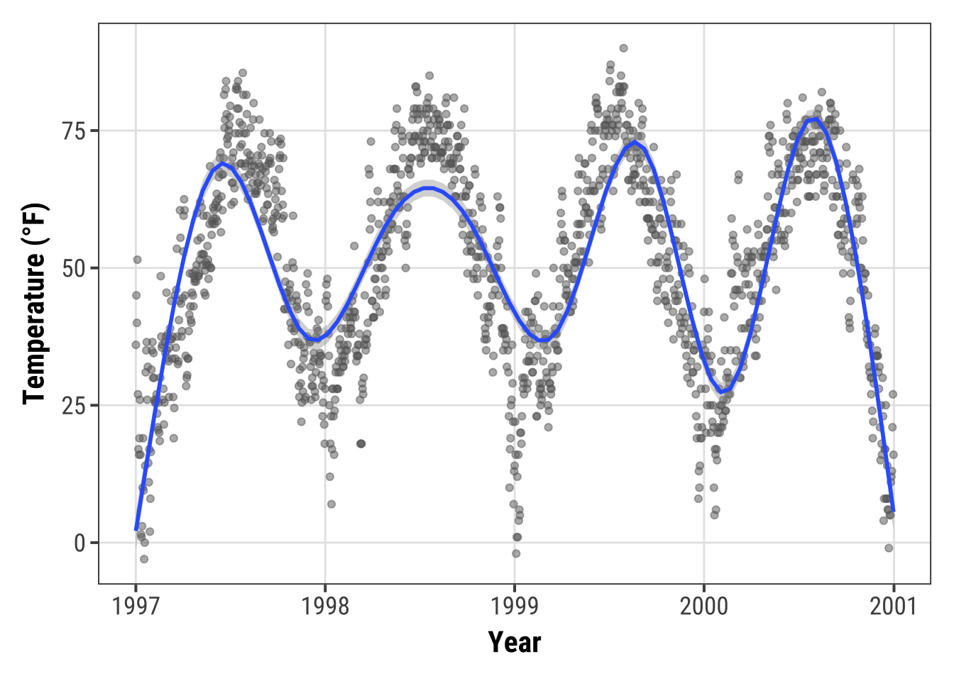
💡 In most cases one wants the points to be on top of the ribbon so make sure you always call the smoothing before you add the points.
Adding a Linear Fit
Though the default is a LOESS or GAM smoothing, it is also easy to add a standard linear fit:
ggplot(chic, aes(x = temp, y = dewpoint)) +
   geom_point(color = "gray40", alpha = .5) +
   stat_smooth(method = "lm", se = FALSE,
               color = "firebrick", linewidth = 1.3) +
   labs(x = "Temperature (°F)", y = "Dewpoint")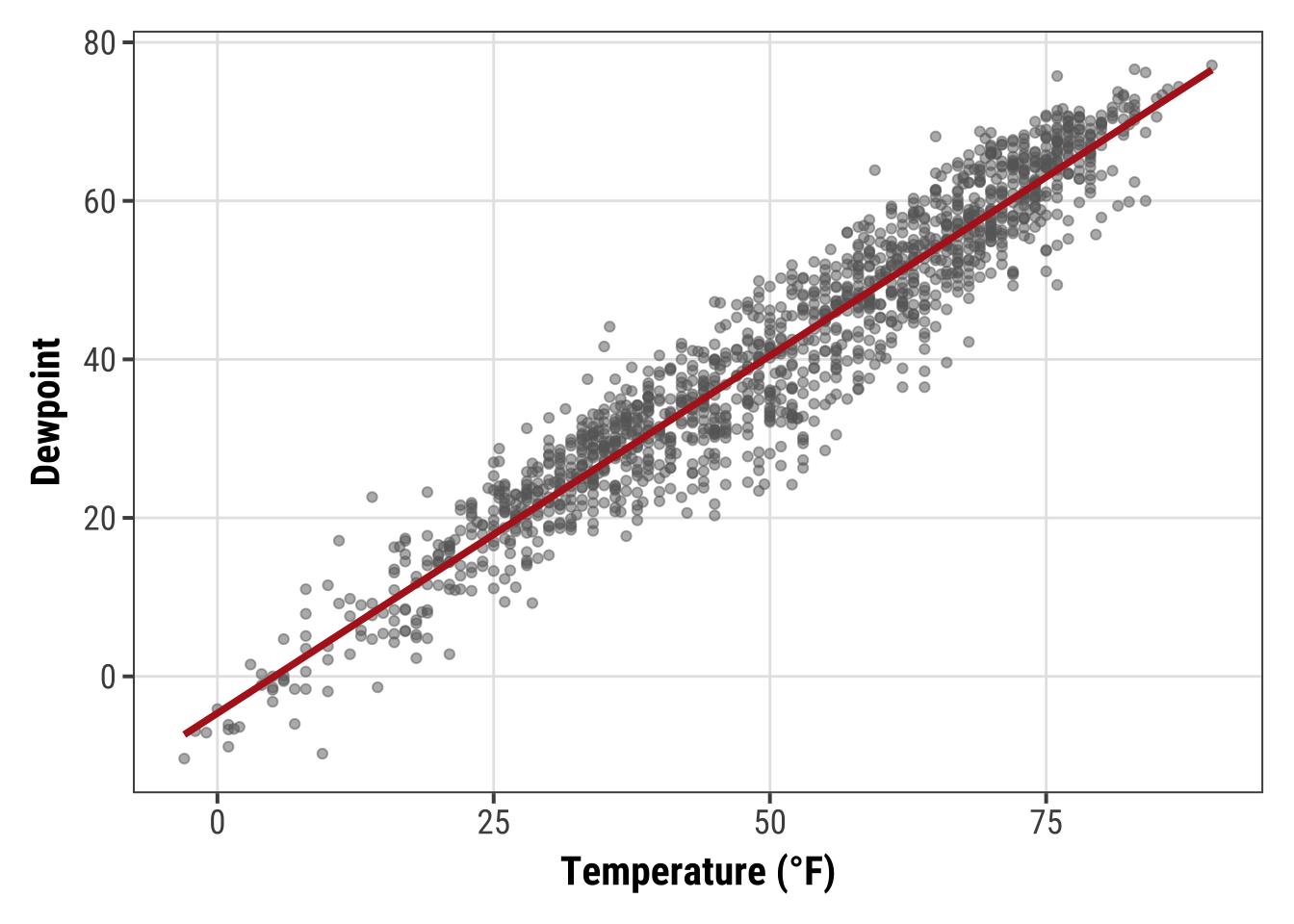
Specifying the Formula for Smoothing
{ggplot2} allows you to specify the model you want it to use.
Maybe you want to use a polynomial regression?
ggplot(chic, aes(x = o3, y = temp)) +
  geom_point(color = "gray40", alpha = .3) +
  geom_smooth(
    method = "lm",
    formula = y ~ x + I(x^2) + I(x^3) + I(x^4) + I(x^5),
    color = "black",
    fill = "firebrick"
  ) +
  labs(x = "Ozone Level", y = "Temperature (°F)")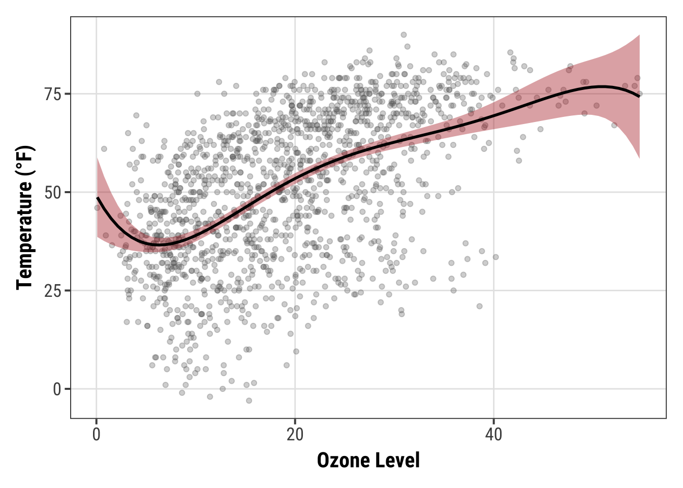
💁 Huh, geom_smooth()?
There is an important difference between geom and stat but here it really doesn’t matter which one you use.
Expand to compare both.
ggplot(chic, aes(x = o3, y = temp)) +
  geom_point(color = "gray40", alpha = .3) +
  geom_smooth(stat = "smooth") + ## the default
  labs(x = "Ozone Level", y = "Temperature (°F)")
ggplot(chic, aes(x = o3, y = temp)) +
  geom_point(color = "gray40", alpha = .3) +
  stat_smooth(geom = "smooth") + ## the default
  labs(x = "Ozone Level", y = "Temperature (°F)")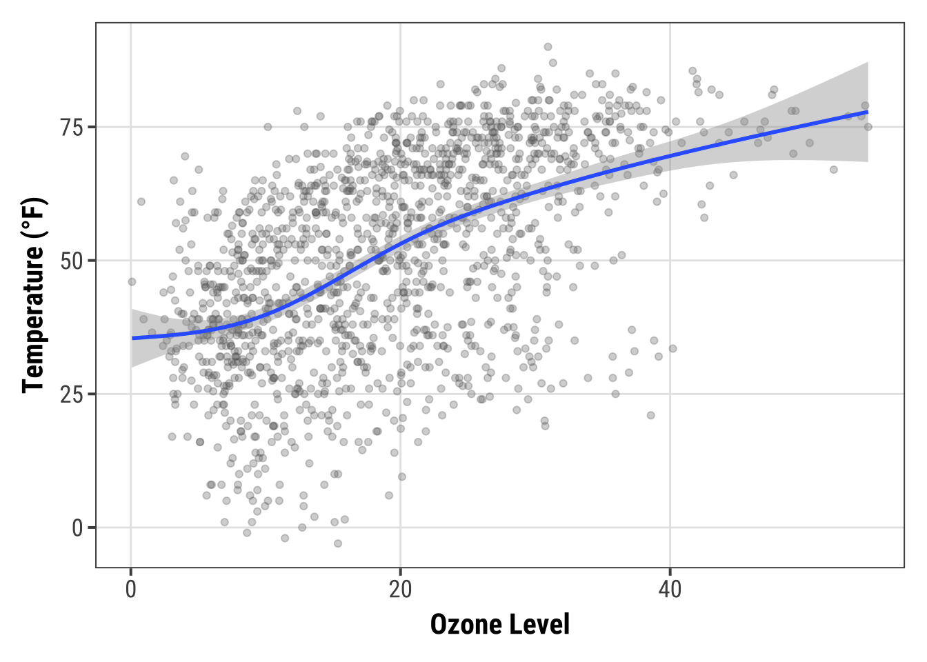
Or lets say you want to increase the GAM dimension (add some additional wiggles to the smooth):
cols <- c("darkorange2", "firebrick", "dodgerblue3")

ggplot(chic, aes(x = date, y = temp)) +
  geom_point(color = "gray40", alpha = .3) +
  stat_smooth(aes(col = "1000"),
              method = "gam",
              formula = y ~ s(x, k = 1000),
              se = FALSE, linewidth = 1.3) +
  stat_smooth(aes(col = "100"),
              method = "gam",
              formula = y ~ s(x, k = 100),
              se = FALSE, linewidth = 1) +
  stat_smooth(aes(col = "10"),
              method = "gam",
              formula = y ~ s(x, k = 10),
              se = FALSE, linewidth = .8) +
  scale_color_manual(name = "k", values = cols) +
  labs(x = "Year", y = "Temperature (°F)")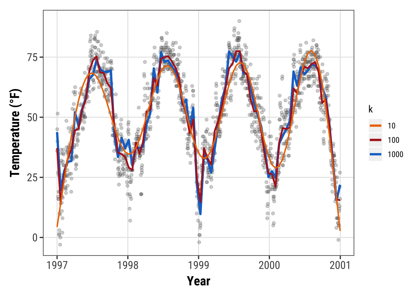
Working with Interactive Plots
The following collection lists libraries that can be used in combination with {ggplot2} or on their own to create interactive visualizations in R (often making use of existing JavaScript libraries).
Combination of {ggplot2} and {shiny}
{shiny} is a package from RStudio that makes it incredibly easy to build interactive web applications with R.
For an introduction and live examples, visit the Shiny homepage.
To look at the potential use, you can check out the Hello Shiny examples. This is the first one:
library(shiny)
runExample("01_hello")
Of course, one can use ggplots in these apps. This example demonstrates the possibility to add some interactive user experience:
runExample("04_mpg")Plot.ly via {plotly} and {ggplot2}
Plot.ly is a tool for creating online, interactive graphics and web apps.
The {plotly} package enables you to create those directly from your {ggplot2} plots and the workflow is surprisingly easy and can be done from within R.
However, some of your theme settings might be changed and need to be modified manually afterwards.
Also, and unfortunately, it is not straightforward to create facets or true multi-panel plots that scale nicely.
g <- ggplot(chic, aes(date, temp)) +
  geom_line(color = "grey") +
  geom_point(aes(color = season)) +
  scale_color_brewer(palette = "Dark2", guide = "none") +
  labs(x = NULL, y = "Temperature (°F)") +
  theme_bw()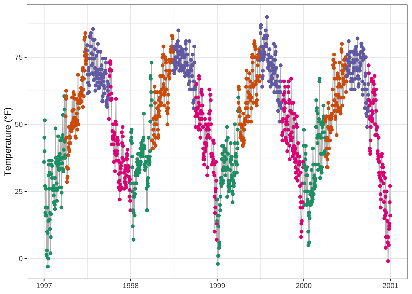
library(plotly)

ggplotly(g)
Here, for example, it keeps the overall theme setting but adds the legend again.
ggiraph and ggplot2
{ggiraph} is an R package that allows you to create dynamic {ggplot2} graphs.
This allows you to add tooltips, animations and JavaScript actions to the graphics.
The package also allows the selection of graphical elements when used in Shiny applications.
library(ggiraph)

g <- ggplot(chic, aes(date, temp)) +
  geom_line(color = "grey") +
  geom_point_interactive(
    aes(color = season, tooltip = season, data_id = season)
  ) +
  scale_color_brewer(palette = "Dark2", guide = "none") +
  labs(x = NULL, y = "Temperature (°F)") +
  theme_bw()

girafe(ggobj = g)
Highcharts via {highcharter}
Highcharts, a software library for interactive charting, is another visualization library written in pure JavaScript that has been ported to R.
The package {highcharter} makes it possible to use them—but be aware that Highcharts is only free in case of non-commercial use.
library(highcharter)

hchart(chic, "scatter", hcaes(x = date, y = temp, group = season))
Echarts via {echarts4r}
Apache ECharts is a free, powerful charting and visualization library offering an easy way of building intuitive, interactive, and highly customizable charts.
Even though it is written in pure JavaScript, one can use it in R via the {echarts4r} library thanks to John Coene.
Check out the impressive example gallery or this app made by the package developer John Coene.
library(echarts4r)

chic |>
  e_charts(date) |>
  e_scatter(temp, symbol_size = 7) |>
  e_visual_map(temp) |>
  e_y_axis(name = "Temperature (°F)") |>
  e_legend(FALSE)
Chart.js via {charter}
charter is another package developed by John Coene that enables the use of a JavaScript visualization library in R. The package allows you to build interactive plots with the help of the Charts.js framework.
library(charter)

chic$date_num <- as.numeric(chic$date)
## doesn't work with class date

chart(data = chic, caes(date_num, temp)) |>
  c_scatter(caes(color = season, group = season)) |>
  c_colors(RColorBrewer::brewer.pal(4, name = "Dark2"))
(The example doesn’t work in Rmarkdown.)
Remarks, Tipps & Resources
Using ggplot2 in Loops and Functions
The grid-based graphics functions in lattice and ggplot2 create a graph object.
When you use these functions interactively at the command line, the result is automatically printed, but in source() or inside your own functions you will need an explicit print() statement, i.e. print(g) in most of our examples.
See also the Q&A page of R.
Additional Resources
- “ggplot2: Elegant Graphics for Data Analysis” by Hadley Wickham, available via open-access!
- “Fundamentals of Data Visualization” by Claus O. Wilke about data visualization in general but using
{ggplot2}. (You can find the codes on his GitHub profile.) - “Cookbook for R” by Winston Chang with recipes to produce R plots
- Gallery of the Top 50 ggplot2 visualizations
- Gallery of
{ggplot2}extension packages - How to extend
{ggplot2}by Hadley Wickham - The fantastic R4DS Online Learning Community that offers help and mentoring for all things related to the content of the “R for Data Science” book by Hadley Wickham
- #TidyTuesday, a weekly social data project focusing on ggplots—check also #TidyTuesday on Twitter and this collection of contributions by Neil Grantham
- A two-part, 4.5-hours tutorial series by Thomas Linn Pedersen (Part 1 | Part 2)
↑ Jump back to Table of Content.
R Session Info
## R version 4.3.0 (2023-04-21)
## Platform: aarch64-apple-darwin20 (64-bit)
## Running under: macOS Ventura 13.2.1
##
## Matrix products: default
## BLAS:   /Library/Frameworks/R.framework/Versions/4.3-arm64/Resources/lib/libRblas.0.dylib
## LAPACK: /Library/Frameworks/R.framework/Versions/4.3-arm64/Resources/lib/libRlapack.dylib;  LAPACK version 3.11.0
##
## locale:
## [1] en_US.UTF-8/en_US.UTF-8/en_US.UTF-8/C/en_US.UTF-8/en_US.UTF-8
##
## time zone: Europe/Berlin
## tzcode source: internal
##
## attached base packages:
## [1] grid      stats     graphics  grDevices utils     datasets  methods   base
##
## other attached packages:
##  [1] echarts4r_0.4.5   highcharter_0.9.4 ggiraph_0.8.7     plotly_4.10.2     ggridges_0.5.4    ggforce_0.4.1     forcats_1.0.0     ggrepel_0.9.3     hrbrthemes_0.8.0  dplyr_1.1.0       prismatic_1.1.1   scico_1.5.0       rcartocolor_2.1.1 ggsci_3.0.0       ggthemes_4.2.4    gridExtra_2.3     cowplot_1.1.2     purrr_1.0.1       ggtext_0.1.2      showtext_0.9-6    showtextdb_3.0    sysfonts_0.8.8    patchwork_1.1.2   ggplot2_3.4.3
##
## loaded via a namespace (and not attached):
##   [1] RColorBrewer_1.1-3      rstudioapi_0.15.0       jsonlite_1.8.7          magrittr_2.0.3          farver_2.1.1            rmarkdown_2.20          vctrs_0.6.3             blogdown_1.18           htmltools_0.5.6         curl_5.0.0              broom_1.0.5             TTR_0.24.3              sass_0.4.7              bslib_0.5.1             htmlwidgets_1.6.2       zoo_1.8-12              lubridate_1.9.2         cachem_1.0.8            uuid_1.1-1              commonmark_1.9.0        igraph_1.5.1            mime_0.12               lifecycle_1.0.3         pkgconfig_2.0.3         Matrix_1.6-1.1          R6_2.5.1                fastmap_1.1.1           shiny_1.7.5
##  [29] digest_0.6.33           colorspace_2.1-0        crosstalk_1.2.0         akima_0.6-3.4           labeling_0.4.2          fansi_1.0.4             timechange_0.2.0        httr_1.4.5              polyclip_1.10-4         mgcv_1.8-42             compiler_4.3.0          bit64_4.0.5             fontquiver_0.2.1        withr_2.5.0             backports_1.4.1         hexbin_1.28.3           highr_0.10              Rttf2pt1_1.3.12         MASS_7.3-58.4           gfonts_0.2.0            tools_4.3.0             quantmod_0.4.25         httpuv_1.6.11           extrafontdb_1.0         glue_1.6.2              nlme_3.1-162            promises_1.2.1          gridtext_0.1.5
##  [57] generics_0.1.3          isoband_0.2.7           gtable_0.3.4            tzdb_0.3.0              tidyr_1.3.0             data.table_1.14.8       hms_1.1.2               sp_2.1-0                xml2_1.3.3              utf8_1.2.3              pillar_1.9.0            markdown_1.5            stringr_1.5.0           vroom_1.6.1             corrr_0.4.4             later_1.3.1             splines_4.3.0           tweenr_2.0.2            lattice_0.21-8          bit_4.0.5               tidyselect_1.2.0        fontLiberation_0.1.0    knitr_1.42              fontBitstreamVera_0.1.1 bookdown_0.35           crul_1.4.0              xfun_0.40               stringi_1.7.12
##  [85] lazyeval_0.2.2          yaml_2.3.7              evaluate_0.20           httpcode_0.3.0          extrafont_0.19          gdtools_0.3.3           tibble_3.2.1            cli_3.6.1               xtable_1.8-4            systemfonts_1.0.4       munsell_0.5.0           jquerylib_0.1.4         Rcpp_1.0.11             parallel_4.3.0          ellipsis_0.3.2          readr_2.1.4             assertthat_0.2.1        viridisLite_0.4.2       rlist_0.4.6.2           xts_0.13.1              scales_1.2.1            crayon_1.5.2            rlang_1.1.1