Header image by Richard Strozynski
Sunday
Two days ago, I was sitting in the sun with a friend working in UX and Graphic Design, chatting about DataViz:
She: “Oh man, last week we had one customer asking for a bar chart race. Do you know these?”
Me: “Yes… They are literally EVERYWHERE 1”.
She: “Yeah, and we had some tough time to make that work and to customize it in Adobe Animate.”
Me: “…”
She: “… and I wondered if you could have done this in R?”
Of course, one can! And especially, looping through design choices with a customer regarding colors, fonts, size and also simply to map the relevant data to a bar plot is so much easier.
I mean, they have drawn each bar separately during their progress which took them hours to do!
To demonstrate the capability of R, I immediately sat down after the family went to bed and copied the example provided by Abdul Majed Raja using the great {gganimate} 📦 (what else?!) by Thomas Lin Pedersen (who else?!) to create a smooth and colorful bar chart race with some own data.
I am playing around with Berlin weather data from the DWD (Deutscher Wetterdienst) for a few days now—for example my contribution to the #SWDchallenge on “Visualizing Uncertainty”—so this was an easy choice. I created the usual bar chart race as introduced by John Burn-Murdoch visualizing the daily maximum temperature in Berlin-Dahlem (one of many stations in Berlin), averaged for each month. 15 to 30 minutes later (okay, add one more hour for playing around with different time periods and frame rates) I was very happy about this gif:
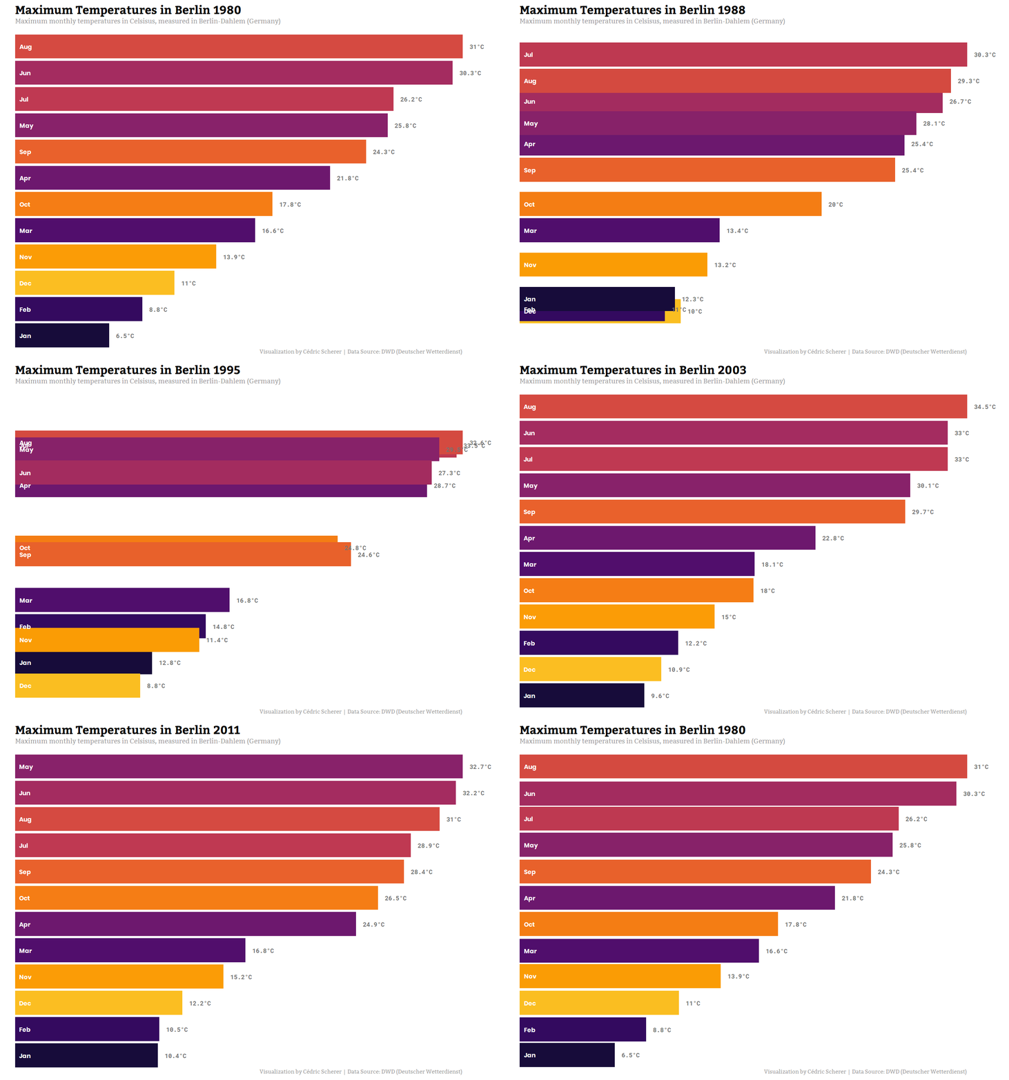
Even though I love the viridis color palettes and they are my default color choice (here: option inferno because it fits the topic), I gave it another try. The {scico} 📦 is another great color palette package, again maintained by Thomas Lin Pedersen, and there is one particular palette that couldn’t match my animation better - it’s blue-redish and called berlin!
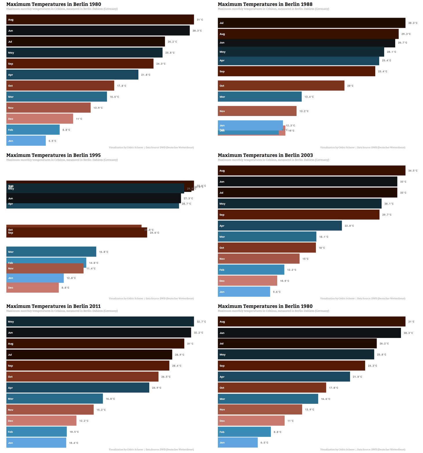
It was already late and I had to stop. I’ve mailed her the animations and while going to bed, I was already thinking about other cool stuff one could use a bar chart race for in this context.
Monday
In the morning, on my way to work, I coded an unusual bar chart race (or maybe it doesn’t even fit this definition any more?) showing the difference of monthly average temperatures to the 1951–1980 period, and thus both positive and negative values. While showing the general seasonal pattern in the northern hemisphere with summer months being warmer and winter months being colder than average, this illustrates nicely increasing temperatures in more recent years during the summer months and also in spring and autumn:
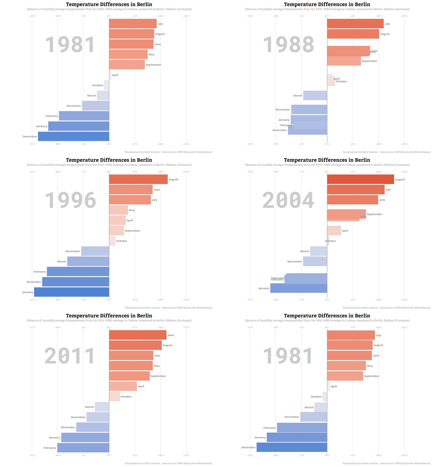
I again depicted only the period from 1980 until now since the animation became too long2.
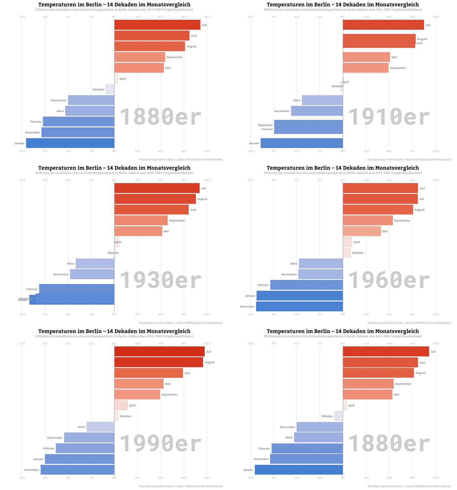
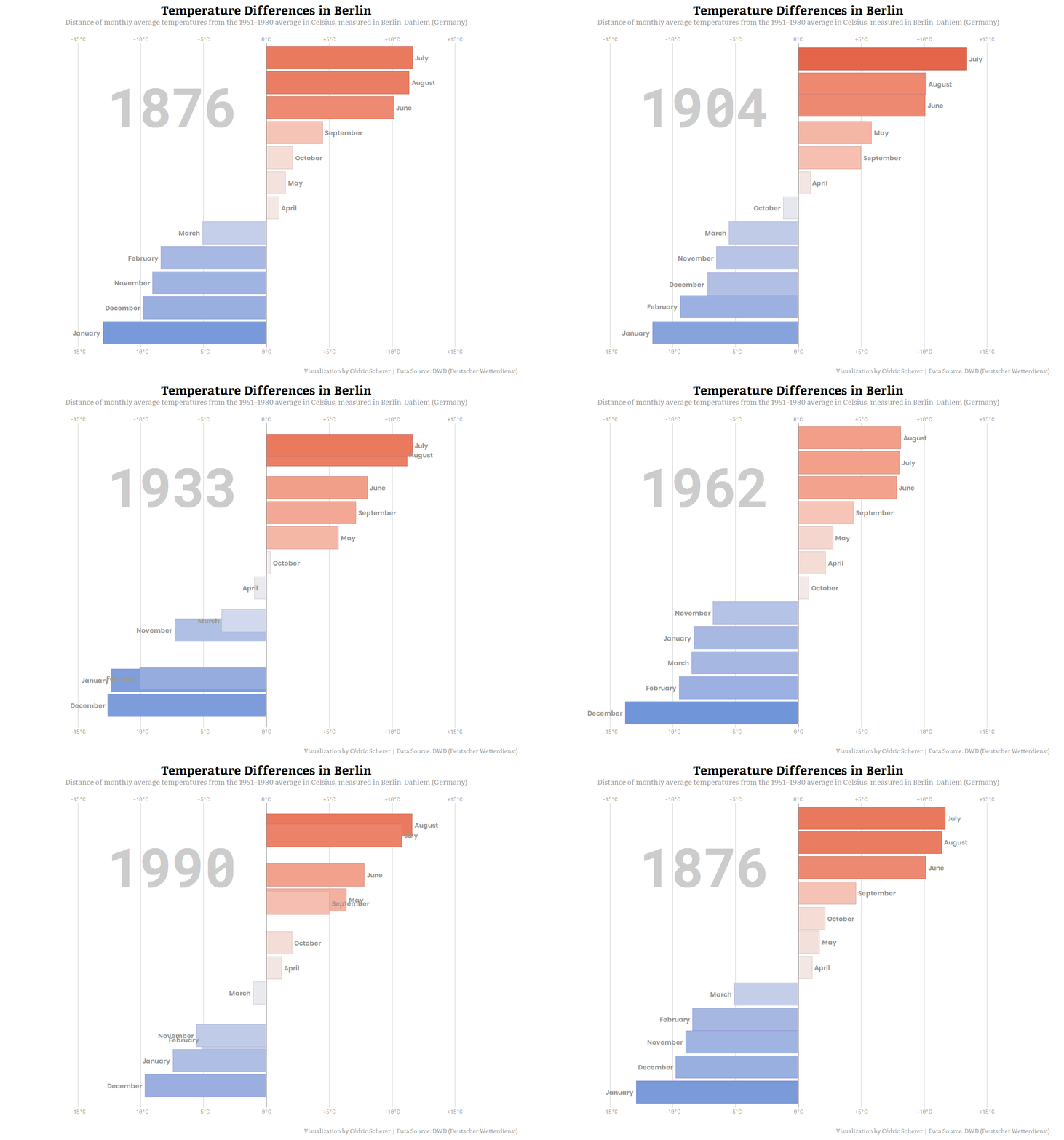
To visualize the trend over the whole period (1876–2018), I decided to group the data per decade (to do so in R with{dplyr} use: mutate(decade = year %/% 10 * 10)) and visualize the difference in average monthly temperatures: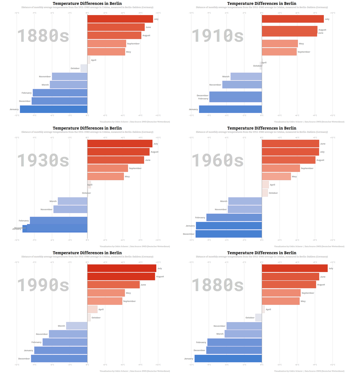
Finally, so that the locals can understand it too, I’ve created a version in German:
Tuesday
So, now I am sitting here watching bar chart races on my laptop in various forms, colors, languages, and time periods.
Me: Wow, it’s amazing what you can do with R! And how easy it is.
Also me: Next time, my friend’s agency hopefully contacts someone who knows how to use R and data visualization (me!) to make reproducible, publication-ready bar chart races (or any other DataViz)!Also me: Maybe I should jump on the hype train before it's gone3 and write a blog post.
Footnotes
1 see for example: the already famous bar chart race from John Burn-Murdoch, the #TidyTuesday contribution by Jon 'The Geek' Harmon, a bar chart race about the popularity of bar chart races on Reddit and the "Bar Chart Race of Bart Chart Races". Go back ↑
2 Here is the long version showing monthly average temperatures for all years (1876–2018):
… and differences in monthly temperatures to the 1951-1980 average:
3 Probably I am already too late to catch that train... Go back ↑