Header image by Richard Strozynski
At the end of an exiting second #TidyTuesday year, Jon Harmon, host of the TidyTuesday Podcast, asked on Twitter:
What was your favorite #TidyTuesday dataset of 2019? What were some of your favorite visualizations? Why? Let me know with an @ or via #BestTidyTuesday2019!
— TidyTuesday Podcast (@tidypod) December 12, 2019
I took this opportunity to recap the last year of contributions to the #TidyTuesday challenge. Immediately, several contributions came to my mind and I tried to pick the best from those I’ve seen and which I remember. Since there were to many, I decided to group them in two groups: design and storytelling.
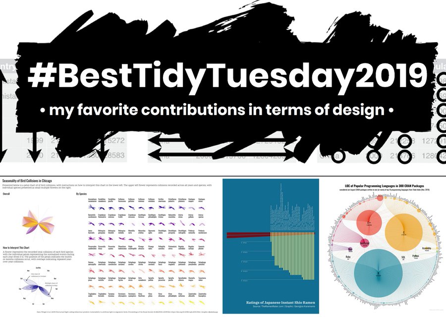
Here I refer to design as visually pleasing and interesting, maybe using unusual chart types to display the data. While it should give insights in the data to serve as a good data viz, there might be simpler (but visually less appealing) ways to tell the same story.
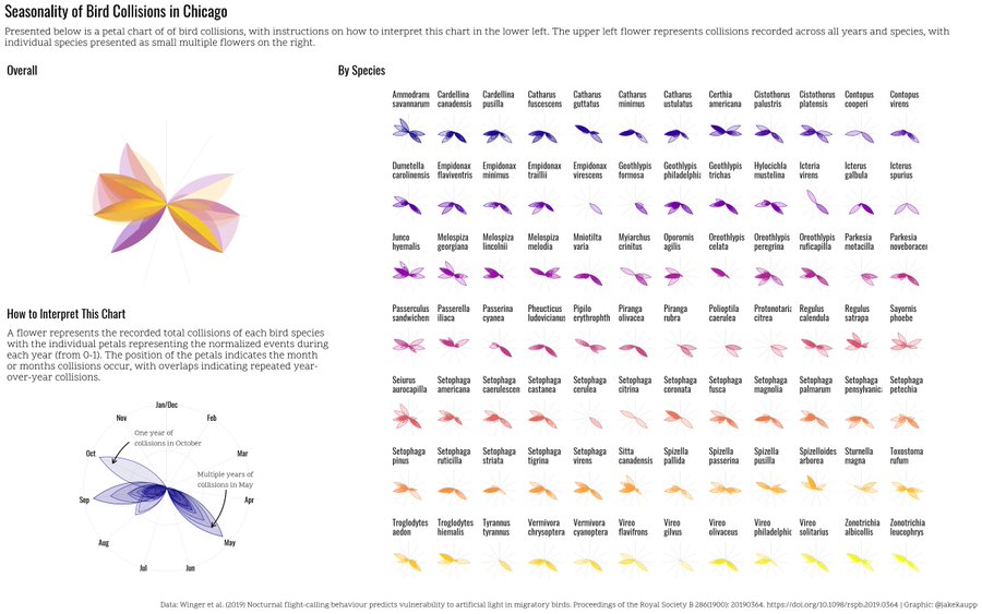
Chicago Bird Collisions by Jake Kaupp
One of the most active contributors to the #TidyTuesday is Jake Kaupp. Over the last two years, he participated with several well designed and clever contributions. A particular one that blew me away was his “flower representation” of bird collisions in Chicago for week 18. I didn’t know such things were possible in ggplot2. Now I know and it looks so beautiful and clean - thanks Jake for the many inspiring contributions!
My submission for #TidyTuesday week 18 went to a more artistic place than I expected. I represented the seasonality of the bird collision data in Chicago as petals in a flower. H/T to @thomasp85 for patchwork making layouts a lot easier. Code @ https://t.co/1BhlhPnYyC
— Jake Kaupp (@jakekaupp) May 1, 2019
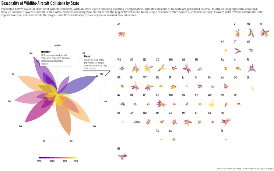
Jake presented a similar design in combination with a geofacet of the United States a few weeks later as contribution to week 30 on wildlife strikes by aircrafts:
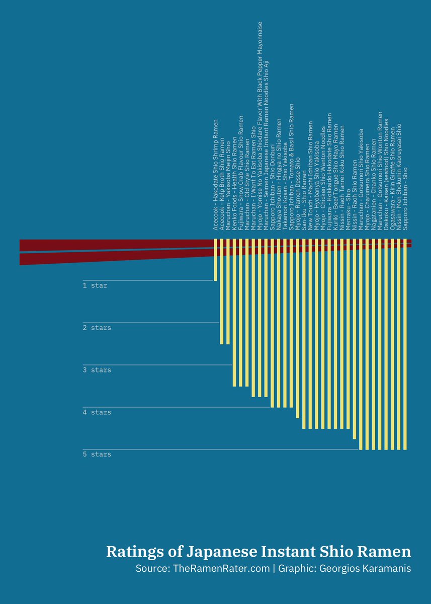
Ramen Ratings by Georgios Karamanis
Of course, Georgios Karamanis’ contributions also crossed my mind. Georgios started participating in 2019 and shared impressive visualization with a particular taste for artistic and creative design. I especially liked this simple but very well-designed contribution to week 23 on Ramen ratings:
Instant ramen reviews by @theramenrater for #TidyTuesday. Good luck reading the text, but couldn't help it, it was too much fun making this plot!
— Georgios Karamanis (@geokaramanis) June 5, 2019
code: https://t.co/jWEPqEefT7
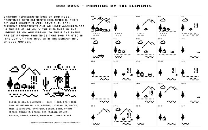
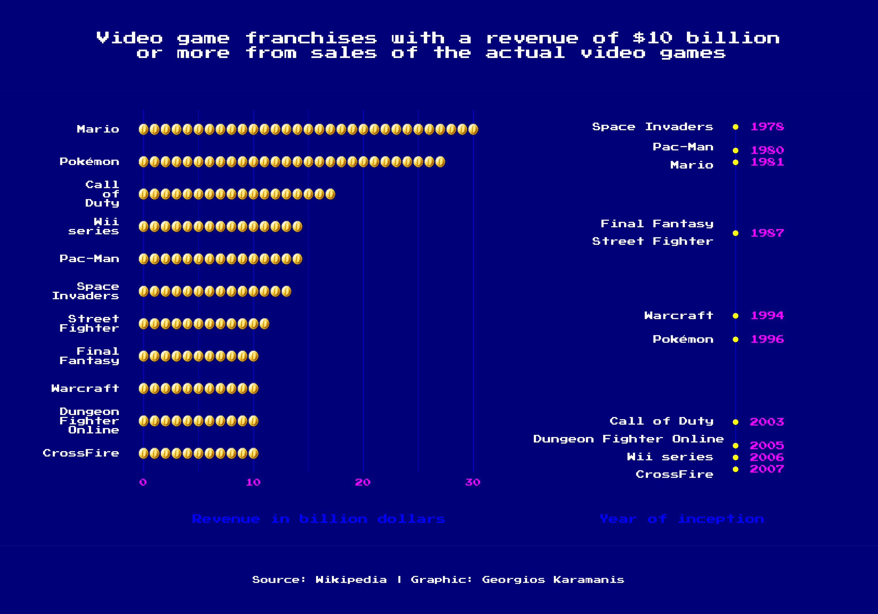
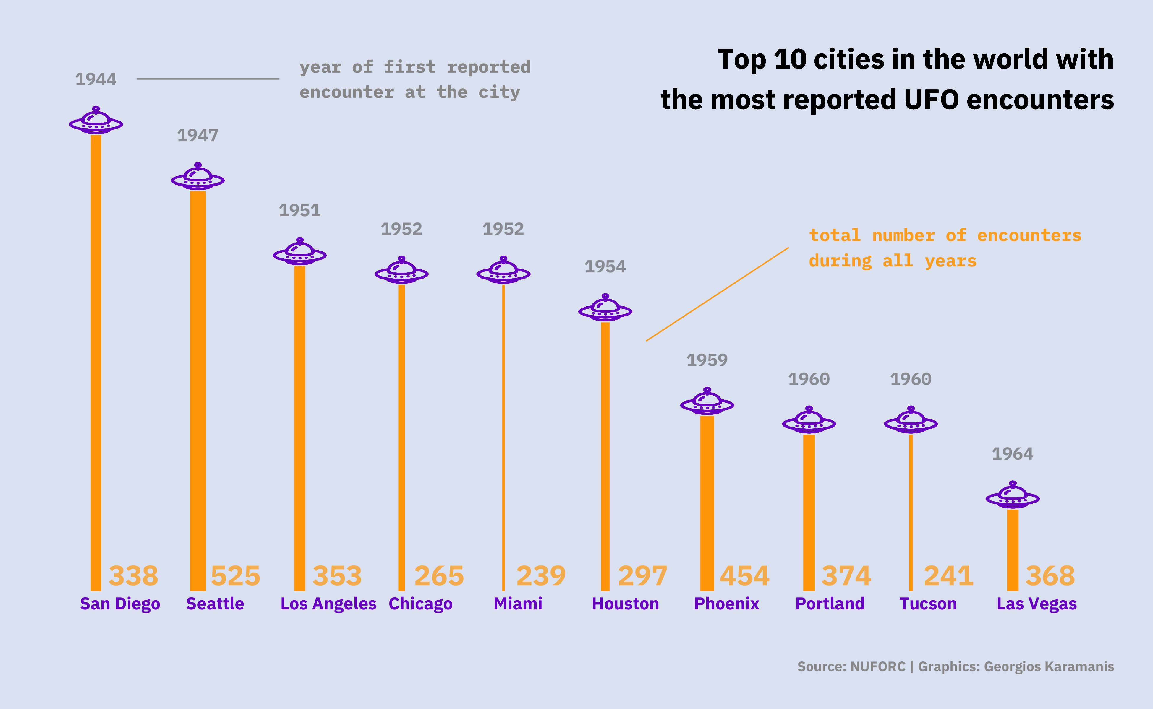
Several other contributions by Georgios are on my list of favorites, including the fabulous small multiples of Bob Ross paintings and two—again simple but very clever—visualization of Arcade game revenues and UFO sightings:
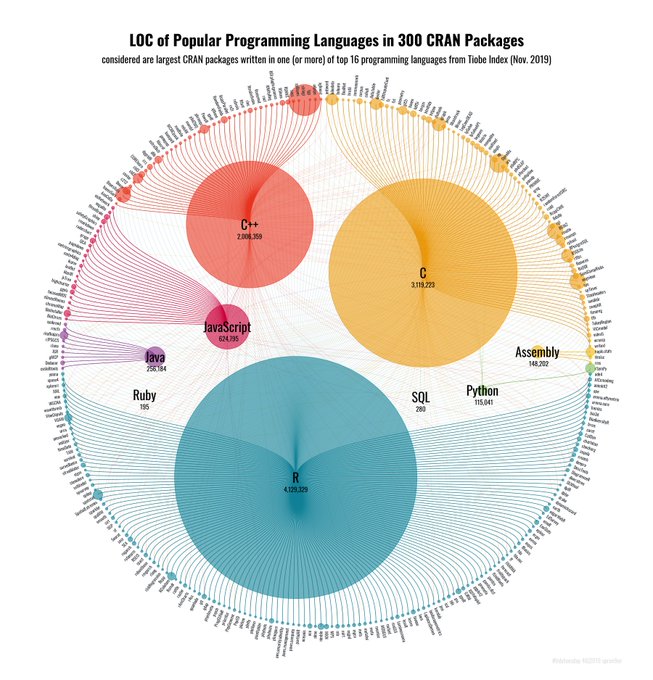
CRAN Code by Torsten Sprenger
Another great and very recent contribution is the fabulous network of CRAN packages by Torsten Sprenger for week 46:
My #tidytuesday 46|2019 contribution: Usage of Popular Programming Languages in 300 large CRAN Packages #rstats
— Dr. Torsten Sprenger (@spren9er) November 16, 2019
Code: https://t.co/b015aRyU9Q
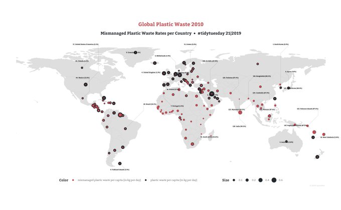
Have a look at all of Torsten’s contributions, it’s a rich source of great ggplot vizes! I particularly liked his minimalistic visualizations of the gender bias in scientific publishing and global plastic waste:
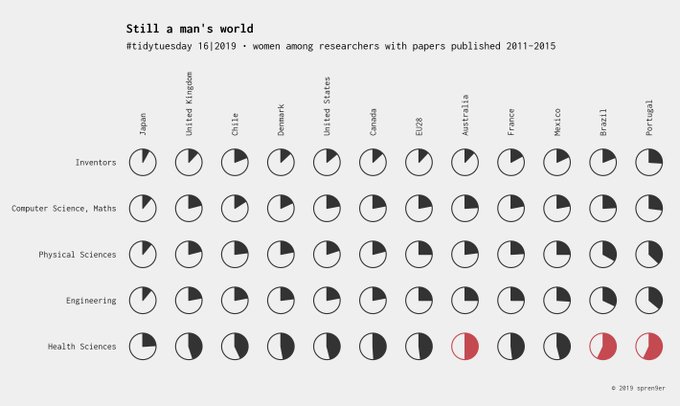
Contributions to the #TidyTuesday challenge focus on a single or few graphs, rarely on infographics or long and detailed stories. Anyway, by presenting a simple yet convincing chart in an appealing way and using clever annotations, a single chart can give a lot of insights and tell a (short) story and guide the reader.
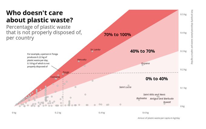
Global Plastic Waste by Christian Burkhart
Christian Burkharts contribution on global plastic waste (week 21) is not easy to grasp. The scatterplot shows the relationship of the amount of plastic waste and not properly disposed plastic waste per capita. I love how the stripes with different intensities and direct annotations highlight groups of countries that care the most and which doesn’t—and those in between:
#tidytuesday For this tidytuesday I tried to visualize the countries that are really bad at disposing their plastic waste properly. Code can be found here: https://t.co/HdnyVbKM7D
— Christian Burkhart (@Christi58451746) May 24, 2019
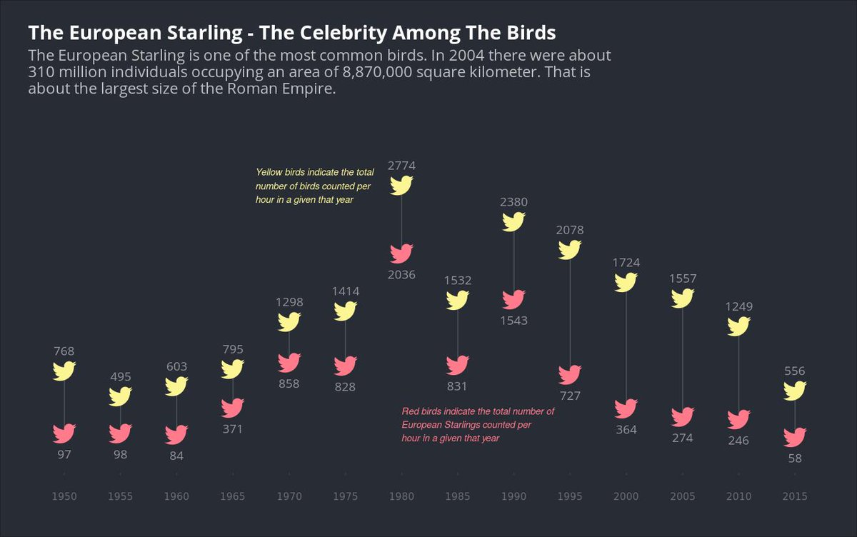
Christian is a new member of the #TidyTuesday community but shared several great visualizations such as the one on the European starling. He also is quite active in publishing step-by-step tutorials for specific ggplot charts on his page ggplot2tutor.
Amusement Park Injuries by Ariane Aumaitre
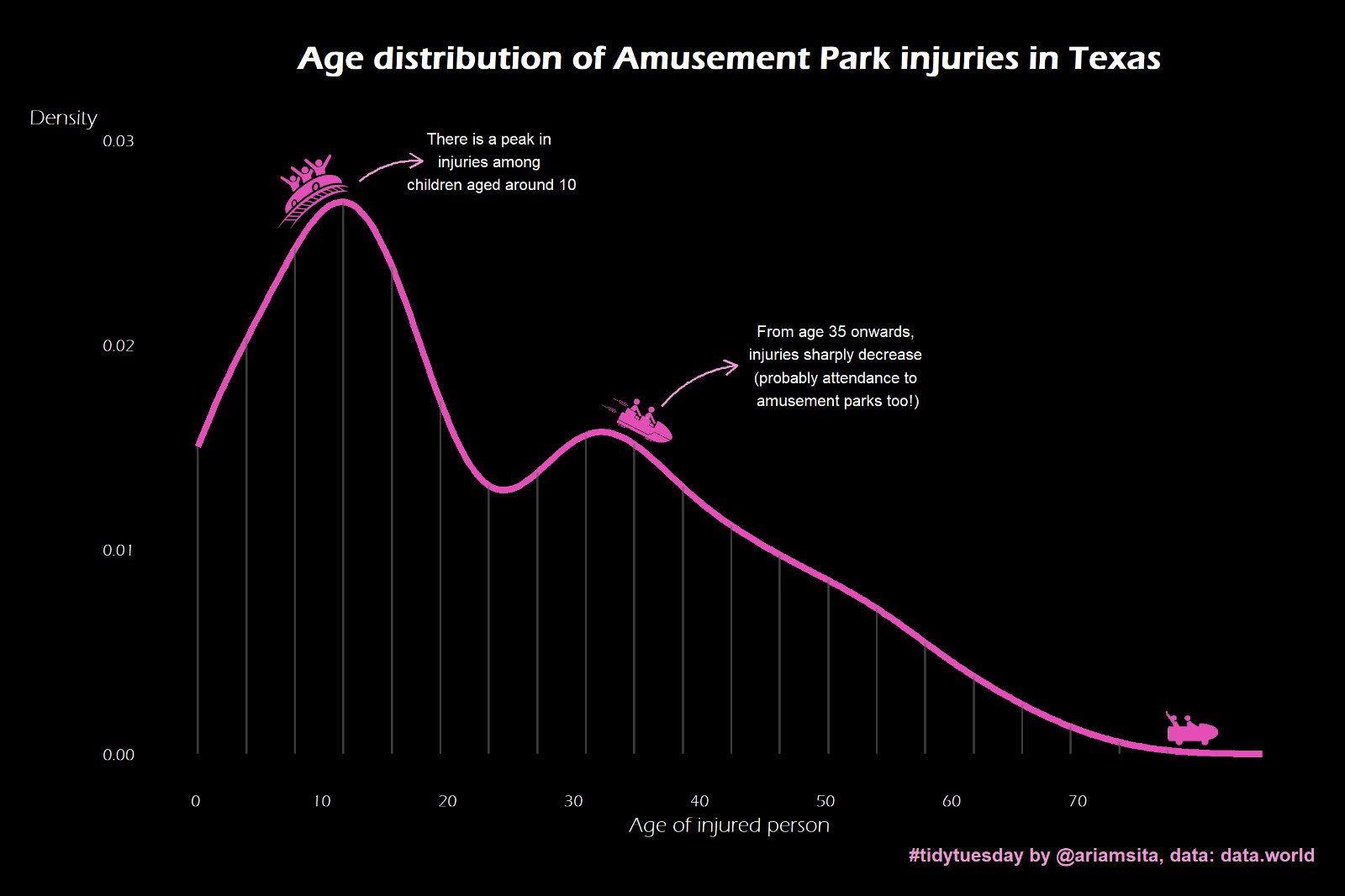
With her contribution to week 37 on amusement park injuries, [Ariane Aumaitre earned a lot of compliments and also a mention on the TidyTuesday Podcast! The line plot is very simple (and I would probably choose different colors here) but the use of annotations of both pictograms and text make sure the reader gets immediately what this plot is about! The impression of a rollercoaster is completed by the elegant use of “fake” grid lines that serve as girders:
Quick and simple (but I think fun!) contribution for this week's #tidytuesday.
— Ariane Aumaitre (@ariamsita) September 10, 2019
I plotted the age distribution of injuries as a rollercoaster 🎢. Main challenge: doing it without internet connection. Fake gridlines done w/ geom_linerange(), icons added w/ annotation_custom() 😬
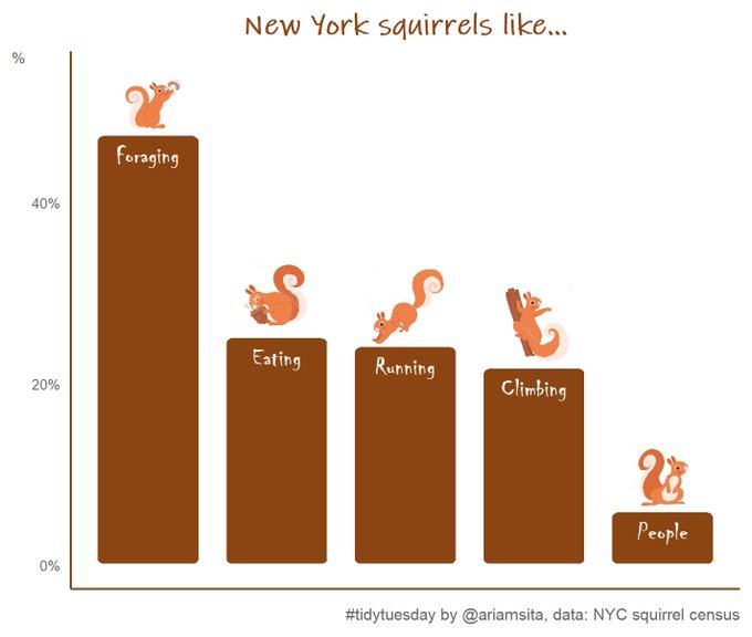
The clever use of pictograms can help to guide the reader. Another good example is her contribution to the Squirrel challenge:
I also would like to mention the contributions which are also contained in this blog post: Georgios’ visualization of UFO sightings or my animated car race below. (However, the use of the Twitter logo to visualize sightings of European starlings may have the opposite effect and mislead the reader. At least, every time it takes a moment for me to realize that Christian is talking about real birds here.)
US Student Loan Debt by Julia Watzek
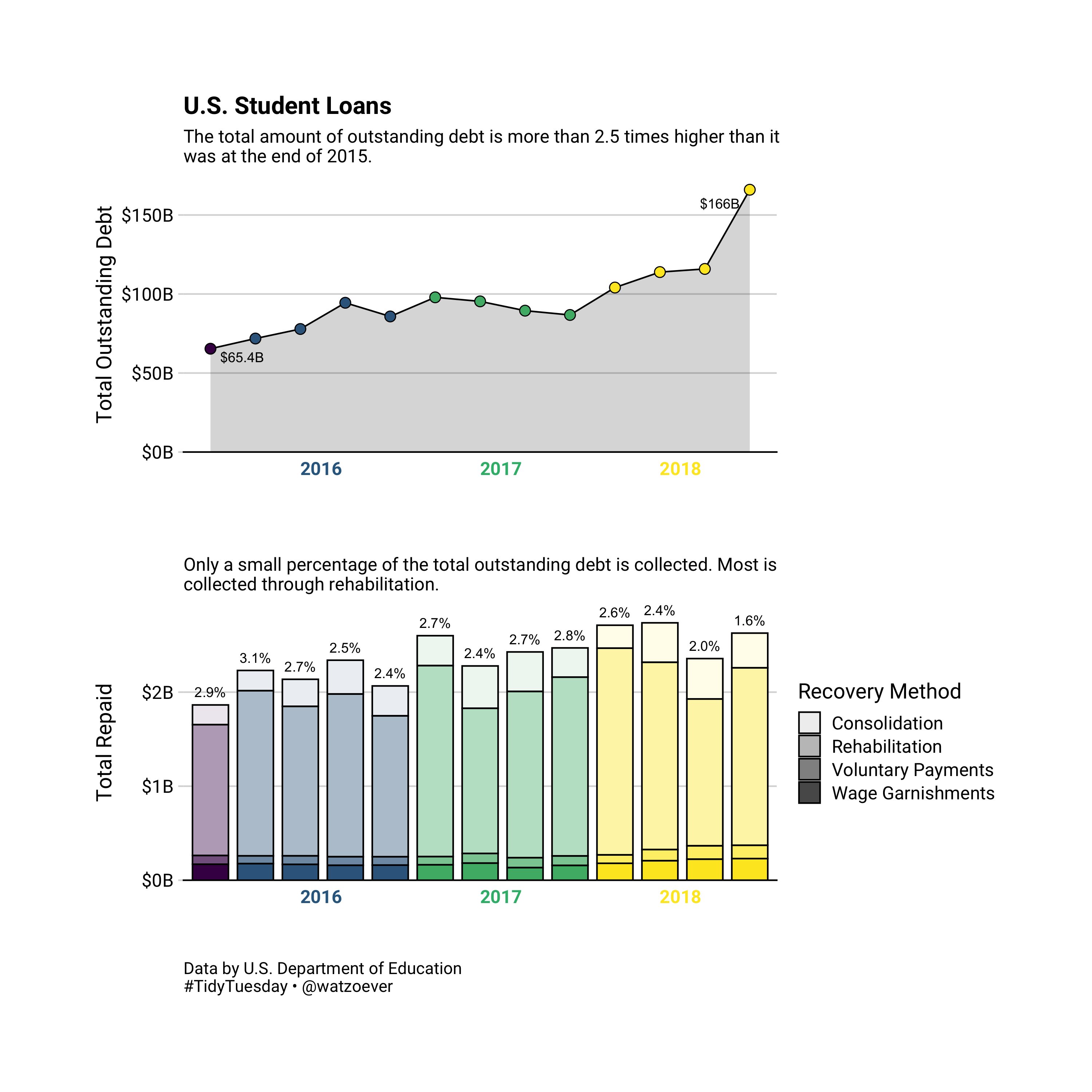
Julia Watzek has chosen two simple chart types to visualize student loan debt in the US: a line chart showing the outstanding debt over time (per quarter) and a stacked bar chart that gives more detailed insights on the paid debts by showing the proportion in total and for four different recovery methods:
#TidyTuesday 2019-48 • US Student Loan Debt 🎓💸
— Julia Watzek (@watzoever) November 27, 2019
Not sure about all the loan terms, but 1st time using ggtext📦 was a success!
Data: US Department of Education
Code: https://t.co/XfnLSM55mu#rstats #r4ds #dataviz
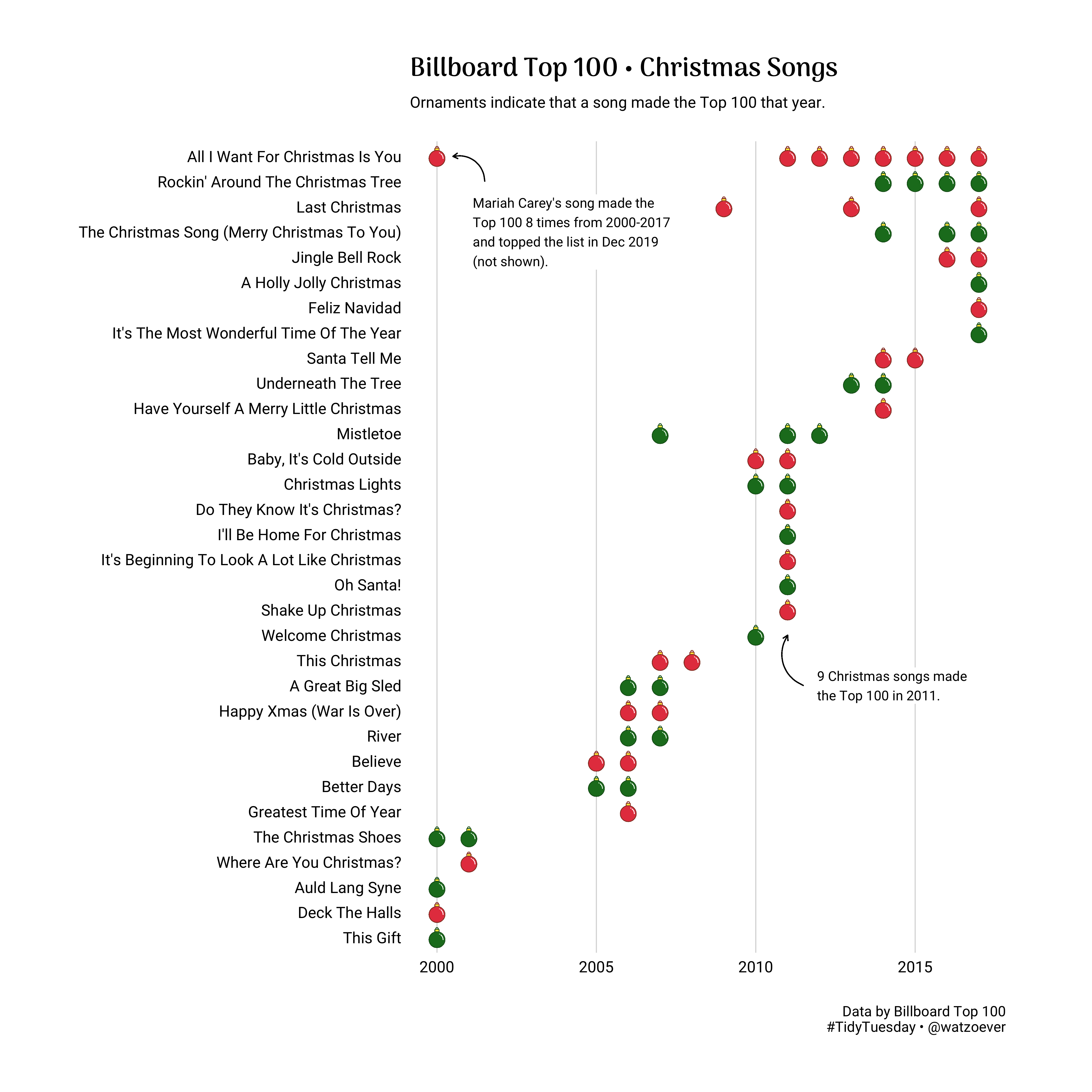
What I particularly like about this contribution is the consistent use of colors which make it easy to jump between both panels. This is also supported by the vertical alignment of the two plots. I found Julia’s contribution very informative and convincing, while being very simple and clean! From the very beginning, Julia shares high-quality contributions to the #TidyTuesday challenge I especially loved her latest Christmas-themed contribution:
Final Thoughts
This was a great second year of #TidyTuesday with so many interesting data sets and inspiring visualizations—I am sure I missed a ton of good contributions here! The longer I think about, the harder it gets to pick the favorite three visualizations… So please don’t be mad at me for not mentioning you. Which were your highlights?
