Coronavirus SARS-CoV-2, COVID-19 or simply Corona—what started as an epidemic in China’s Hubei province has become a global pandemic, leading to hundreds of thousands of infections and thousands of deaths so far, national lockdowns and quarantines of cities, #stayhome and #flattenthecurve hashtags—and obviously a global shortage of toilet paper.
When the corona pandemic started, I felt scared, curious and tired at the same time. Scared as a husband and father by the impact this virus outbreak might is going to have on our life, in 2020 and way beyond. Curious as a scientist who studies the spread and persistence of directly transmitted diseases in the context of contact rates and animal movement. And tired as a data visualization specialist when I saw a lot of visualizations that were created by persons that neither had the knowledge nor the interest to produce accurate visualizations. Back then I decided against creating corona-related data visualizations for several reasons, some related to my mood, some to the uncertainty in data and the sheer mass of unimportant or misleading visualizations popping up everywhere. However, I have the feeling that the initial spread of misleading visualizations that either trigger panic or play down the risk is mainly over and we now have a lot of data and background knowledge to base our visualizations on. And, more importantly, I had an idea how to visualize and compare the death tolls among countries. (Also I had a reason to create an animation thanks to the latest #SWDchallenge.)
Latest Update: June 28, 2020

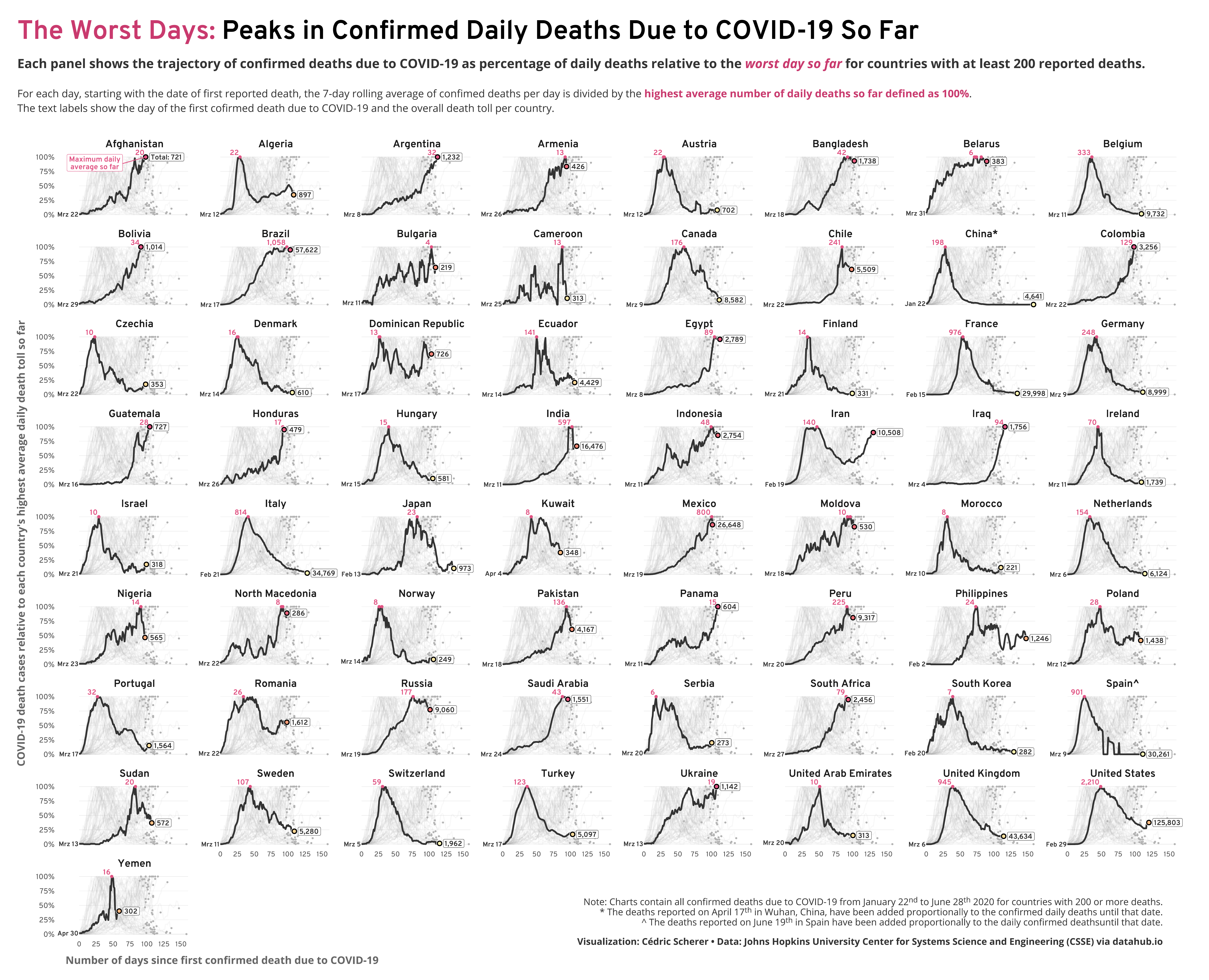
New Chart: Trajectories
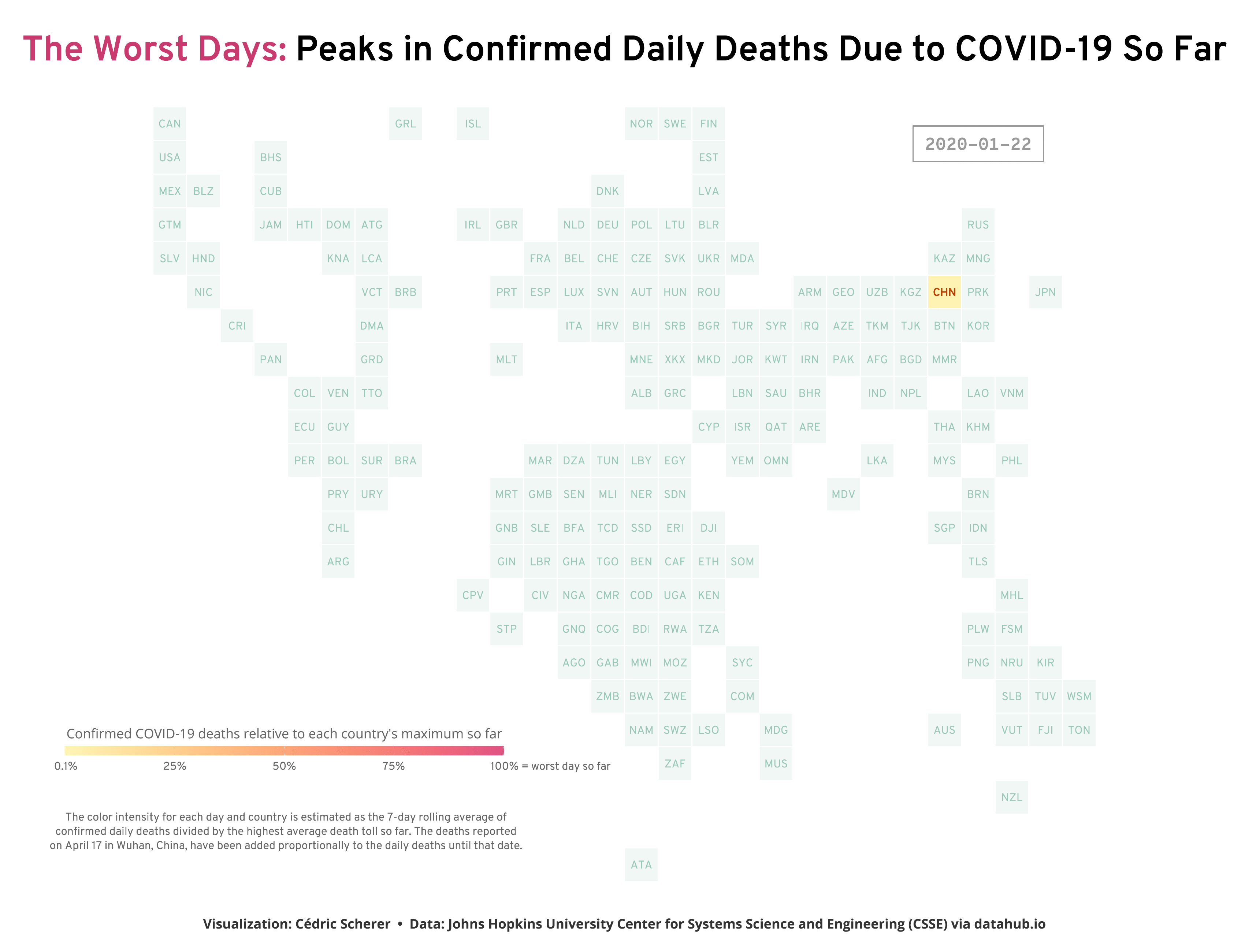
New Animation: Tile Map
The Idea
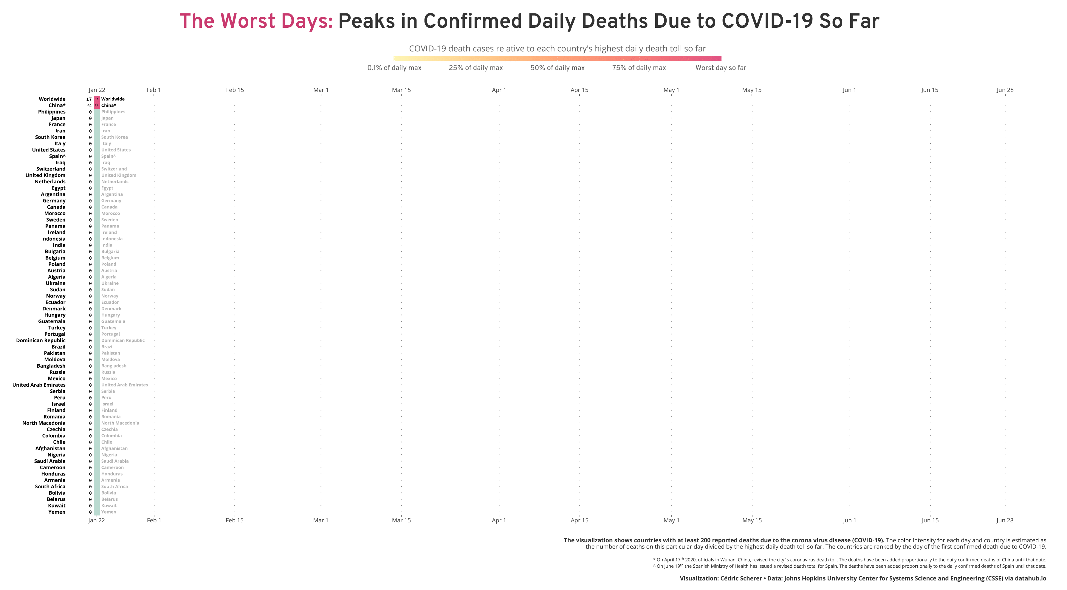
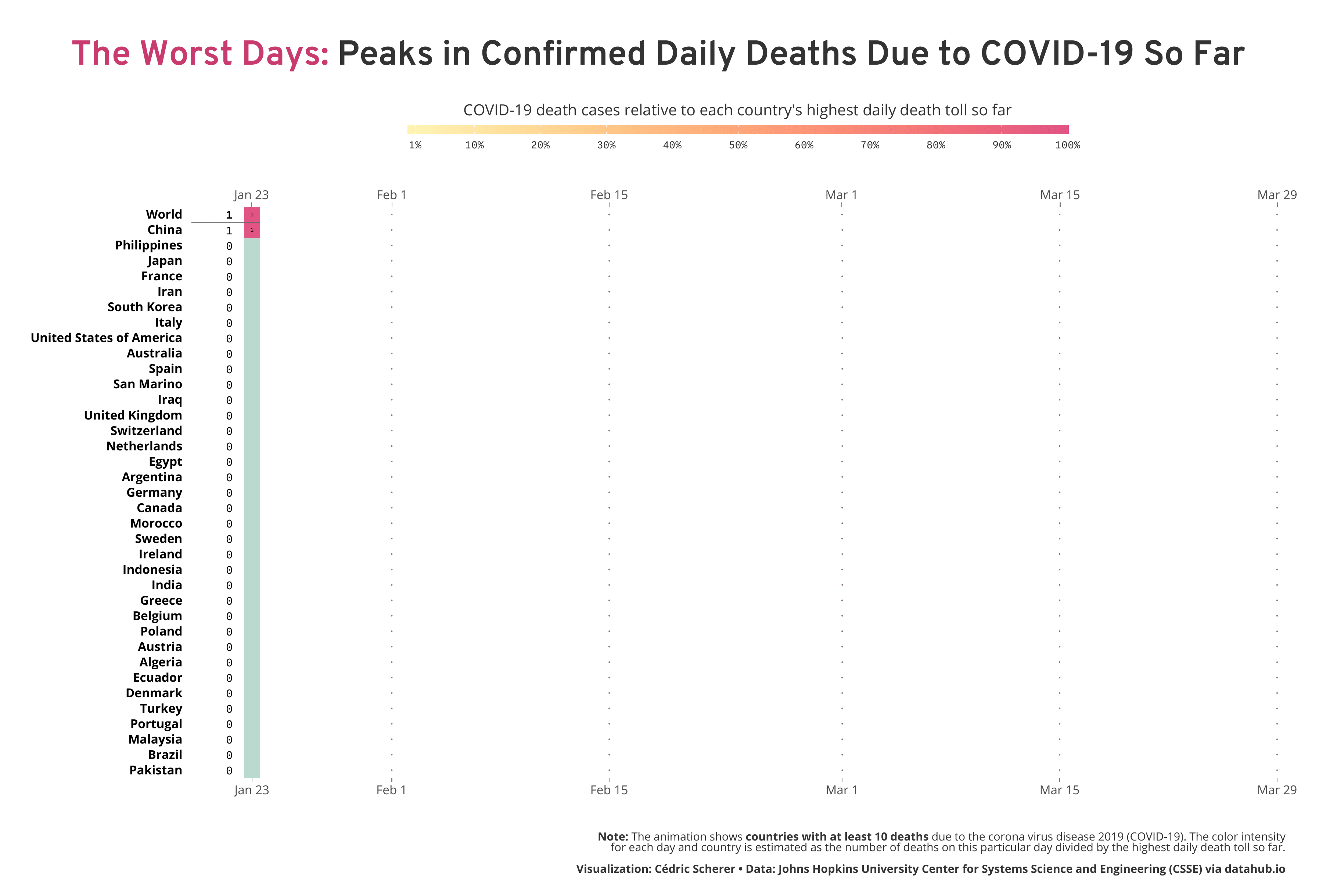
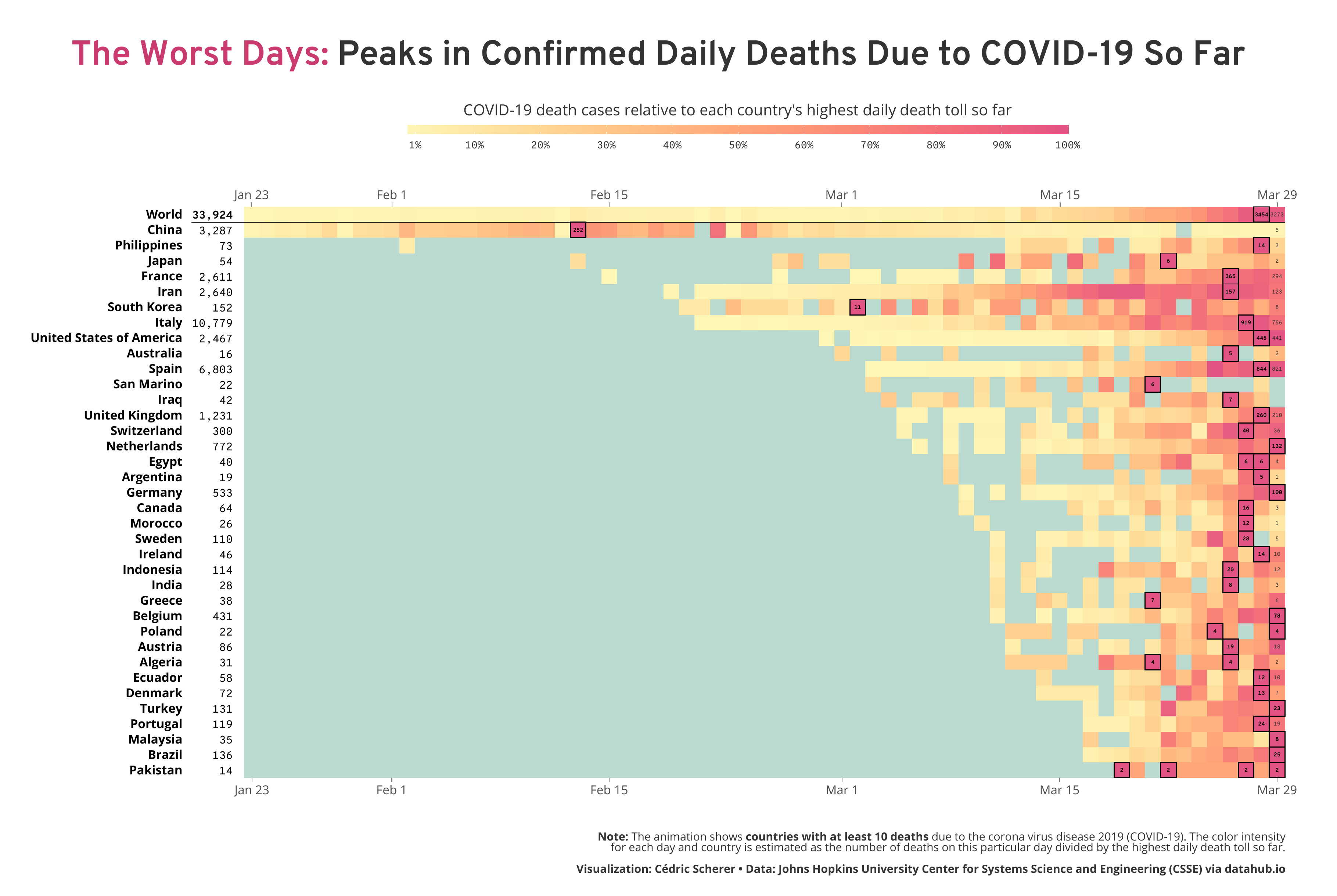
Inspired by my colleague Alexandre Courtiol, who looked at the worst day on a country-level by visualizing the deaths due to COVID-19 adjusted for baseline mortality and population size, I decided to highlight where each country falls along the wave. While his plot reveals some interesting patterns, I aimed for a timeline to reveal the temporal trends. Particularly, I wanted to highlight the relativity of the feeling “today is the worst day” and also the current trends, either today or a week ago—are we already over the (first) wave or can we expect more and more deaths in the next days? So I decided to take a different approach by calculating the number of daily deaths relative to the worst day on both the global and the country level.
How to Read the Visualization
As explained above, I calculated for each day the number of death cases relative to the “worst day”, namely the day with the most reported deaths so far. Imagine a naïve population that was not facing the virus before. At some point, there might be individuals dying but likely only a few (with regard to COVID-19—in general, this depends on the severity of the infection caused by the pathogen, often referred to as case fatality ratio or simply case fatality). Consequently, the proportion of deaths on the first day compared to the worst day has to be 100% (since the first day is, by definition, the worst day so far). On the next day, there might be more deaths than on the day before, a known pattern we see in reality and in simulations of early epidemics. Exponential growth, an always increasing curve we aim to flatten by reducing contact between infected and susceptible (individuals that are not infected but able to catch the infection). So on day two, two times as many individuals might die which makes the second day the worst day with a proportion of 100%. At the same time, the proportion of deaths on day one decreases from 100% to 50%. This way of transforming the data enables to see if we are still facing (exponential) growth or if we, at least for now, over the peak if deaths.
Things to Keep in Mind When Visualizing COVID-19 Data
In the recent weeks, there is a lot of discussion on several things to account for when analyzing data and designing visualizations on the topic of the corona pandemic.
Make Design Choices Carefully
First of all, the final visualization should be as precise and transparent as possible. (Of course, this should be the case for all visualizations!) This means that the final product should be designed with care by adding the source of data, how the data was aggregated and analyzed, and what the visualization shows. Further, this implies a careful choice of text, especially the title, and the colors which should both neither be hysteric nor play down the current situation. For example, the use of bloodish colors to make it crystal-clear that this virus is deadly might spark panic in some people. If this is an intended choice, this is professional malpractice and must be called out by us as data visualization specialists.
Gain Knowledge, Contact Experts, Check Your Facts
In the early days of the global pandemic, the intention of a particular graphic was often not clear to the reader. Also, I hardly could tell if the designer has the knowledge to analyze and visualize the data in a meaningful way (no, you are not an expert in pathogen spread when you’re investigating market sales!) or contacted any experts when preparing the chart. To cite Alberto Cairo, knight chair in visual journalism at the University of Miami: “Numbers without domain knowledge are dangerous” and “the rule should be to ignore any analysis from people who haven’t consulted with epidemiologists/biostatisticians”.
Be Explicit About Uncertainty
The data we read about and see in the news and our social media streams come with a lot of uncertainty. It is very important to understand that detected or confirmed cases do not necessarily reflect the reality but underestimate the real number of cases—and to communicate this fact explicitly in the visualization. The number of detected persons with an infection depends on the number of tests that were performed—and that differs a lot among countries! A more robust measure might be deaths due to the coronavirus but keep in mind that the way to report these numbers differs between countries. Furthermore, no two countries are alike when it comes to access to healthcare and medical resources and even the age structure of the population which in turn influences the number of reported cases.
Since we are still in the early days of the coronavirus pandemic, correlations with any variable such as temperature or cultural differences need to be treated with caution. Do not release any of such analyses or visualizations if you are not sure what you are doing and did your best to account for any biases. There are experts for this and they are already searching for correlations with the right tools and knowledge.
Do I Need to Adjust for Population?
There is a ongoing discussion of “showing the raw numbers” versus “adjust data for population”. As John Burn-Murdoch—data visualization designer at the Financial Times and creator of these fantastic and very informative visualizations on the current situation of the corona spread—states: “Generally, and especially early in outbreak (first few weeks), higher per-capita numbers just mean smaller country, not anything different about how that country’s dealing with covid”. Of course, population density matters since the coronavirus is transmitted by direct or close contact. However, population size does not necessarily reflect the density in a country. So if accounting for population, this should be optimally done on a regional level sufficient to capture the area of spread instead of borders drawn by influential humans. In the end, it also depends on the story you want to tell if and how you adjust the data. There are also other ways to adjust the data such as those which two ways Alexandre and I have chosen.
Should I Use a Logarithmic Axis?
Furthermore, the use of logarithmic axes is another ongoing discussion. Since the initial growth is likely exponential in case of directly transmitted diseases—and this is what we see with the coronavirus as well—a logarithmic scale “is the natural way to track the spread”. While I would not name it the natural way, it is true that such a transformation helps to understand the dynamics and makes (some) comparisons more easy. But again, the choice depends on the picture you want to draw: when turning the y axis into a logarithmic one as John did, “readers now only have to draw a straight line in their head to see if two countries are one the same path”. While with this transformation it might be easier to compare countries there might be disadvantages: the reader needs to realize and understand the logarithmic axis and small differences might be underestimated which are in reality much higher than some might think.
Benefits and Caveats of the Visualization
By calculating the proportion of deaths per country, I avoid some of the issues with current visualizations on the COVID-19 topic:
-
I use the number of deaths which is, compared to positive cases, a more reliable measure. Using numbers of deaths due to COVID-19 minimizes the difference in testing rates which vary a lot between countries. Though, we have to keep in mind that countries also have been reported to classify “death due to COVID-19” in different ways and might be underreported. Also, it is known that the risk of dying due to an infection with COVID-19 depends on the age, and thus a country’s demography plays a role as well. All this may make a comparison between countries difficult. However, by just looking at the numbers per country, every comparison is made with the same standards which do not differ within countries.
-
There was no need to perform any logarithmic transformation to reveal the pattern since, again, we compare the absolute numbers per country not between countries.
-
By scaling death tolls by country, the visualization accounts for different population sizes and states of the epidemic which enables us to compare them more easily.
-
Each country has its on row which helps to see a clear pattern for each country without dealing with overplotting.
-
The evolving patterns mimics the way we have experienced and are experiencing the pandemic. I found it very interesting to look at the change in a dynamic way since values that look very high today might be low in a few days depending on the trend. This way the animations mimics us humans and how we see the situation without making any claims about how the numbers will change in the next days. You can also ride the wave and wait for the new colors to be not pink anymore.
-
To be transparent that the highest color does not show daily cases but a calculated measure, I have added both the number of daily deaths for each country’s worst day and the latest day as well as the sum of deaths next to each country’s name.
But there might be also some drawbacks:
-
The sheer number of cases is not the main focus but added as numbers for the worst days and the latest day.
-
It is easier to see trends of particular countries. However, a comparison of many waves in detail might be difficult for countries that are not plotted next to each other.
-
I might run out of space soon…
How to Create the Visualization?
The data is made available by the Johns Hopkins University Center for Systems Science and Engineering (CSSE) and can be downloaded via datahub.io.
You can find the codes for my submission to the SWDchallenge showing the death tolls until the 29th of March in my corresponding GitHub repository. The code for the latest visualization are uploaded to this GitHub repository.